This post has not been edited by the GamesBeat staff. Opinions by GamesBeat community writers do not necessarily reflect those of the staff.
What kind of gamer worth his/her salt could possibly be unfamiliar with Sonic the Hedgehog? You know. The spiky quelled blue hedgehog with an attitude that first appeared on the scene in 1991 and launched Sega’s Genesis system (in all of its blast processing glory) into the forefront. Sonic would soon develop into a pop culture icon (much in the same vein as Nintendo’s Mario) with his face plastered over all sorts of merchandising, cartoon shows and of course two (well three if Sonic CD counts) classic sequels and a series of spin off games.
It would seem as if Sonic was on top of the world but in the late 90’s, the gaming industry started charging and a new generation of consoles that capitalised on new 3D technology were starting to dominate the market and Sonic would have to change with the times. Sadly, it would seem with the exception of a select few titles, the poor hedgehog has fallen from grace and is just now starting to show some signs of recovery.
But we’re not here today to talk about the history of Sega’s mascot. No. We’re here to talk about the little speed demon’s first leap into the 3D realm (sort of). Would you believe it if I told you that it was actually released on the Sega Genesis?
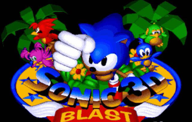
Sonic 3D Blast was released for the Sega Genesis on November 30, 1996. The bell was in fact tolling for the Genesis and Sega was gearing their focus on their 3D system the Sega Saturn (this game was released on that platform as well). With Sonic being the console’s heaviest hitter, Sega felt they needed to end the Genesis’ with one last speed induced hurrah. But instead of giving us one last great 2D platformer, they decided to test the very limits of what the Genesis was capable of graphically and the end result was Sonic 3D Blast.

Was a 3D game on a 2D platform really the best send off that Sega could have given it’s contribution to the 16-Bit era?
Before we evaluate 3D Blast’s graphical presentation, we need to discuss a couple of other aspects. First, let’s take a look at the game’s story. Dr. Robotnik (in this he’s Rocbotnik so that is the name I’m using) has discovered an island, which is populated by birds known as Flickies (Yes. Those Flickies) that can travel through alternate dimensions using large rings. Robotnik decides to turn them all into robots and use their abilities to locate Chaos Emeralds.
Luckily, Sonic happens to be on the Island as well and decides to save them from Robotnik’s grasp, as well as be the first to locate the Chaos Emeralds. I don’t really have too much to say about the story. I mean it isn’t exactly an example of epic story telling and Sonic finding the island at the exact same time as Robotnik is a pretty big coincidence but this is before plot elements were seen as important in Sonic game’s, so I guess I can give this one a free pass. It is basic and basic was in at the time so, yeah whatever.
The game may be lacking a bit in the story department but it certainly isn’t lacking in terms of music. Sonic 3D Blast has a great soundtrack that delivers both in terms of light hearted fare, as well as excellent beats and rhythms that really get the blood pumping. No matter the zone, the mood is always set perfectly. Well, in the Genesis version at least. The Saturn version serves up a sharp contrast to this. Don’t get me wrong. The music in the Saturn version is amazing and probably some of the best video game music I have ever heard (thanks to composer Richard Jacques) but it is just too serious and dramatic to really belong in this kind of game. If you were to play the game as you were listening to the Saturn version’s music, you would notice right away that it doesn’t mesh well. These tracks would be perfect for an RPG or anything with a more serious or character driven plot but it just doesn’t really belong in a Sonic the Hedgehog game.
Here’s a little comparison of the musical styles of both the Genesis and Saturn versions:
(These are actually from the same level. Which do you think is better?)
I guess I should also mention that all of the classic Sonic sound effects from the original trilogy are all in tact and as always they are just fine and dandy.
Now that we got the smaller details out of the way, it is time to talk about the game’s graphical presentation, as well as its gameplay. For a 16-Bit Genesis game, this game looks fantastic (for the most part). All of the character models and backgrounds are all done with very nice looking 3Dish polish and the fact that Traveller’s Tales was able to pull this off with the limitations of second generation gaming technology is nothing short of impressive. All of the locals, from the island setting, to the ancient ruins, to snow and lava worlds and even the crazy mechanical backdrop of Robotnik’s lair are all highly detailed and look absolutely stunning on the Genesis.
The character models are a little bit more of a mixed bag though. Sonic and Knuckles both look great in this style of 3D. The Flickies themselves look adorable and have some good designs, which helps set them all apart and the badniks are bit goofy in their designs this time around and don’t look as good as they did in past games but they still look pretty good.
However, there are a couple of character designs that I don’t care for. Robotnik just looks ridiculous here. Granted, he always looks ridiculous but here the designers just went over board. His mustache is way to wide for his face and his shirt looks like it’s part of a jester’s outfit. Tails (who happens to be favorite Sonic character) has the worst character design in the game because of his head. The nose and mouth stick out just fine but the rest of his head looks like it is pushed in. Was he hit in the face with a shovel?
But other than those two minor gripes, the game looks fantastic, although it looks slightly better on the Saturn, with it being a bit brighter and more polished (it is a 3D system after all). That port even spots some nice extra effects like rain, fog and other nifty looking weather conditions.
Well actually, I do have one other gripe about the graphics but that will just have wait because it factors in with the gameplay, which I will begin discussing…..
Now!

(Sonic saving the Flikies from certain doom)
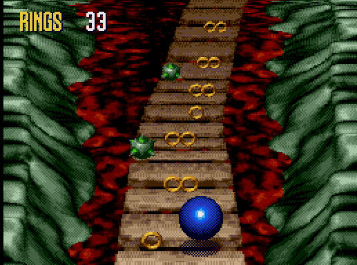
Sonic 3D Blast is mostly like any of the games in the main Sonic series up to this point. It is a 2D style platformer (So I guess I should have used the more modern term 2.5D to describe the graphics huh?), where you smash open badniks in order to rescue animals (the Flickies) and reach the end of the Act. Each zone has 3 acts, with the third one being the boss battle. And of course you have to collect the Chaos Emeralds by completing bonus levels. These aspects are classic and should be in every Sonic game. But I will say that the Chaos Emerald stages don’t offer up the same level of challenge or fun as they do in the other games. Instead of running through a half-pipe and doing loop de loops to collect rings (Sonic 2) or running at high speeds to collect blue orbs, while dodging red ones (Sonic 3), you are simply running in a straight line. Sure you have to collect X amount of rings in order to get the emerald and you must dodge a few spikes but it is too easy and quite frankly, boring. These were actually handled better in the Saturn version. Probably because they were developed by Sonic Team. Basically, it is the same as in Sonic 2 but with some fancy 3D effects added in, like a trippy free fall, which has you spinning around like cyclone as you collect the rings. From what I have seen of it, it looks cool but it can be a bit dizzying.

(This is actually more boring than it looks)
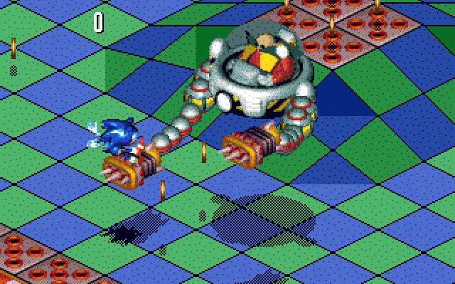
The second difference is a graphical misstep, which comes close to rendering the game unplayable. And that is the introduction of an isometric perspective (again I should have called this 2.5 D rather than 3D). So, rather than it being a simple side-scroller, Sonic has to dash his way through the upper and lower levels of a 3Dish (think Q-Bert) grid that is tilted at a 45 degree angle. This perspective makes it incredibly difficult for Sonic to run around in his typical fashion because the grid’s angle doesn’t mesh well with the use of a regular D-Pad (although an analogue stick doesn’t help much either). Sonic can still run around but trying to control him with the D-Pad results in him mostly sliding all over the place like he is ice-skating. The angle also makes it hard to tell where exactly Sonic is standing. I can’t even tell you the number of times in which I have been hit by an enemy or failed to counter attack because I was standing in the wrong spot. Oh and worst of all, it causes eyestrain. Playing this game usually gives me a headache because of the way each level design is tilted. It also doesn’t help that I have to focus my eyes on Sonic as he is quickly slipping and sliding across the screen.

(If only I knew where I was standing. Then I could you know, DODGE!)
But still, the controls are fluent and responsive enough to offer up a decent play through, even if the perspective adds an unfair challenge. Just be sure to save your progress (if you can), so you can take breaks to avoid headaches. There’s enough here for me to like it but there is an equal amount for me to hate it as well.
If you are a Sonic fan, you may want to check it out but if you are new to the series, I would say that you are better off starting with one of the side-scrollers and would advise you to leave this one in the dust.
Final Score: 5/10
