This post has not been edited by the GamesBeat staff. Opinions by GamesBeat community writers do not necessarily reflect those of the staff.
![]()
Imagine a house filled with thousands of rooms, each unique in some small way. Its occupants are mysteriously absent, yet the house is teeming with life.
Goldfish jump in and out of bowls placed haphazardly; a nearby basketball bounces of its own accord. Paper helicopters materialize out of the ether, only to disappear just as suddenly, while two slices of bread hop up and down in a toaster that sits on a small table. Elsewhere, an exposed pipe drips water in a darkened room and balloons magically rise through the floor.
And you are a paper airplane, at the mercy of air currents, whose very survival depends on avoiding these strange and wonderful — yet simultaneously mundane — household objects.
This is the world of Glider, a classic Mac game with a devoted fan base that remained strong for over a decade. It spawned from the mind of John Calhoun, who released a simple version of Glider in 1988.
The game evolved considerably over the following decade, growing in depth and complexity, expanding its fan base, adding a level editor, and even picking up a commercial release. This is the story of the origins and evolution of Glider, from its humble beginnings as a mere experiment to the aftermath of Glider Pro — the final version of the game.
“It may be that I saw games as bridging the artistic and creative pursuits with those more technical,” Calhoun says, when asked about his initial attraction to programming games. His first coding experience came on a Commodore PET computer, on which he modified an ASCII graphics game that vaguely resembled the arcade classics Frogger and Asteroids. A random sequence of asterisks would scroll up the screen, two per horizontal line, while you tried to move your ship (a less-than symbol) across the screen without colliding with an asterisk. He spent time tweaking the game with a friend, making it “richer, more complex, and frankly more fun.” They added shields, enemy ships that would pursue you, and a gradually increasing “asteroid” density.
In later years, he moved on to tinkering with the light-cycle game on his dad’s Commodore VIC-20, whereupon a simple experiment led to the earliest beginnings of the Glider concept. Inspired by the home console version of Choplifter and the well-known arcade game Defender, Calhoun redefined the bitmap tables for the text characters to create something that looked like a blower vent. He also created a triangular, dart-like paper airplane, which could move left or right across the screen. The paper airplane would rise when above the vent and fall at all other times.
Amused by this simple mechanic, Calhoun mentally filed it away — where it lingered dormant until he entered college some time later.
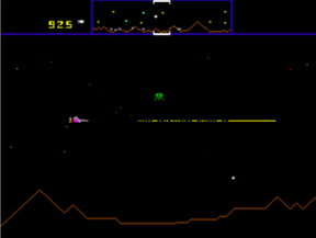
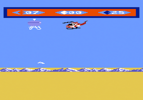
Inspiration for the paper airplane and air vent came from Defender (left) and Choplifter (right)
When asked about the origins of the idea, he suggests that it had something to do with a childhood hobby; Calhoun liked to throw things off the ledge above a large air-conditioning unit at the local mall. The fan on the air conditioner created a powerful updraft, which provided fascinating resistance and lift to the foam peanuts and paper aircraft he tossed out over the unit.
Calhoun picked up his first Macintosh — a Macintosh Plus — in college, quickly learning the basics of the Pascal programming language and bitmapped graphics. Once ready to try making a game on his Mac, he decided to return to the paper airplane and blower vent concept. He drew a small paper airplane and an air vent — like one you might see in a house — with MacPaint, a powerful painting and drawing program that came bundled on all Macs at the time. The concept still seemed fun, so Calhoun thought about how it could become a proper game. He expanded the play space, adding tables and shelves as obstacles. The pieces were coming together — with clever placement of obstacles, the game could be a kind of puzzle or obstacle course for the glider to maneuver through.
Convinced that he had a good idea, Calhoun entered full production on the game. His imagination ran wild, with visions of a series of rooms in a house connected through air ducts and filled with puzzles. New elements were added: Candles could provide additional lift but would burn the glider if you got too close, and electrical outlets might periodically zap. He experimented with physics, trying out different speeds for glider movement, fall, and lift. It was important to work this out early, as a different ratio between horizontal movement speed and gravity would result in the arrangement of objects falling out of balance (giving him more work to do repositioning objects on the screen).
He added objects one at a time, with each meant to fill a role — be it a particular kind of puzzle or simply for increased variety. Calhoun’s living conditions provided the bulk of the inspiration. Exposed pipes, running from floor to ceiling; ancient rusty radiators; cracks in walls; and hand-me-down furniture were all part of his daily life as a college student in Lawrence, Kansas. If something from his everyday life seemed like a good fit for the game, it would be tried as either an object or decoration. Gradually, Glider emerged more fully as a game with a distinct style and aesthetic.
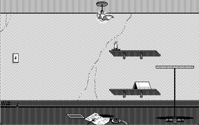
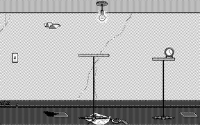
Little changed in the visuals between Glider 2 (left) and Glider 3 (right), but the third installment added sound and a greater sense of polish.
By the time Glider 3 came out, some two years after the first version, Calhoun had a steady stream of shareware checks coming in from people who loved the game — despite a distinct lack of polish. He had uploaded it to a few of the more popular Macintosh FTP sites, then watched it spread like wildfire.
The money wasn’t much, but it allowed Calhoun to buy a pizza and two large Cokes on a semi-weekly basis. The free pizza helped justify to his girlfriend the frequent late-night programming, while the letters that accompanied the checks gave a little extra motivation to keep improving the game. Referring to the period, he states, “I wasn’t getting rich by any stretch of the imagination, but the letters were often enthusiastic and gave me the sense that Glider was, to some, a special little game.”
Encouraged by the game’s success and inspired by Steven Levy’s book Hackers, Calhoun decided to try getting Glider published commercially. Hackers had captured his imagination with its talk of late-night coding sessions fuelled by caffeine and Dungeons and Dragons. He had planned to become a high-school teacher after graduation, but the book persuaded him to approach some game companies with Glider.
This article was originally published on MacScene and is based on an interview with Glider's creator, John Calhoun, which is available in two parts: part 1 and part 2.
SimCity had just been released, so he tried Maxis — no response. Then he tried Casady & Greene, whose ads — for the games Crystal Quest and Sky Shadow — he had seen in Macworld magazine. They liked what they saw. Calhoun would make a color version of Glider, with more rooms; they would publish the game and give him a color Macintosh for development. He offers a simple comment: “What a deal.”
The demand for more rooms struck another lightbulb in Calhoun’s head. Creating rooms for the house was a tedious process in which objects were laid out blindly — everything was hard-coded and testing changes was slow. So he thought to create a “room” editor, which would let him create rooms via a graphical user interface and test them with a simple modification to the start point.
But he didn’t keep the editor to himself. An earlier Macintosh game called World Builder, by Silicon Beach Software, allowed players to create their own levels or games and share them with others. He had seen some of these World Builder games on FTP sites; it seemed like a good idea to let Glider players create and share their own content, too.
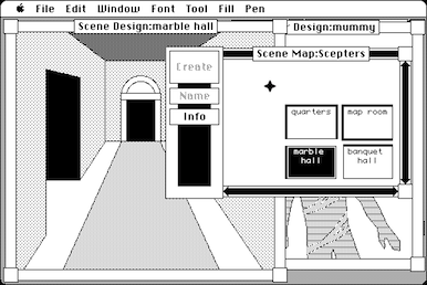
World Builder.
The timing could not have been better. America Online (AOL) emerged at around the same time as Glider 4.0, which was the version made for Casady & Greene. Glider houses had very small file sizes, so they could be uploaded and downloaded quickly from AOL at dial-up speed.
From here, a thriving community of modders grew up around the game. People evidently loved the idea that they could make a game of their own using the simple editor. The ingenuity of some of them surprised Calhoun, who did his best to download and play them all (until the sheer volume became overwhelming). One house, created by Ward Hartenstein, could be played in its entirety without touching a single key. Like a Rube Goldberg machine or the auto-Mario levels that have become popular on YouTube, the house played itself in a breathtaking display of artistry.
The house editor came with a huge cost of time, however. The decision to include it with the game meant that Calhoun needed to add sanity checks and considerable polish so that it was usable by a mass audience. It would not do to have a candle that sucks a Glider towards its flame; every object required similar checks to ensure players could not break the game. Layering a highly polished user interface on top of the editing functionality was essential to the accessibility of the editor. The work required to do all of this, as far as Calhoun can recall, actually exceeded that which he put into the game itself, even though Glider 4 used none of the code from Glider 3.
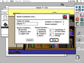
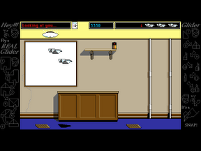
The Glider 4 Room Editor (left) and default house (right)
Glider 4 was a major departure for the series, and not just because of the editor and commercial release. Both the introduction of power-ups and the shift to a 16-color palette contributed to a significant change in tone. The game now felt somehow darker and edgier, like the house secretly had it in for you, and all was not well in the magical Glider-land. Hitting a switch could now cause a big chain reaction or radically alter the dynamics of a room. Foil (for protection) and rubber bands (for player-fired projectiles) were added to differentiate the game from its shareware predecessor, but they had an inadvertent knock-on effect. The rooms became more claustrophobic, fraught with danger, as though you were leaving the playground and entering a war zone.
Yet Glider retained its charm. To save memory, Calhoun limited the game to 16 colors instead of the 256 that newer Macintoshes supported. He tried to make up for this limitation by using a graphics technique called dithering, which involves scattering different colored pixels in an image to give the appearance of an intermediary color. Most often, he used a dithering pattern that consisted of two colors — usually grey and a primary or secondary color — alternating in a checkerboard pattern.
This resulted in a muted, desaturated color. Different shades of grey provided variations, such that the 16-color palette could be used to produce far more than 16 colors. This, quite deliberately, led to a frumpy and dinghy-looking house — similar to that in which Calhoun lived at the time.
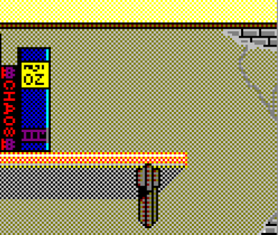
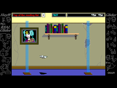
Pattern dithering in Glider 4 (left) and the Windows port (right)
Glider 4 was successful enough to warrant a Windows port. Unfortunately, the game looked dated by the time it was ready for a PC audience, and publisher Casady & Greene was unsure how to market to Windows users. As a result, the game failed to make a splash; the Glider phenomenon remained confined to the Mac.
Glider PRO arrived on the scene in 1994, around the same time as the Windows version of Glider 4. The tone shifted again as support was added for outdoor environments — rather than feeling claustrophobic and dark, Glider PRO felt open, bright, and laid-back.
The change came because Calhoun was feeling restricted by the Glider formula. “I was beginning to feel perhaps like someone who has been cooped up too long watching TV or otherwise wasting their life away," he says. "So I literally threw the windows open.” The prize was no longer escape; it was collecting all the “stars,” which were scattered throughout the house (although “house” had become a much looser concept).
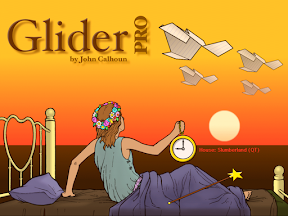
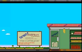
The resulting game had incredible variety. There were tree houses, graveyards, sewers, castles, an art museum, a grocery store, a space station — even the Titanic. Calhoun enlisted the help of several of the community’s best house designers to make Glider PRO the deepest, most definitive version of the game. One house, Slumberland, was co-authored by Calhoun, Paul Finn, Steve Sullivan, and Ward Hartenstein. The default house in Glider PRO, it included a whopping 403 rooms, and was the closest Calhoun ever got to fulfilling his dream of a huge house with thousands of rooms.
The community embraced the game, diving in to the improved modding tools. Hundreds, perhaps thousands of houses were created, with many taking advantage of the new option to load different artwork. Two e-zines sprung up, each lasting a couple of years, while other fan websites and newsletters developed (and survived) well into the next decade.
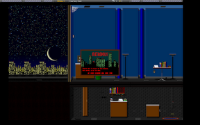
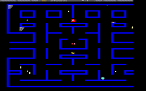
Custom "houses" for Glider PRO
Some have suggested that Glider lost much of its charm in the transition to PRO, however, and Calhoun is inclined to agree. He suggests that the expanded scope came at the cost of a “quiet domesticity,” which was core to the original game’s charm. But he is (currently) unable to take a new stab at the “definitive” Glider — even if he wants to — because of commitments as a programmer at Apple (he left the games scene many years ago, after his other games failed to match Glider’s impact).
![]() The Mac gaming scene — along with the Mac itself — has changed and reshaped considerably since the arrival of OS X at the turn of the century. Games like Glider have become rarer as the Mac audience grows more fragmented. Little indie games are seldom seen at trade shows alongside the big commercial apps, and the Mac seems to be losing both its underdog status and its tight-knit community. Calhoun readily admits that the heady days of shareware, which catapulted Glider into the limelight, are long over, while the excitement has shifted to Apple’s iDevices.
The Mac gaming scene — along with the Mac itself — has changed and reshaped considerably since the arrival of OS X at the turn of the century. Games like Glider have become rarer as the Mac audience grows more fragmented. Little indie games are seldom seen at trade shows alongside the big commercial apps, and the Mac seems to be losing both its underdog status and its tight-knit community. Calhoun readily admits that the heady days of shareware, which catapulted Glider into the limelight, are long over, while the excitement has shifted to Apple’s iDevices.
But for many of its fans, Glider is, was, and always will be the quintessential Mac game — charming, friendly, unique, and somehow magical. It shaped John Calhoun’s life and, I’m sure, many others.
This article was originally published on MacScene and is based on an interview with Glider's creator, John Calhoun, which is available in two parts: part 1 and part 2.
