This post has not been edited by the GamesBeat staff. Opinions by GamesBeat community writers do not necessarily reflect those of the staff.
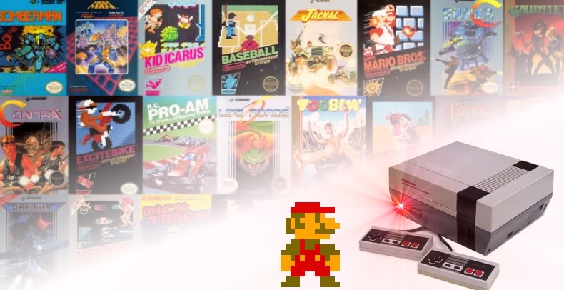
Remember when game covers weren't as uniform as they are today? There was once a time when every developer had their own label style, and cover art was somewhere between the literal definitions of "art" and "garbage." With over 700 titles to choose from in its hit-and-miss library, the NES was notorious for harboring many of these unique design themes and quite possibly containing more variations than any other system. In the years to follow, game companies began transitioning to a more conventional form of cover presentation, usually making sure every single game box (excluding "greatest hits" editions) looked almost exactly alike.
Seriously though, whatever happened to those bizarre mixtures of cover art we used to see on video games? Don't get me wrong, today's designs are nothing short of spectacular, but regardless, yesteryear's label illustrations possessed a classic charm we simply don't see today. So in honor of many spectacular, mediocre, and just plain weird pieces of cover art, let's take a look back at some of the most common styles and themes seen on NES games.
The "Here's what you get" design
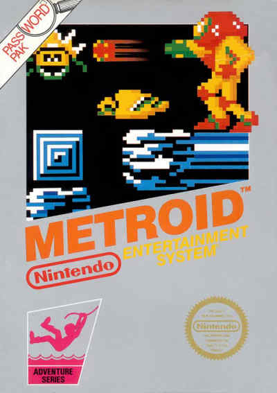
These covers are commonly seen with in-house developed Nintendo titles, and they get the point across perfectly. The overall presentation is quite conservative, and they simply show you a small screenshot of what you're actually getting. For instance, the covers of Super Mario Bros. and Metroid feature the 8-bit protagonists themselves, spruced up with a background of environmental ornaments. These classic silver displays — usually highlighting a special "series" of other NES games like "Action" or "Sports" — were some of the most memorable covers seen during the console's prime. Many of these games also have later revisions, like Metroid's yellow label featuring a more animated depiction of Samus.
This was really a sign of things to come, as most first party companies preferred to keep similar label types on all their games. Though many previous companies — including Atari and Sega — also had a habit of doing this, Nintendo was still the first to put an official "seal of quality" on every title the company had approved, first and third party alike. Most collectors will notice how other off-brand cartridge companies, like Tengen and Wisdom Tree, are missing the seal altogether; these games rarely received any sort of official consent from Nintendo.
The "This will probably appeal to Americans" design
In the world of video game box art, marketing can be a very funny concept; it's a practice that will either make or break the games up for grabs. Even under more extreme circumstances, some consumers will continue to support products containing an awkward presentation but scratch their heads as to why certain types of art were chosen in the first place. The funniest part in all of this? Even if it's strange or wrong, it's somehow what the company felt consumers wanted all along.

In the 80s and 90s, Japan had a hilarious habit of transforming anime themed covers they felt were unpopular and converting them into something they figured was on a random North American movie poster for a terrible action flick. One classic series that really took a hit on this one was Mega Man; the beloved cartoon character mutated into a strange, genetic nightmare. Seriously, it's like Dr. Light decided to see what happened if Mega Man contained the DNA of Sylvester Stallone and the Six Million Dollar Man. Most of these covers — though strange and revolting to some — still represent a golden age in North American gaming, while others are considered abominations that should have been avoided altogether.
The "Accurate arcade" design
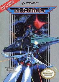
These covers are usually best at outlining a realistic image of the game without greatly exaggerating appearances. Companies who commonly ported arcade games, like Data East and Konami, usually preferred to go with this classic style. For example, the cover art on Gradius simply presents an illustration of the same title screen offered in the arcade version. Marble Madness — another arcade classic — simply portrays the three-dimensional playing field with multiple marbles. Even if these designs aren't exact replicas of what you would see on arcade cabinets, many third party developers still did a fantastic job in attempting to recreate the same ideas and concepts for a home arcade environment.
Most titles that received this treatment spawned from the arcades, but some were also exclusive to the home console world; these were games that wanted to capture an arcade essence, regardless of the fact that your first experiences with them were on home consoles. For instance, the cover art for Rare's R.C. Pro-Am featured a drawing of lifelike R.C. cars battling it out on the track. In most cases, gamers could simply look at the cover without being surprised or disappointed by the end result, all thanks to these arcade inspired themes.
The "Incredibly corny and highly misleading" design
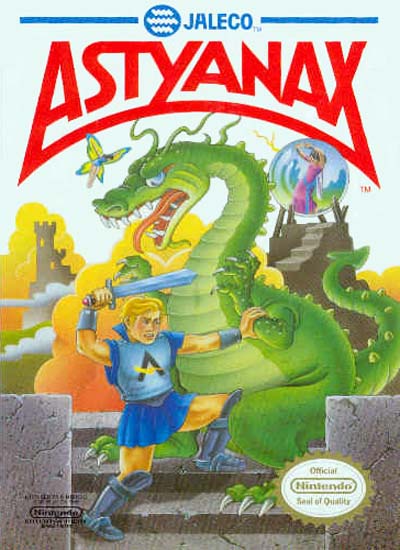
These covers are my personal favorite to find, and they can either be good or bad depending on the game. One great representation is Astyanax, which features a rather dorky looking hero attempting to fight some kind of preschool storybook dragon. Even the cheesy anime-like introduction was almost more humiliating than the cover, but the actual game turned out to be a reasonably stable hack-and-slash side-scroller. Some of the levels are more annoying than others, but it was still nice to find a game like this that's actually playable on the NES.
Moving on to the "bad" side of the spectrum, we also have games like Puss N' Boots: Pero's Great Adventure. These games will go out of their way to make sure the initial product presentation looks extremely polished just so they can fool you into buying a terribly developed game. Some folks will strongly admire these fantastic collages — which are quite stunning at times — as they tell themselves it's well worth the purchase. The consumer, however, will soon discover that marketing has paid off for the company and made up for their initial failure to develop a quality program. Keeping this in mind, if you haven't yet read a review or walkthrough of the games in question, avoid "tie-in" merchandise titles from movies or TV shows if you can — but hell, that's probably just the golden rule of game shopping to begin with.
It's, um…a design
Even if a cover featured cheesy artwork or highly dramatic interpretations, at least these images still gave us a general idea of what we were about to get into; titles like Anticipation neglected to give players any sort of clue at all. Honestly, when I saw this game for 50 cents in a thrift store, I almost refused to pick it up. After loading it into my NES console for the first time, I was pleasantly surprised. I had initially expected some kind of unplayable casual nightmare with terrible controls and shady graphics, when in reality it's something I wouldn't be (too) embarrassed to play with another friend.
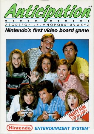
The game itself is best described as a pictionary-like quiz game, where you can take turns with up to four players. Your main objective is to answer questions by identifying objects or shapes as you attempt to race towards the final goal on your virtual playing board. I'll admit, the cover photo still does a good job of implying how Anticipation is a more social game, therefore making it some kind of interactive "party" title, but how in the hell are we supposed to know what else it has to offer? All you get is a tiny amount of flavor text reading "Nintendo's first video board game," accompanied by an already vague photo of people who jumped out of an 80s sitcom. Even I was waiting in anticipation (funny) to play this, since I found this thing on a trip away from home without an NES to immediately throw it in.
Looking at the big picture
Of course, there are dozens of art and label designs to consider, especially with a console containing hundreds upon hundreds of video games to choose from. These five basic themes mentioned today represent a fraction of these "artistic" oddities the NES — and other consoles alike — had to offer in the way of upfront presentation. Looking back, what were some of the most memorable pieces of cover art you can recall seeing? Did they fall into one of these categories mentioned, or were they a different kind of animal?
