This post has not been edited by the GamesBeat staff. Opinions by GamesBeat community writers do not necessarily reflect those of the staff.
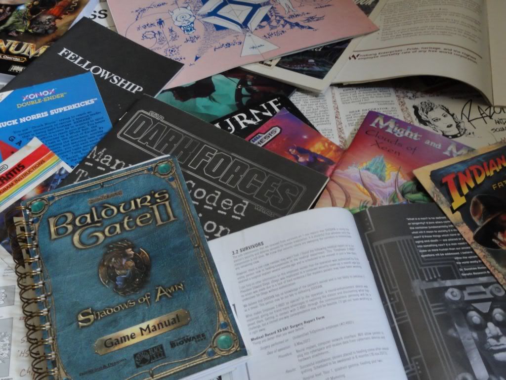 Back when visuals left much to the imagination, designers would sometimes try to squeeze a bit more effort into what went into the box along with the floppies and cartridges to describe what would be waiting inside.
It was often all that I had to go on before I could get home to play these gems as a kid. Peeling away the plastic wrap with New Game Smell™ filling the air or cracking open that rental case and then getting to the manual immediately put my imagination into overdrive on what I could expect – or set me up for grave disappointment. The game could still suck.
Yet whether it was through entertaining prose, a practical map, comics, or as a 'magazine' that doubled as flight instructions, manuals were often the first slice of the game that players would get outside of what the box or magazine spread had told them back then. I had no idea what to expect from a Phantasy Star or Life Force in those days – but the manuals for both pumped my expectations on what I was getting into.
Early examples were sometimes decorated with diagrams and level layouts. Funky statistics, such as measurements on the Vic Viper to the backstory on an arcade port were typical and utterly unexpected. Further on, titles such as Falcon 4.0 sported massive tomes out of necessity while others such as Baldur's Gate 2 literally doubled as the “short” version of the Player's Handbook for AD&D.
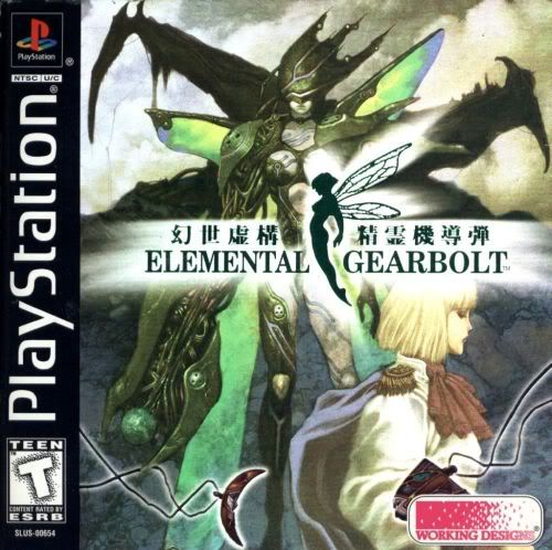 Gradius with a backstory? Where did that come from? Now it's part of a wiki dedicated to the series. Sending the time machine further back, Atari had packaged a few of its 2600 titles with “Atari Force” comics – penned and inked by DC. Its Swordquest series had even used them to hide puzzle clues. Nintendo could always be counted on to fill their manuals with colorful characters and expressive icons instructing players on how to save Zelda once again.
Not every manual was handed the creative treatment. Most were your standard “here is what does what” stereo instructions for your hands. But enough were given a few more splashes of color and text to turn them into small, illuminated chunks of digestible fiction worthy of a second look.
As technology (and storage space) evolved, designers across platforms have become better at cleverly blending teaching with gaming reducing the need to reference a dead tree – or a digital copy of one – for any reason. Yet on the other hand, it's also hard not to feel that an imaginative outlet is slowly fading away as elements that had been taken for granted at one time are being marginalized into the occasional Collector's Edition.
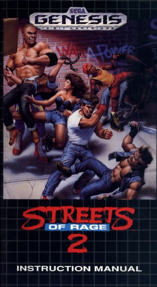 Many early CRPGs came with maps, for example, sometimes made out of cloth and often came with manuals lined with detail if only to describe the complex gameplay systems at no extra cost. Even the occasional JRPG, like Final Fantasy III (aka FF6 in Japan), came with their own maps. One or two games even came with books, such as Interplay's Stonekeep which came with a hardcover novelette entitled 'Thera's Awakening'.
RPGs didn't have a monopoly on extras, though. Infocom's text-only adventures famously included plenty of extras that ranged from origami, scratch 'n sniff stickers, and even a piece of “magical” crystal in its own velvet pouch.
I agree that not all games need as many pages or extras – I'm not weepy eyed in seeing something like Call of Duty go nearly down to a sheaf of glossy paper leaving everything else in-game. Yet when a big deal is made out for something as straightforward as an FPS, that's just additional icing on the cake. I won't complain there, either.
And a few efforts still manage to squeeze by the bean counters, such as CD Projekt RED's packaging for the Witcher 2's “premium” edition which costs the same as a regular copy.
Though it's not as much of a common practice nowadays as Richard Garriott's Ultima made it out to be back then, whenever a developer decides to stretch their creative legs through the pages of that little book inside with the game, it's always a welcome surprise.
The next few pages have a several examples of the cool, strange, and inventive twists manuals and a few light extras have given their games. If you have a favorite of your own, be sure to let everyone know in the comments!
Pac Man (1982)
by Atari for the Atari 2600
Though a technical marvel considering the pressures that programmer, Stephen Fry, was confronted with, the game was cited as one of the causes for the North American Video Game Crash of '83. The included art in the manual tried to put a positive spin on what Pac Man had turned into. Players and critics weren't convinced.
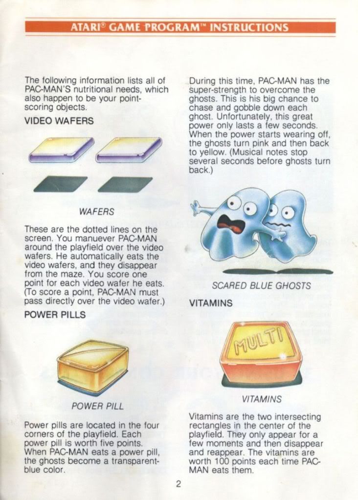
Wafers? Vitamins? How would players react if the lag in Mortal Kombat were called 'spacial distortion anomalies' as part of the game?
Infiltrator (1986)
by Mindscape; PC version
A Cold War precursor to the sort of espionage that Solid Snake would be doing later, Infiltrator was a tongue-in-cheek action/covert-ops title. The manual for the computer versions included a bit of snarky humor such as the small vignettes espousing the good graces of military contractor, Whizbang Enterprises.
Interesting note: most manuals at this time didn't have a software license agreement at the end, only a warranty against damage, and some had even encouraged “copies for backups”. Ah, the innocent days of early gaming.

Nick Cage's Lord of War would have been at home at Whizbang

All that's missing is an endorsement from Buckaroo Banzai
Gradius (1986)
by Konami; NES version
When Gradius was ported over to the NES, the arcade game suddenly had a backstory talking up the Bacterions and the galactic struggle to keep them from dominating the universe. Stages even had their own writeups to fit in with the fiction along with most of the enemies. Reading through this stuff only made waiting to get home to play it worse.
It wouldn't be the first time during these early years that Konami, or other developers, would expand these straightforward ports in creative ways. Capcom's Bionic Commando, for example, went from an arcade standup to a game that had its own storyline.
Was it necessary for a manual to go this far? No. But it was damn cool that it did.
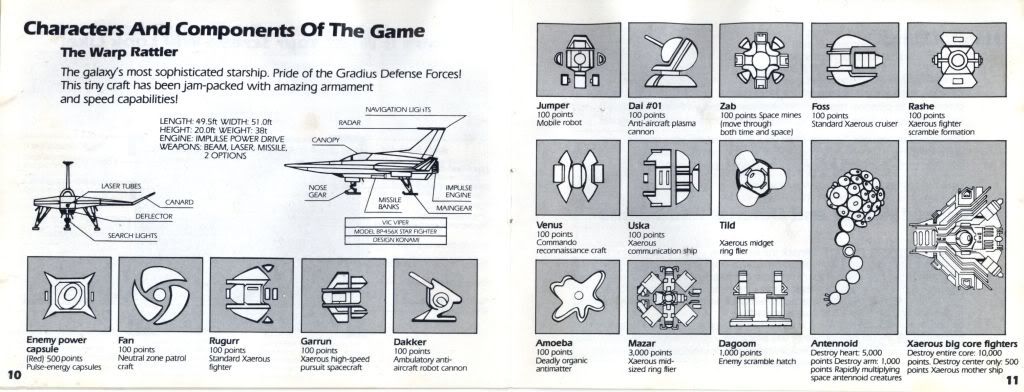
If SyFy had been around, this could have ended up as one of their Saturday evening specials.
Hacker II: The Doomsday Papers (1986)
by Activision for PCs
The first Hacker was notable for NOT having a manual because, as the game's packaging pointed out, there are no instructions for that sort of thing. You could mail Activision for a sheet of 'instructions' which amounted to clues, but that was it. Eventually, players found themselves involved in a world-spanning conspiracy once they 'broke into' the system.
In Hacker II, the United States government is asking for your help after you had done so well in the first game. Your mission is to use a series of remote controlled robots to retrieve the 'Doomsday Papers' from secured complex in Siberia. These papers outline the Soviets' ultimate plan to defeat the United States, so no pressure.
Unlike the first game, you actually get documentation this time around in the form of a manual detailing the multi-monitor system (the game interface) that you would be using. It was a clever bit of immersive fiction, much like how the first game left you only with a login prompt, pulling players deeper into its conspiracy laden atmosphere.
The thing was, it really needed to go that far because of the maddening detail they put into the 'security' system you needed to circumvent. You would need to loop video, monitor guard patrols, and guide your finite number of robots through the complex in a search for the vault combination. Tripping an alert calls out the Annihilator, a machine made to turn your robots into pancakes. And everything would be driven from these monitors.
This was the Demon's Souls for interfaces.
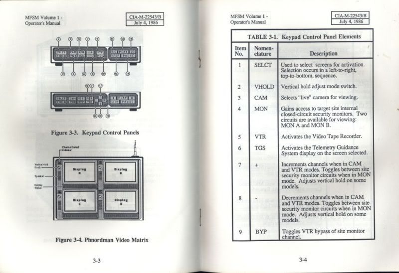
All the player gets is the four screen monitor face on the left and the bank of buttons. Being able to juggle between all of the screens and switches is all part of the gameplay. The game also quizzes you on what does what when you fire it up as a sort of copy protection the first time in.
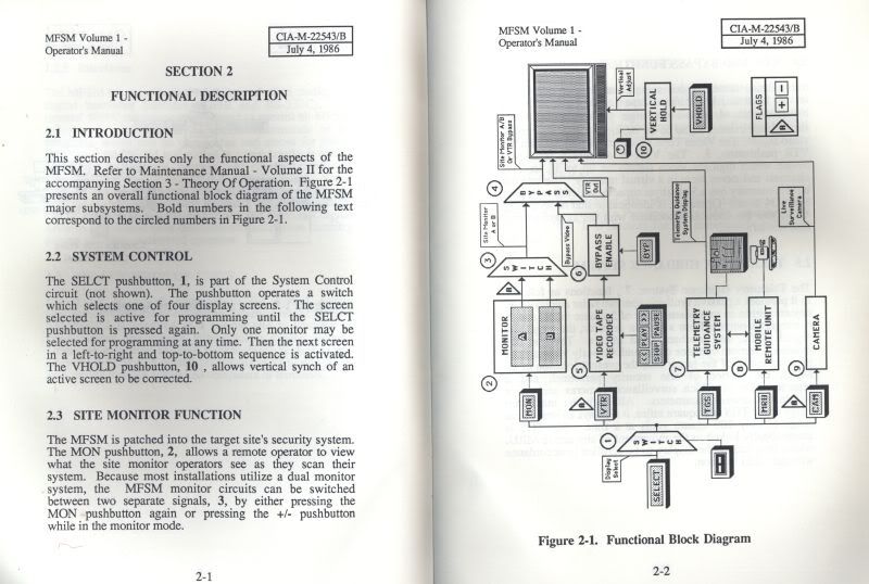
Chloe O'Brian probably made one of these as a kid.
The Bard's Tale II (1986)
by Interplay; PC version
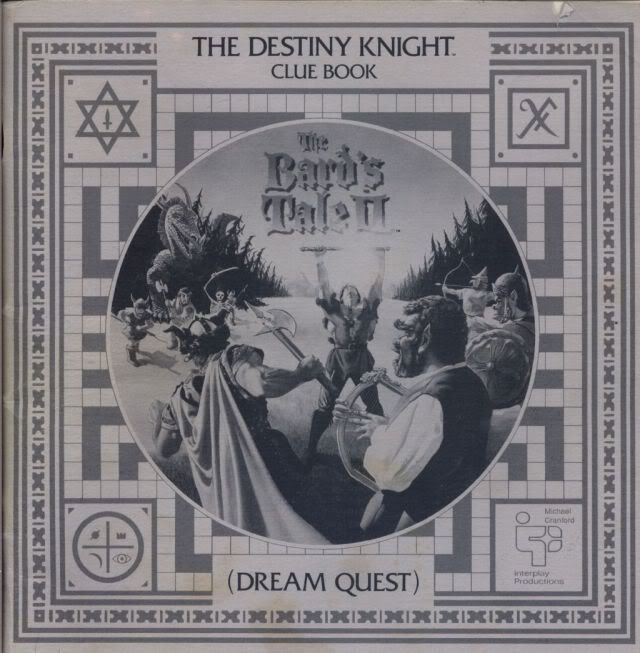
Though the Bard's Tale II had a rather plain manual, the hint guide was a different sort of tree pulp. Nowadays, hint guides just give you the facts. But the Bard's Tale II had a guide notable in how it told you how to solve each dungeon and puzzle in story format, complete with a beginning and ending.
It wasn't alone in this regard, but it's an approach that could have given the game its own novel much like what some titles are receiving today – such as Halo.
Pool of Radiance (1988)
by SSI; PC version
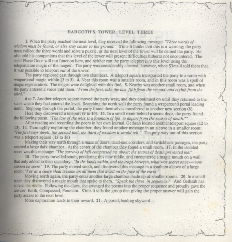
SSI's license with TSR started the "Gold Box" series of CRPGs on PCs and each one came with two manuals – a standard one on how to actually play the game, and an “Adventurer's Journal” which was used as a reference for when the occasion called for it.
It was filled with diary entries, fiction behind the fall of the city of Phlan, table with stats at the end, and SSI included these with nearly every AD&D title without having to squeeze an extra penny from players. Hey, text took up space on those floppies!
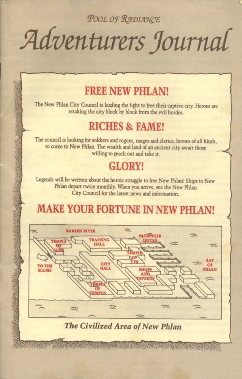
Adventurers are welcome in New Phlan! Someone has to replace all of the dead ones.
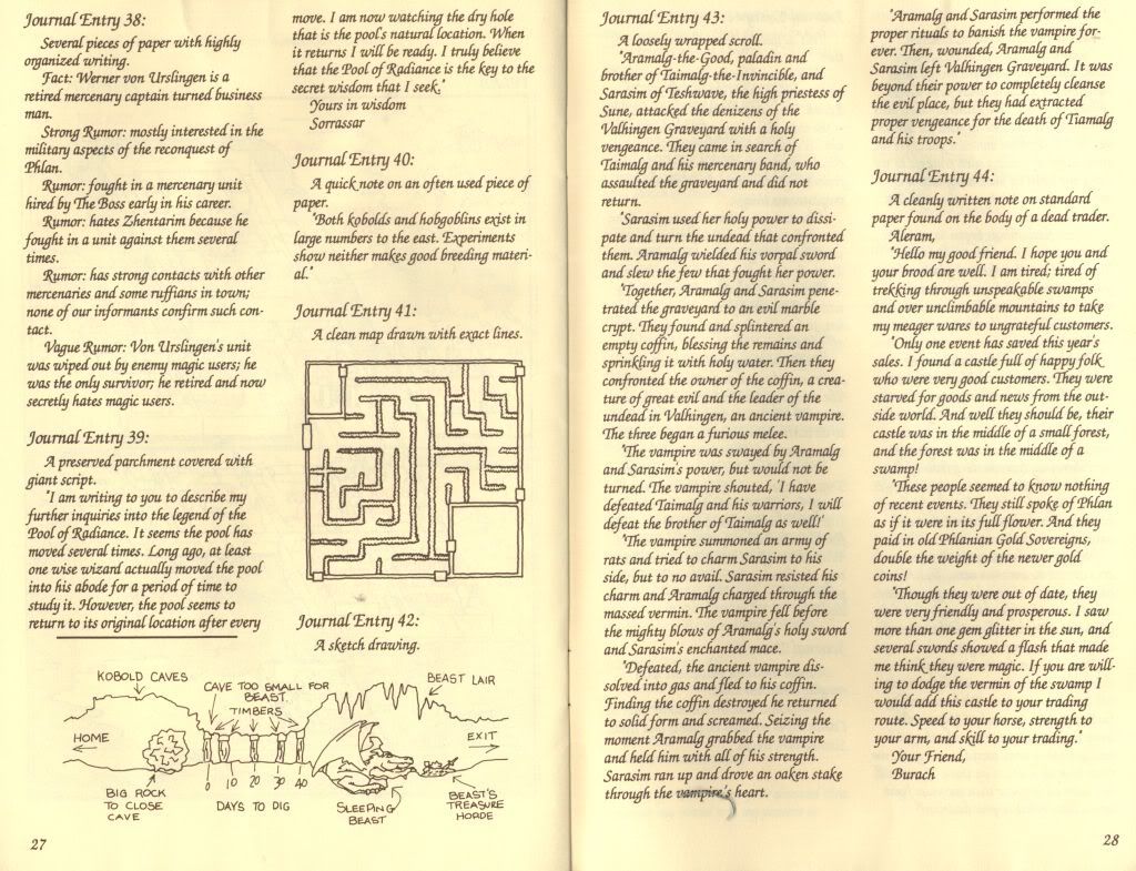
The journal's pages were beaten yellow, scribbled over with diagrams, and filled with scrawled journal entries referenced from within the game as a form of copy protection.
Wing Commander (1990)
by Origin Systems; PC version
Chris Roberts' Wing Commander would revolutionize the space-sim genre with its incredible, action packed combat and a storied mission system that could change depending on how ace a pilot you were or not. It would also put Creative Labs' Soundblaster on the map, something that its sequel would use to great effect with a separate, purchasable Speech Pack. And you thought horse armor was the only cosmetic add-on ever made.
It also came with plenty of documentation including “Claw Marks”, a 'magazine' for the crew of the space carrier, the Tiger's Claw, where you would be stationed. It was filled with articles ranging from pilot profiles to strategies used in battle, making it both useful as a player aid as well as a fantastic piece of fiction designed to pull the player further into Roberts' universe.
Lavish documentation like this wasn't unusual for a developer like Origin with its Ultima roots, a series that had often treated its own players with extras. It was a tradition that other titles would benefit from throughout Origin's history such as Roberts' Strike Commander a few years later.
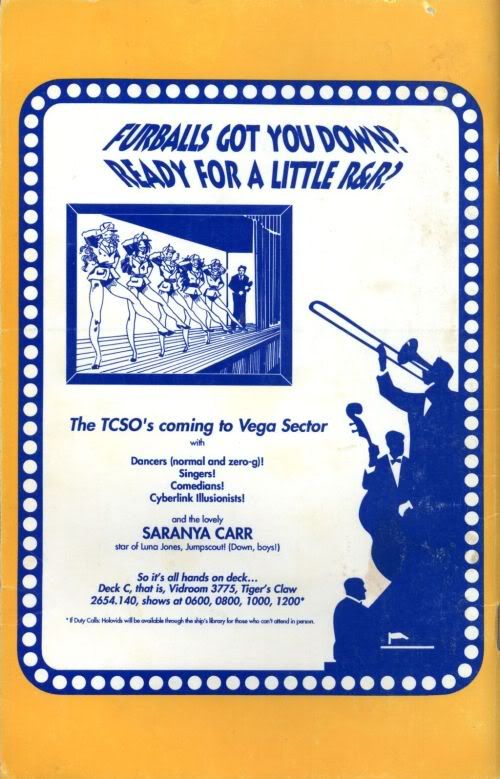
You don't actually get to see the show. Dammit.

Reading through these enemy profiles turned the faceless, trickier AI that they were in the game into characters that I couldn't wait to blast into flaming hairballs.
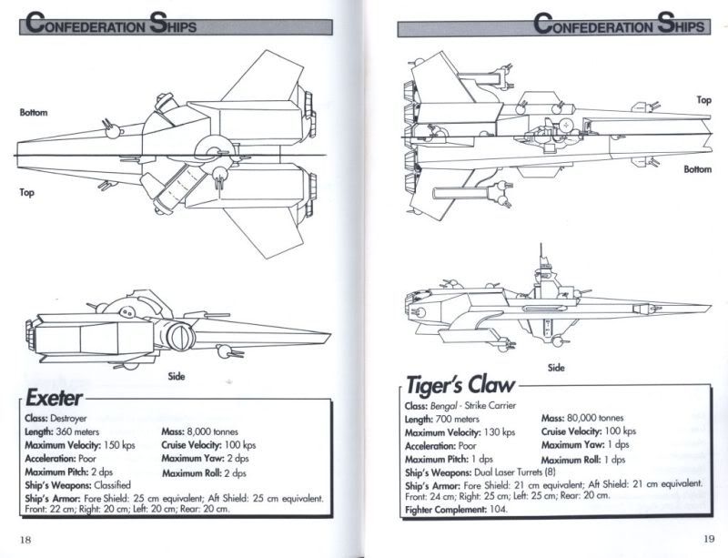
As impressive as these stats for the big ships were, they looked to be the same size as your ship in the game thanks to the technical limitations of the day. When Wing Commander III went full 3D with polys, the sheer size of the series' capital ships was finally realized.
Conan the Cimmerian (1991)
by Virgin Games; PC version
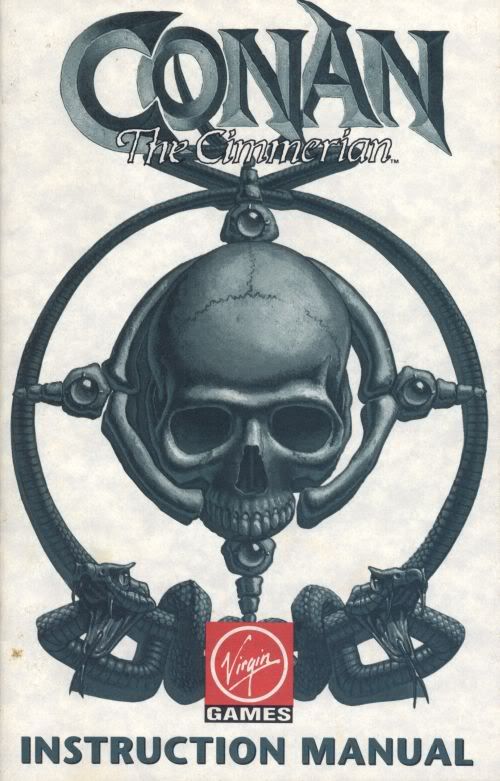
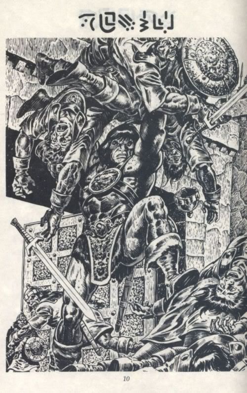
The manual for Conan the Cimmerian by Virgin Games was topped off with plenty of cool art which is what many of the sharper looking manuals would often do, though the selections chosen for the book were particularly awesome.
The manual itself was made from a kind of weathered, rough feeling paper though the instructions were pretty sparse.
Alone in the Dark (1992)
by Infogrames; PC version
When the zombie shambled up into the attic that I was in, the music kicking in at just the right moment to yank on my nerves, I was hooked. And sort doomed to a quick death.
Infogrames' game set the standard for horror games, a point of reference that titles such as Capcom's Resident Evil and Frictional Games' Amnesia can easily trace their inspired terror back to.
The game also came with a newspaper that helped season the atmosphere with just enough subtle cues to tug on the player's curiosity. Eight pages filled with articles and ads helped to set up Alone in the Dark's world of 1924 right before the player set out as one of two characters to plumb the mysteries of the haunted mansion, Derceto.
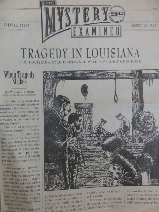
A suicide? Or something else?
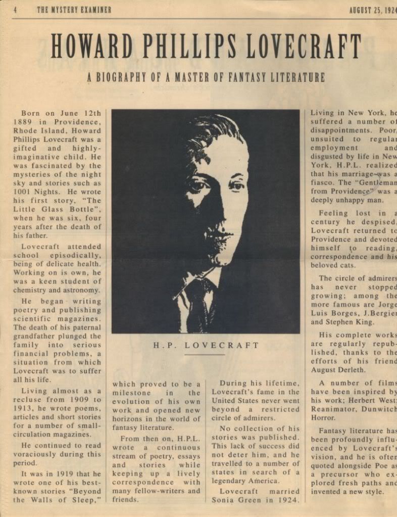
When this guy is mentioned in a game, that should be enough of a warning to players that they'll end up crying from fear or sucked through an interdimensional sphincter.
Ultima 7 (1992)
by Origin Systems; PC version
The Ultima series, as it grew over the years, exploded with details thanks to the layers woven by its characters and history.
The extras that would later be included with each entry would also become more elaborate. Cloth maps were only the start. As Origin grew, other titles would also benefit from the developer's passion in creating worlds using this venue such as Wing Commander with Claw Marks.
Ultima 7 would include a small book simply entitled “Fellowship” that outlined the fantasy world of Britannia from the perspective of this mysterious new order. Reading between the lines, I'd get the impression that the author wasn't entirely convinced of the legends surrounding the series' ever-present hero, the Avatar, but as we later find out, that was much more than a hint of what was to come.
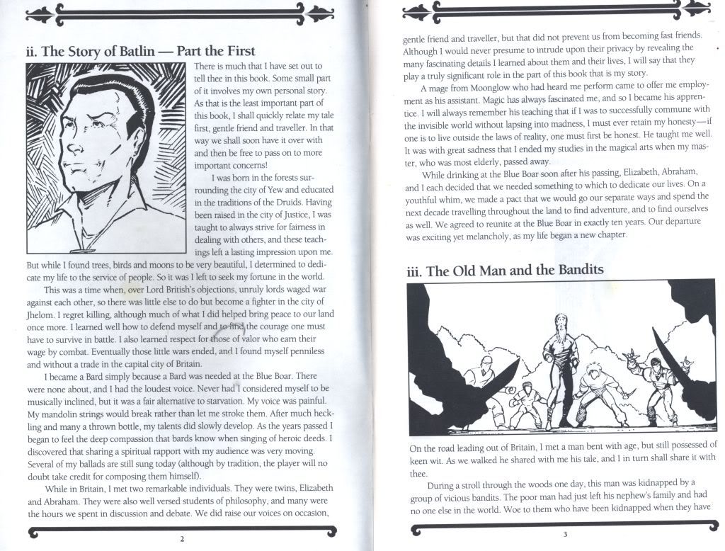
Batlin seems like a nice guy. Really.
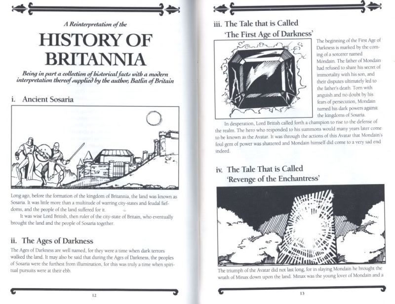
If you missed out on what happened on Brittania from the last six Ultima games, don't worry. The Fellowship will bring you up to speed…friend.
Sam & Max Hit the Road (1993)
by Lucasarts for PCs
Packed with humor, clever animation, and fantastic characters, this was Lucasarts during its heyday. The manual, though on the thin side, had pages tattooed with comic strips featuring everyone's favorite Freelance Police duo.
Fashioned as the “Crimestompers' Coloring Book”, the manual also served as a form of copy protection (you had to dress up Sam & Max depending on which page it told you to reference). It even had a “board game” for those long cross-country trips.
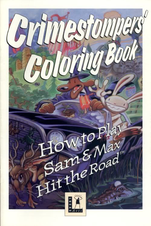
With a fine box of crayons, you can color to your heart's content.
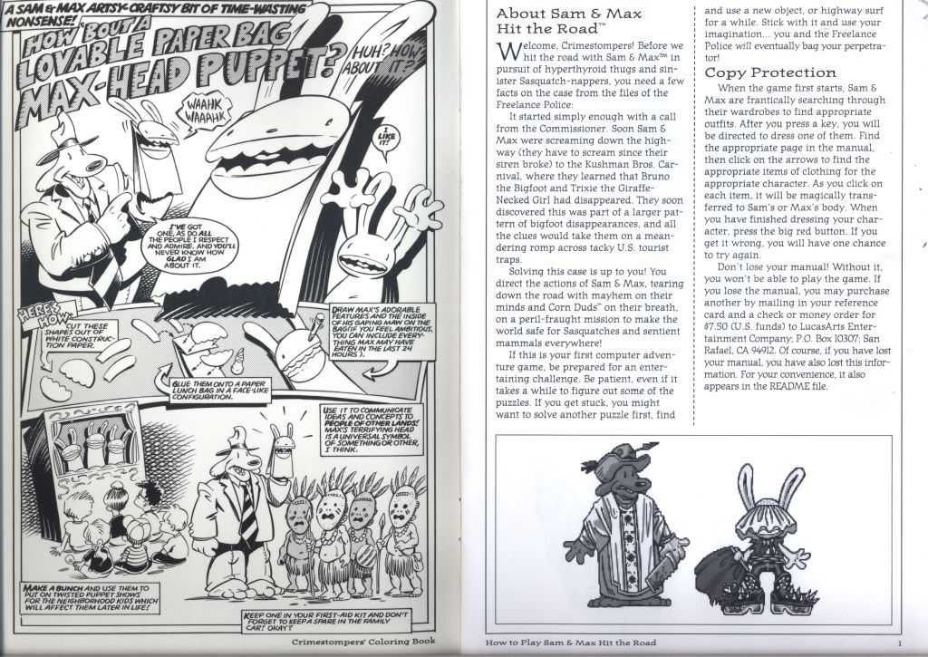
Need Max the Hand Puppet? Now you can make your own piece of insanity! On the right, Sam & Max demonstrate the highly secure and clothing coordinated copy protection for the game.
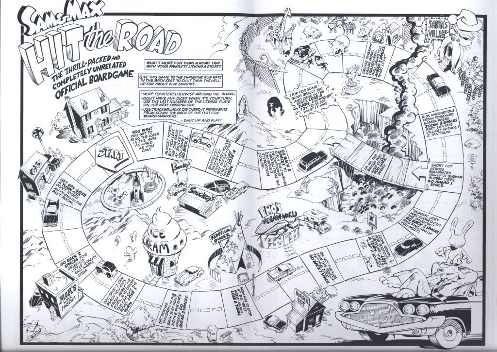
Remember kiddies, don't play and drive at the same time! Unless you happen to be a rabbity headed, feral toothed partner named Max.
Dragon Force (1996)
by Sega, imported to NA by Working Designs; Sega Saturn version
Working Designs' approach to providing a unique experience for their players through their translated imports went through to their manuals as well. Dragon Force's manual typified the kind of quality that their work sought to represent: embossed covers, pages saturated with art, and a translation brief talking about their work.

Working Designs' attention to their imports went into every aspect of the game, especially with the way that they were presented. I just wish they had laid off the forced pop culture references.
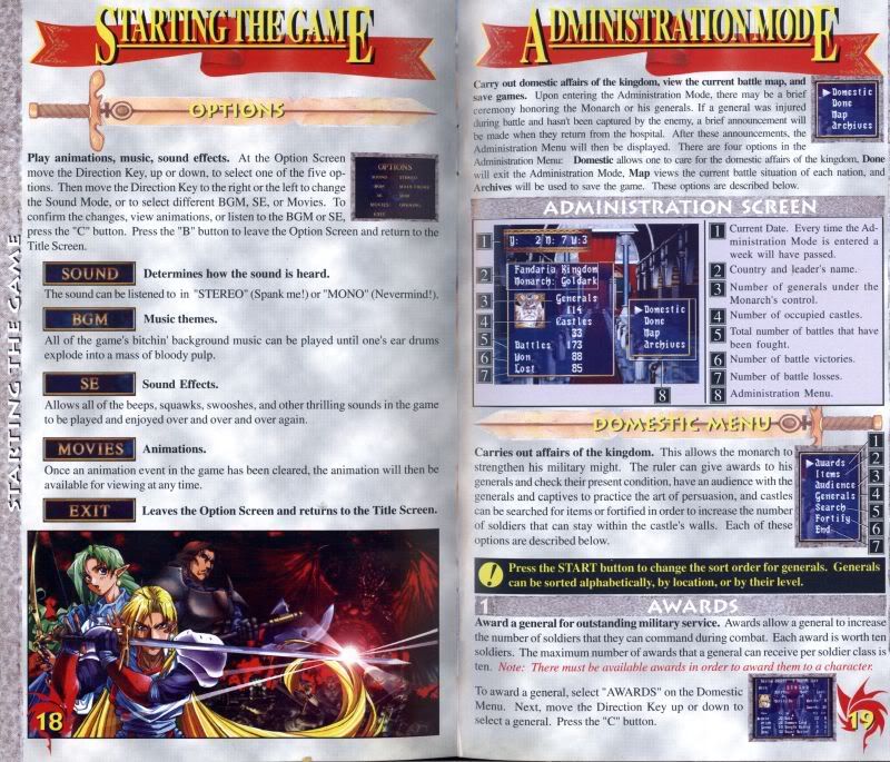
Dragon Force was an incredibly fun RTS on the Saturn, though its sequel was never officially released outside of Japan. If only Operation Rainfall were around back then.
Metal Gear Solid (1998)
by Konami, Playstation version
Artist Yoji Shinkawa's work permeated the manual for Snake's debut on the PS2 with his striking character illustrations.
The manual was also packed with juicy info on the world of Metal Gear, and it wouldn't be the first time that Hideo Kojima and his team would let their creativity take full advantage of this outlet.
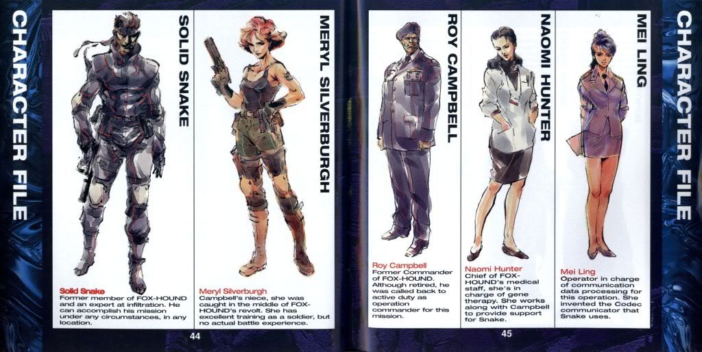
Snake?!
Deus Ex (June, 2000)
by Ion Storm; PC version
Deus Ex's manual was pretty straightforward stuff, but the game also came with a bit of double sided propaganda. On on side, a 'bulletin board' showing off things such as weapons from the game, and on the other side, a news sheet called 'Midnight Sun' that set out to make you even more paranoid about would-be hero Denton's world of the augmented future.
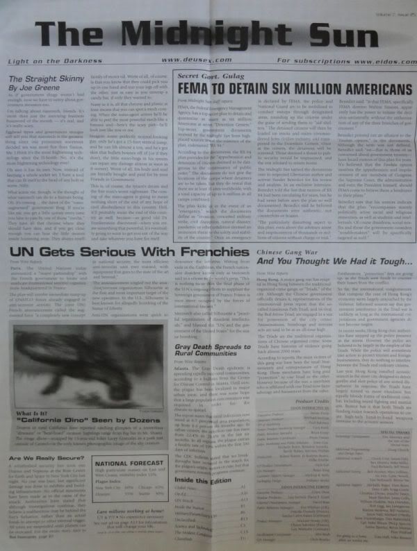
Paranoid yet?
Diablo 2 (June, 2000)
by Blizzard; PC version
Blizzard had always prided itself on the extensive lore accompanying its titles, especially when it came to Diablo. The manual for the first game had art and plenty of text for a solid setup to the series' world. When the sequel came out, it built on the success of the first game in every way by making things even bigger and better. That also included the manual.
As with the first game, Blizzard wasn't content with only a paragraph or two describing characters. They would again devote pages of art and text to setting up the backdrop for who these classes were, their history, and where they stood in the world.
Looking at the kind of extensive focus they had with their early work, it's no surprise that a lot of the passion driving their creative blitz in the MMO space sprouted from these standards.
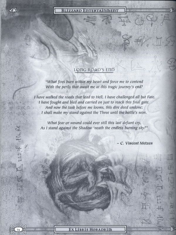
Blizzard's artists easily make their worlds look good either on paper or onscreen.
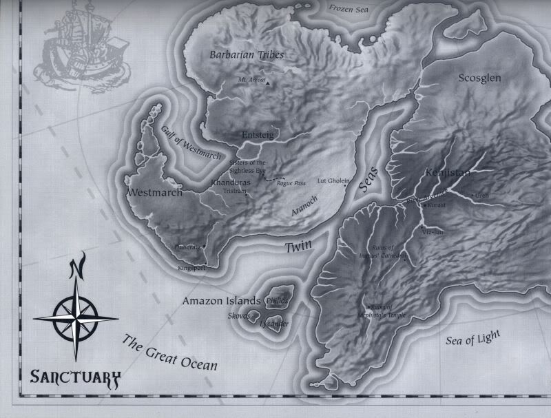
Sanctuary as seen in Diablo 2.
Baldur's Gate 2 (September, 2000)
by BioWare and Black Isle Studios for the PC
One of BioWare and Black Isle's best CRPG collaborations, the manual backing this monster stood at over 250+ pages of sheer information. Much of that was due to the spell listings that took up nearly half of the book, turning it into something of a “thrift” version of the Player's Handbook for 2nd edition AD&D.
Everything was outlined in incredible detail from experience tables to local points of interest. It even had its own index in case anyone got lost in all of that reading.
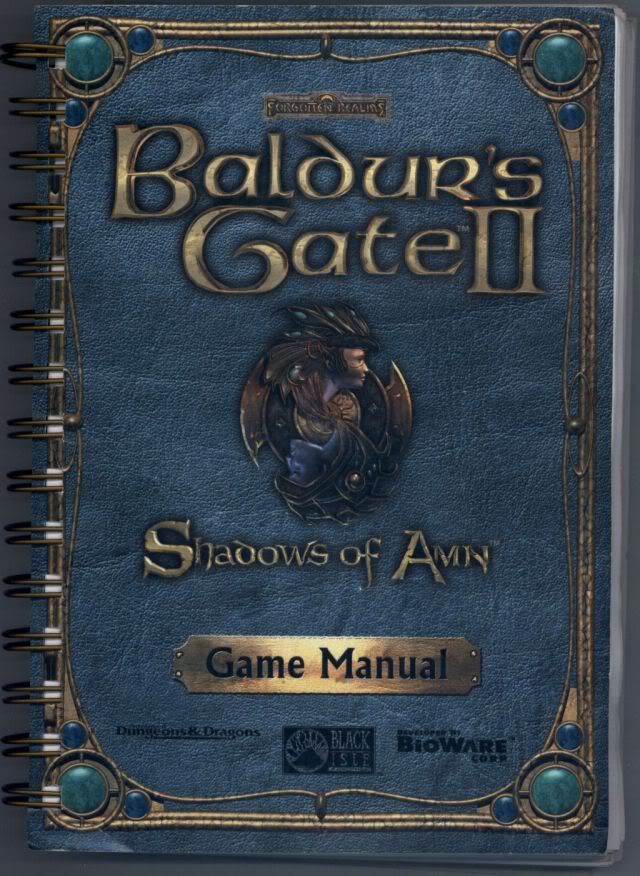
Reading through this manual gave players a +9000 to Character Planning.
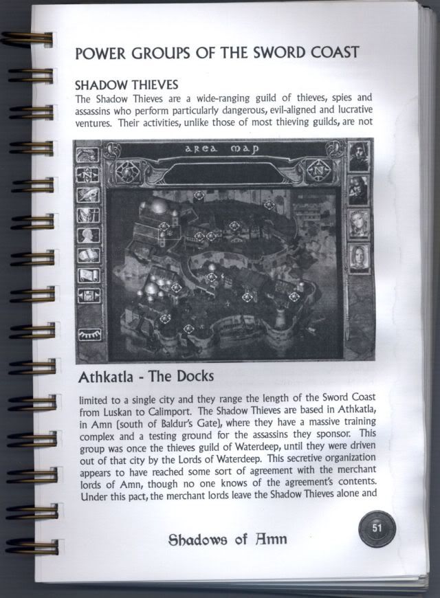
The overview of places to see and factions to meet only whet my appetite for exploration…and for stumbling over a few things off of the beaten path.
Arcanum (August, 2001)
by Troika Games for PCs
Arcanum's manual had art and text peppered with Victorian flavor to pull players into its steampunkish world. A large section was devoted to explaining the races and the world providing pages of lore porn for those that wanted as much backdrop as they could consume.
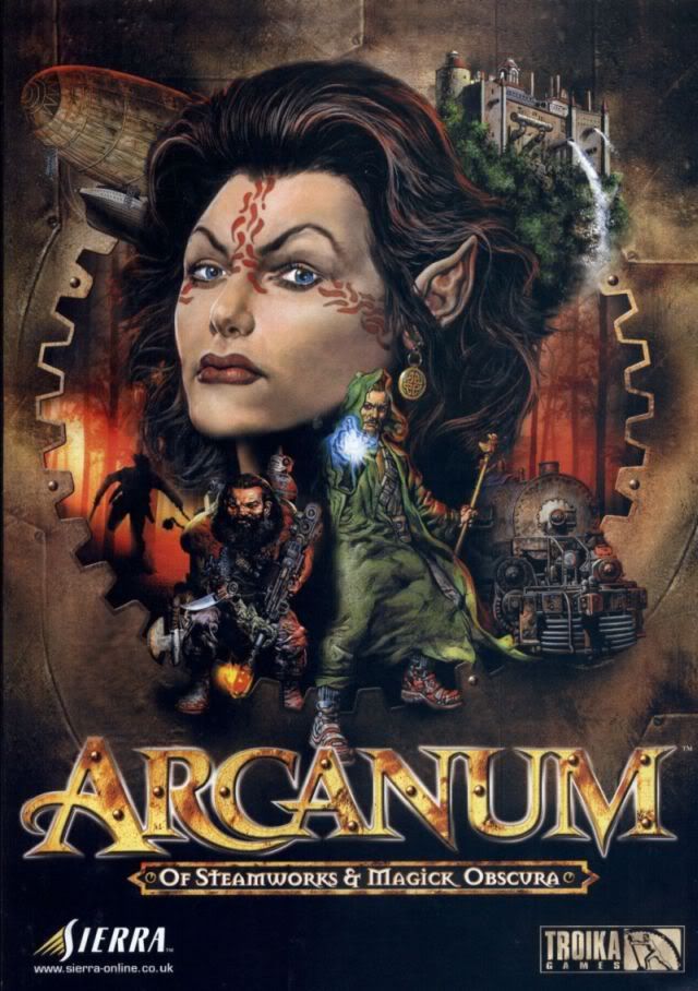
Arcanum's detailed world meant that there were many options in creating your character, often making the generation system a much visited place for many looking to build just the right set of skills to take them through the game. Or not.
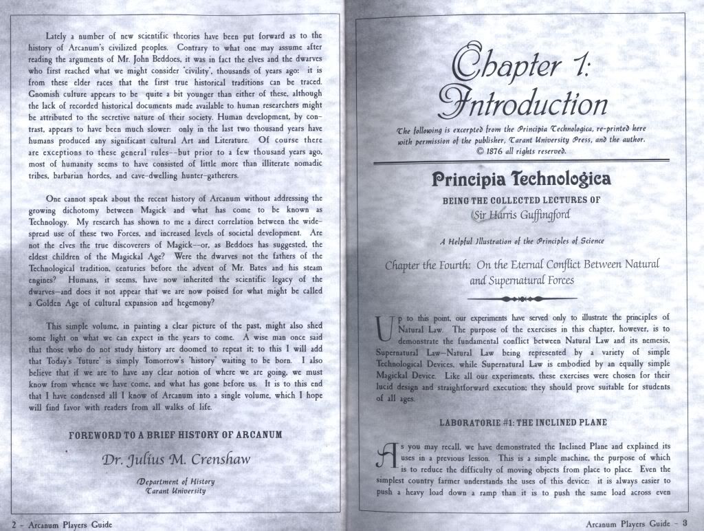
Arcanum's world was divided between technology and magic, though magic was thought to be on its way out in the face of industrialization. Knowing how best to negotiate between the two was part of the fun and challenge.
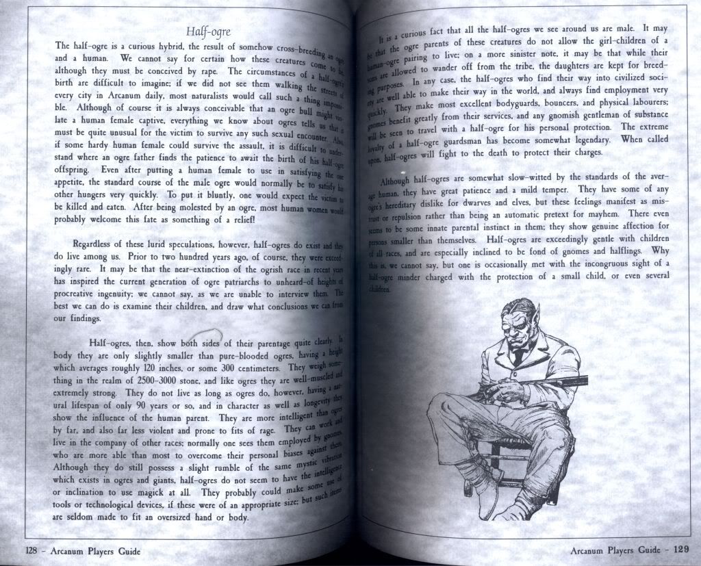
The designers threw out the stock definitions of ye olde fantasy races and wrote up extensive backdrops making each fit in with Arcanum's unique atmosphere. I half expected to see something along the lines of Mrs. Humphry Oration for Orcs hidden here.
Grand Theft Auto III (October, 2001)
by Rockstar; Playstation version
Rockstar's obsession with detail would extend to the manuals included with their games, and when GTA III hit the 3D ground running, the manual would also be worked over with plenty of pics and fake ads to ease players into Liberty City. The manuals for later titles still sport a bit of that design sass, now shared by the fold-out maps that would also become included with the games.

No bowling? For shame!
Return to Castle Wolfenstein (November, 2001)
by id Software, Grey Matter Interactive, Nerve Software; PC version
I mentioned at the beginning that you won't see me crying about how an FPS like Call of Duty ends up with a sheaf of paper pretending to be a manual, but Castle Wolfenstein is a bit different because of what it started out with.
The first game had a manual that actually had printed German translated for players. Wolfenstein 3D really didn't have one (nor did it really need it), but then Return for Castle Wolfenstein thundered back with style.
RTCW came out for PCs sporting a tin box and a Wolfenstein patch as part of a CE. As for the manual, it was designed to look like a small field book filled with rough paper faced with typed, and intentionally dirty, text. The manual was even peppered with small bits of history on the series.
Seeing a manual like this today for an FPS would probably elicit stares along with the large, tin case for the CE version. In contrast, 2009's Wolfenstein had a dismal package of nothing. It was a surprise given how much fanfare its predecessor had gotten.
The sweet days of “copies of backups” had also been long replaced with the usual Software License Agreement now printed conveniently at the end of manuals like this one.
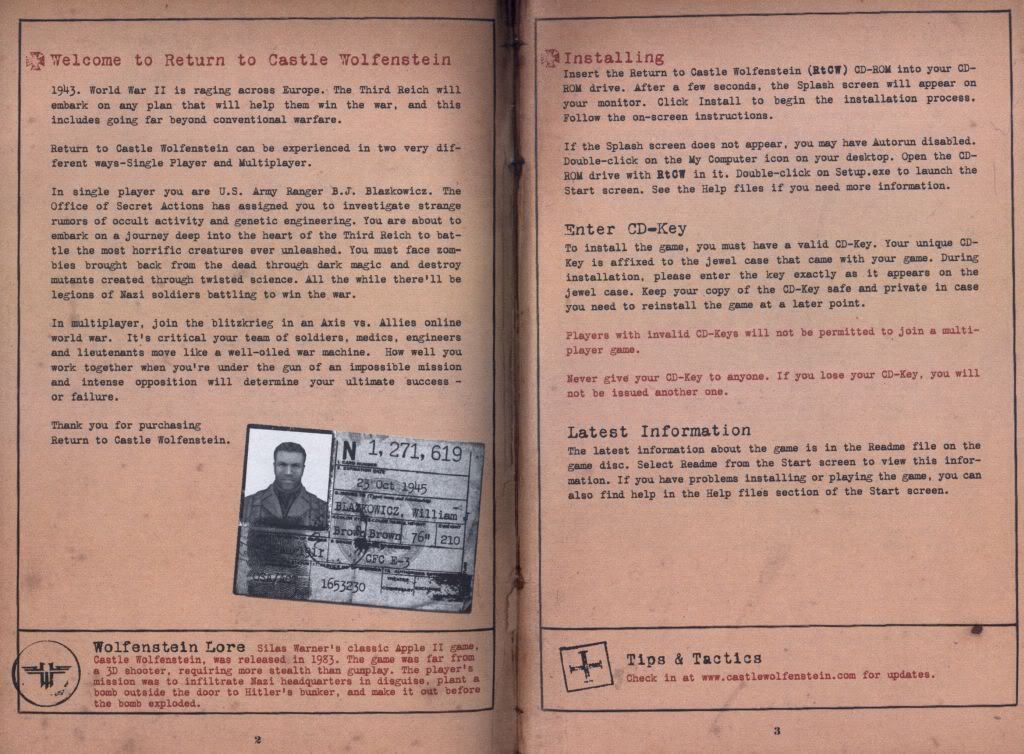
The manual for RTCW was a far cry from the hot garbage that came with Wolfenstein in 2009.
Indiana Jones and the Emperor's Tomb (2003)
by Lucasarts and The Collective; Xbox version
Lucasarts and the developers behind the game, The Collective, went all out in promoting this as Indy's newest adventure and didn't skimp on too many details.
Drew Struzan, whose work can be seen in the posters for films such both the Star Wars and the Indiana Jones series, was called in to do the cover for the game case.
And as for the manual, longtime Indy fan and Senior Designer/Illustrator, Gregory Harsh, then over at Beeline, succeeded in creating one of the best looking manuals that I've seen made for any title. In some ways, the manual outdid the actual game by arguably providing a lot more story than what was actually on the disc.
Gregory Harsh wasn't kidding around when he sat down to create the one manual to rule them all. You can read how he did it at this Indy fan site.
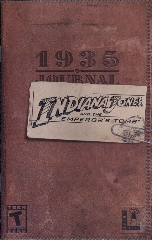
The cover is already full of win.
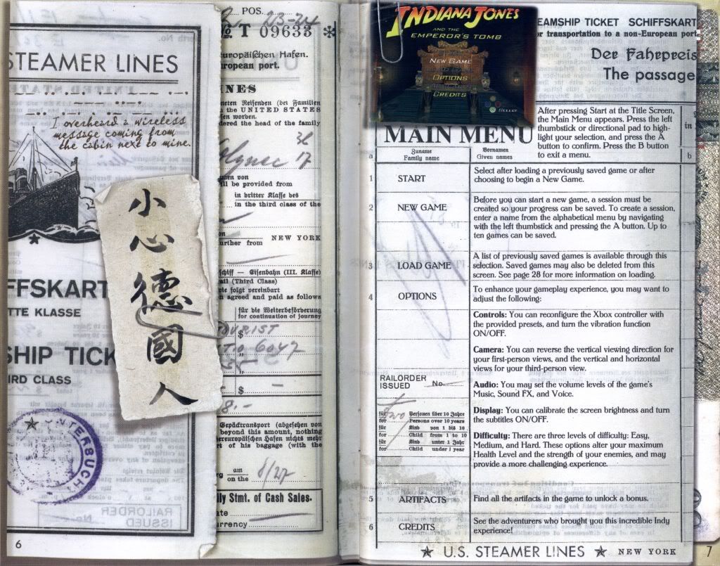
A lot of this stuff looks clipped in, but it's actually the result of fantastic illustration and graphics work. Paging through the manual was almost like walking through a museum of Indiana Jones' history around the globe up until 1935.
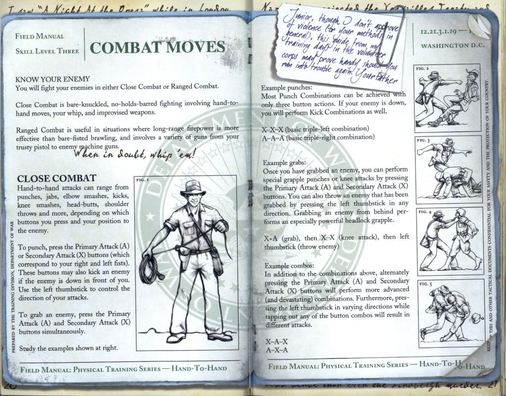
I knew Indy worked for the War Department, but I didn't know he did it in order to become a fight model.
Armed & Dangerous (2003)
by Planet Moon Studios; PC version
From Lucasarts and Planet Moon Studios came this quirky third-person action title that was filled with plenty of humor and bizarre weapons. The manual was also crammed with enough text for an RPG making it something of a unique standout when it came to action games. It also helped that the game itself wasn't half bad.
The story setting things up spanned three pages of text written by someone who must have been watching wall-to-wall episodes of Monty Python. Everything else was also given the humor treatment. If you wanted something to read while in the bathroom, this was it.
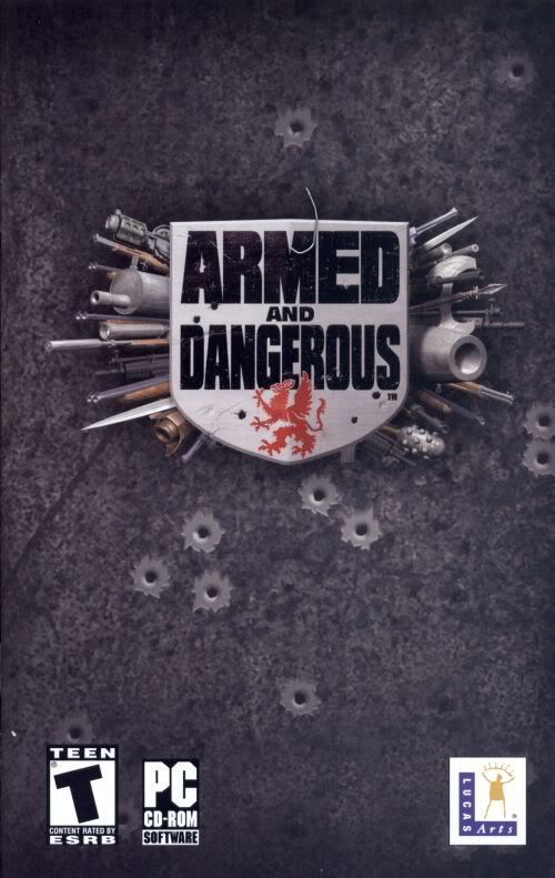
Your typical, bullet riddled cover….
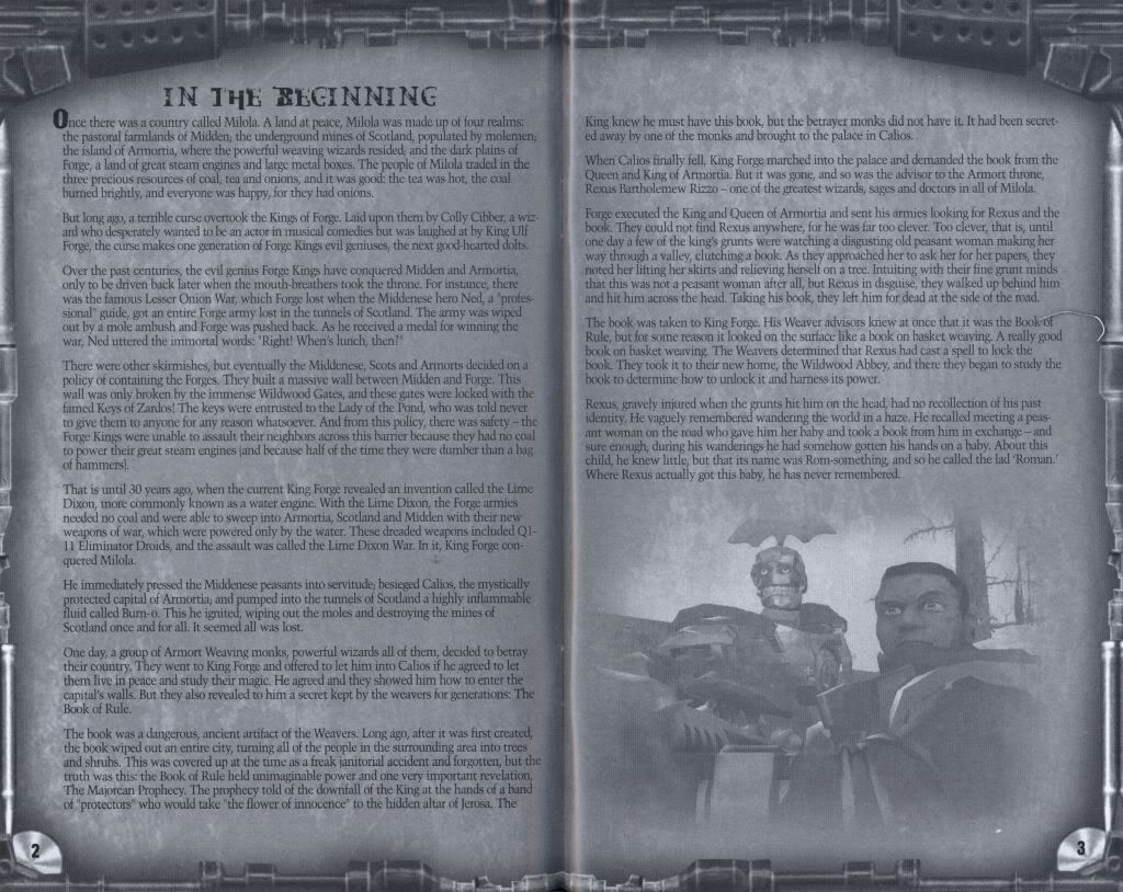
…and the WALL OF LEGEND. And there's a third page, too!
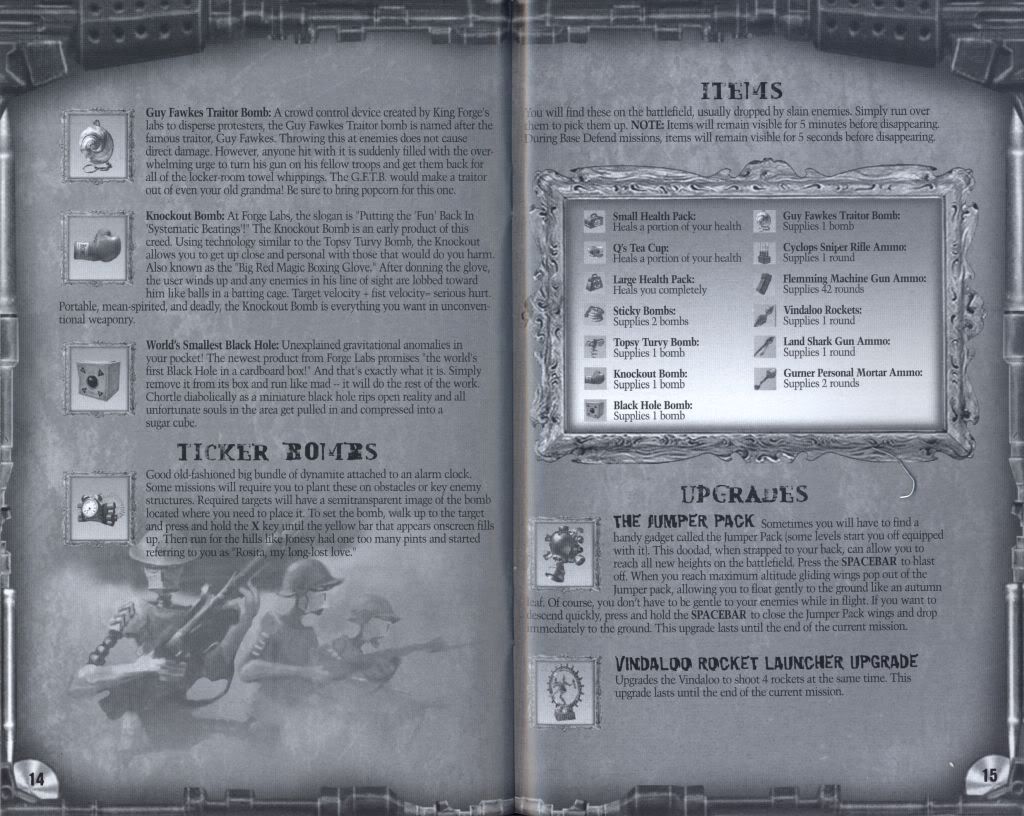
The text assault doesn't stop with just the story. Everything else in the manual got it. My favorite weapon? The World's Smallest Black Hole! So portable. So…destructive.
Shadow of the Colossus (2005)
by Team Ico for the Playstation 2
One of the most artistically creative titles on any system, Team Ico's work extended outside of the game to their unique take on the manual. Instead of reading it traditionally from left to right, it was designed to be paged through vertically. Minimalist in what it set out to say and illustrate, its understated approach was as subtle as the game for which it was written.
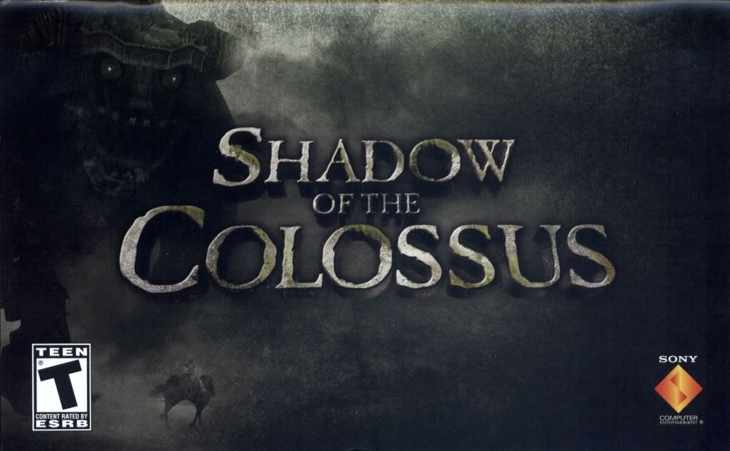
That Colossus may be making the angry face at you now, but you'll feel bad for killing it later.
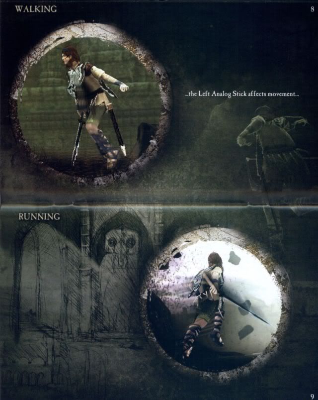
Colossus was a game of few words.
The Legend of Zelda: Twilight Princess (2006)
by Nintendo; Wii version
Nintendo could always be counted on to color the manuals for one of their flagship titles with as much care as they put into making the actual game. Throughout most of their history, they've illustrated their packages and manuals with plenty of characters and color.
Twilight Princess for the Wii was no exception and stands as yet another example of Nintendo's reputation for quality with a stunning art piece in the opening pages and illustrations throughout.
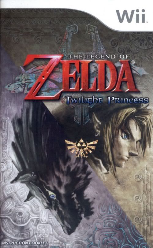
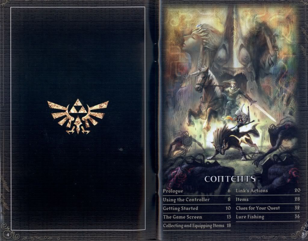
From their first games, to their handhelds, and onto the Wii, Nintendo has always made sure
that their games entertained both on and off the screen.
Metal Gear Solid 4 (2008)
by Kojima Productions for the Playstation 3
The long awaited conclusion to Solid Snake's story also had a manual as creative as the game continuing Kojima Productions' pursuit of careful detailing in every aspect of game design.
Merging comic-styled panels to illustrate controls and in-game situations, it reflected the series' continuing efforts to step a little more outside of the standards set by other titles.
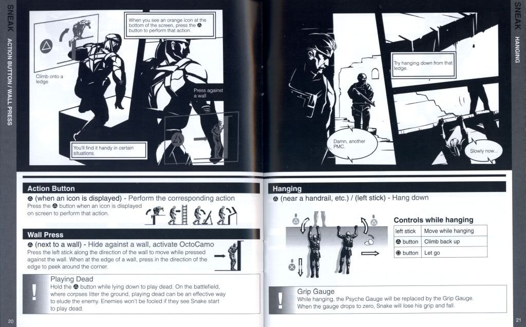
SNAAAAAAAKE!
Ys 7 (2010)
by Nihon Falcom for the PSP
Despite the smaller cases, PSP manuals could often be just as detailed as their larger cousins. Ys 7 was a great example of that with pages filled with colorful character art and plenty of background information on the game and its world.
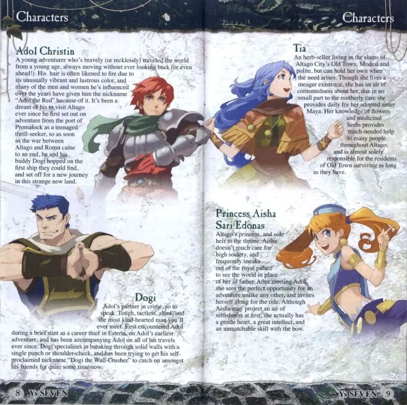
The rest of the manual was splashed with as much color and character as the opening pages. Nihon Falcom had as much care for their manuals as Nintendo did with theirs.
