This post has not been edited by the GamesBeat staff. Opinions by GamesBeat community writers do not necessarily reflect those of the staff.
I’ve done a close reading of the chest-high walls in The Bureau: XCOM Declassified and I’m happy to report that I think they could be a meditation on the tangible benefits of improved graphics. Furthermore, I reckon their implementation also questions if our lust to achieve increased verisimilitude between real and digital worlds is misguided.
In some of the Metal Gear games the player can take part in extracurricular virtual reality simulations. These largely take on the form of challenges, where the player is to focus entirely on their grasp of and prowess with game mechanics, unhindered by the troubles of setting, story, and the like. These VR excursions, in the guise of computerised training programmes, strip away all of these ‘distractions’ and stick the player-character in a glowing, geometric world made of cubes. In doing so, it could be said that the games are making a statement about where the real importance – the heart, if you were – of videogames truly lies. That while videogames are forced to inhabit the trappings of cinema, theatre and literature to attain wider cultural acceptance, the actual hallmark of the medium is, has and always will be the simple pleasures of the player moving things on a screen, and not some highfaluting screen moving the player. Pah.
Pleasure, gained from dicking about in a virtual place, is often seen as too basic a human response to be taken seriously, the mechanics used to elicit it too mechanical, so there’s always been a tendency for videogames to pile things on top of those cubes. Indeed, games like Donkey Kong Land always felt somewhat imprecise, precisely because of the incongruity between a platform’s geometric collision and the fancy graphics slapped in front of it. This was especially problematic when just making a jump, as many platform edges actually started a few pixels back from where their lavish foliage or rock textures would have you believe.
By the end of the SNES and Megadrive era games played on a two-dimensional plane were ridiculously detailed, rarely resembling the primitive menagerie of floating Euclidean elements that they’d previously been. Three dimensions soon put a stop to these artistic strides though (ha!), and videogames were once again forced to curtail their aesthetic aspirations. An early Playstation title like Jumping Flash! is a good example of these constraints playing out. The visuals are relatively rudimentary as to facilitate the game’s ambitious vision of a sprawling 3D platform game, where levels are vast both horizontally and vertically. A prettier game could have been made, but then the mechanical design would have had to be scaled down, a sacrifice the development team clearly didn’t feel comfortable making.
Visuals normally play second fiddle to gameplay when an either/or situation is forced at the birthing of new technologies, except when highlighting new visual capabilities is the raison d’être of a particular title. For examples, see FantaVision, Knack and That Dinosaur Demo.
Once technologies have become established and developers are comfortable in working with them, we see visual fidelity, vibrancy and detail usually increase steadily until that technology is superseded, be that by new console hardware or some meaningful software revision. Generally speaking, the best visual treatments are achieved by the later inhabitants of one of these technological cycles. This is, of course, purely in an objective, technology-focused sense and in no way equates better technology with higher levels of visual artistry, though clearly: the bigger the palette the more options available to the skilled painter. This trend can be seen explicitly throughout the Playstation 3 games of Naughty Dog, with all but one of their four games being lauded as having simply the best visuals the console could possibly ever produce.
It’s refreshing, then, that The Bureau: XCOM Declassified, a game released in the final months of a console generation, appears to have shrugged off this trend of exponential visual improvement, favouring instead a good old fashioned focus on vidyagaming gameplaying play. It’s a fitting end to this particular technology cycle; effectively closing the generation with a meditation on the tangible benefits of improved graphics, questioning if increased verisimilitude between real and digital worlds actually does give us anything of worth.
The Bureau is a tactical squad-based cover shooter, where the player, inhabiting Agent William Carter, leads a team of three through various battles against an alien invasion force in the early 1960s. Carter is controlled in a very familiar third-person action game way; able to run, take cover behind chest-high walls and jump down – but not up – small ledges. The tactical aspects of the game take shape when Carter s-l-o-w-s down time and issues commands to his two compatriots. Their abilities are a mixed bag of offensive, defensive and buff-type specials, and a well-managed team can quite easily take down huge enemies if abilities are combined effectively. Much of the game, then, is spent huddling Carter behind a wall and issuing commands while everything continues slowly around you. Mechanically it’s fine: Carter and his team gently unlock new abilities to add to the old tactical arsenal, and receiving a ‘COMBO KILL’ award for being tactically proficient is somewhat gratifying. Them walls though; they are the most important part of the whole thing.
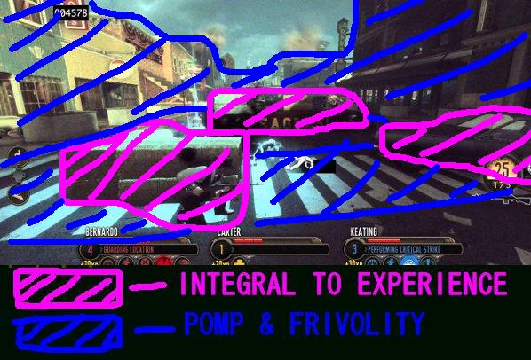
That picture, the one just over there, is a shot from the first proper mission in the game. It’s set in small town America and is full of postcard-level nostalgic sincerity. One of the characters even comments on how unfortunate it is that an alien invasion came to pass on Homecoming parade day. Aw shucks.
What is interesting about these beginning parts of the game is their utter banality. They follow their genre template slavishly, giving the player their requisite collection of hidey-walls – without which the game, mechanically speaking, wouldn’t work at all – and then attempting to build a somewhat believable setting around them. In our example we’ve got some hay bales, a car and a parade float all lined up, very unnaturally, at orderly angles to one another. Almost every cover-surface – let’s agree to just call them walls – in this and all the other areas of the game which necessitate them, are at either ninety or forty-five degree angles to one another. This means that the urban areas are usually filled with lots of barricades, cars, wooden crates and trucks, as the level designers try in vain to build mechanically viable, yet real world-congruent combat arenas. There’s one early skirmish set in an impossibly large geometric garden. It’s filled with a symmetrical layout of walls that play wonderfully in terms of playing the game, but look rather awkward when imagining the garden existing in real life. To further exemplify this dissonance, once this area is conquered you turn a corner and enter another garden, this one populated by terraces at varying elevations, all unnecessary stairs and vantage points. It’s as if the garden was expressly designed with the distant possibility of it some day playing host to a pitched battle between man and machine-inhabiting alien invader.
It’s nothing new though, and ever sine that Gears of War popularised (though by no means invented) the modern cover shooter, designers have been trying to organically fit their walls into levels the best they can. It’s all a bit like that Donkey Kong game I pointedly mentioned earlier, the one about beautifying the hard surfaces of gameplay with lashings of pretty textures. REMEMBER that bit: it’s important for later.
The Bureau does something fascinating with its walls the further into the game you go. In the Homecoming parade level – just after the above picture was taken actually – you’re first introduced to alien walls. They are essentially grey, metallic sheets that are ‘grown’ by your extraterrestrial adversaries and can sprout up on the battlefield at any given moment, without any need for further narrative or formal justification. The game initially implements them as a means of reusing areas for new combat scenarios; you get to one end of a battlefield and suddenly enemies saunter up behind you with a new set of cover, ultimately double dipping the area and elongating its usefulness. I, though, think the game is saying a lot more with these alien walls than might, at first, be obvious.
As the game progresses these new walls pop up – pun intended – more and more frequently. Later levels often begin in an urban or rural setting, only to quickly burrow underground into caverns lined, floored, roofed and chock full of alien walls to hide behind. Later still, missions take place entirely in alien space stations, completely circumventing the cloying quaintness of the earlier sepia-tinged levels and their awkward gameplay versus aesthetics juxtapositions.
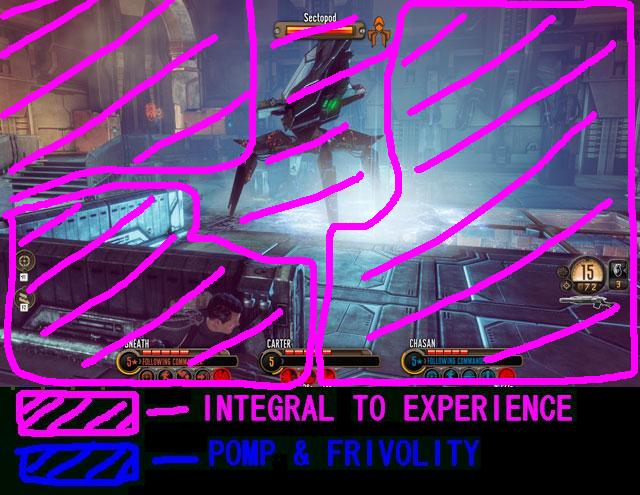
As you can see in this final picture, in moving the game’s events out of recognizable locales, the designers no longer need to worry about making the placement of cover feel natural. If anything, it’s in their interest to do the exact opposite, these being alien installations after all. It’s in these final levels where the game fully casts off the shackles of modern design conventions and effectively says “bugger it, what’s the point in titting about trying to make this look convincing; it NEVER WILL.” The funny gardens from the beginning are recreated with alien walls, and suddenly make perfect sense in this new, gameplay-only focused paradigm. The awkwardness of contextualizing its level design is gone by the end of the game: The Bureau is liberated by simply shunning Videogames’ need to look like something other than a simple, honest challenge.
The Bureau should be celebrated for its bravery in swimming against the current of accepted videogame design. It fearlessly deconstructs the prevailing notion that videogames must not only constantly strive to look better, but also appear more naturalistic as the medium and its technology advances. As The Bureau progresses, it subtly strips away the layers of peripheral aesthetics normally seen as a necessity in modern games, until at its end it is visually little more than a VR mission from Metal Gear Solid; an experience completely defined by its mechanics alone, uninterested in anything threatening to overcomplicate the purity of its experience.
The Bureau: XCOM Declassified, then, is an example of formalist purpose not oft seen from videogame designers, especially ones working in big budget, triple-a development. In stripping away its visual niceties, the game is bringing into stark focus its creators’ opinions on where the true creative importance of a videogame lies. It is a searing polemic against the spiralling costs of making these types of games: an argument that pretty-yet-functionless graphics are a waste of money, and one no doubt inspired by the game’s own years of difficult development.


