You’re offering a great product that everyone should love… so why don’t they?
Chances are, it’s not your product or service is built so much as your UX. Offering something in demand isn’t enough — you also have to offer an enjoyable experience with it. The product is merely a vessel through which you deliver a lasting experience.
This is the science of UX design, and like other fields, it also has some typical pitfalls to watch out for.
Here are 4 of the most common UX mistakes that might be killing your product, and how to fix them.
1. Clever for the sake of being clever
Being clever is a good thing — it’s the heart of innovation and how you separate yourself from your competition. Being too clever, though, is distracting, and can repel users just as quickly.
As described in Interaction Design Best Practices, draw the line on what’s necessary and helpful, and axe everything that’s not. Take this radial menu below:
On apps with a lot of creative leeway, users might like an alternative navigation system, but on apps geared for speed and efficiency, this clever addition would only slow users down.
Solution — Weigh the interface against the cost of entry — what your user has to go through to use your product. Above all, this relates to the learning curve. If they’re likely to be invested right away, they’ll take the time to learn your clever new idea. If not, get straight to the point that will hook them in.
2. Skimping on usability testing
Until your product’s in the hands of actual target users, design is just informed guesswork. Usability testing is an integral part of the process, not just for technical errors, but for gauging what your users like and don’t like.
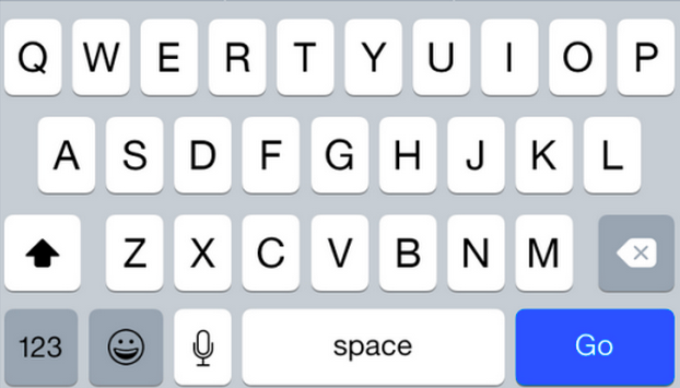
While Apple’s usability testing process is a mystery, we know that the feedback from the iOS7 release criticized the space bar. This was quickly corrected, but the mistake could have been sidestepped earlier with some better testing.
Solution — Test and test well. In particular, pay attention to task success rates (with some tips from the Norman Nielson Group) and navigation. The goal is that your users can go where they need to in as few clicks as possible — and click numbers are easy data to collect.
Being a collaborative design platform ourselves, we always run user tests. Since we’re still a startup, we’re big fans of guerrilla usability testing. In our experience, as long as you test with at least 5 users, you’ll be able to uncover roughly 80 percent of potential issues.
Focusing on visuals and not the experience
UX design is not graphic design, though given UX’s abstract nature, it’s tempting to think so. True, the two work together closely, but many other factors like interaction design, usability, and the content itself also determine the user’s final experience.
A solid visual design is crucial, but it alone will not make a good experience. As a fashion site, Alfred Sung Eyewear understands the importance of visuals… but lacks focus in more critical UX areas. It’s confusing navigation system and frantic clicking to see what’s a link means most people will leave before seeing a second page.
Solution — Prioritize. We recommend:
- Content
- Interaction design
- Visuals
Content-driven design is never a bad idea. At the end of the day, that’s what your users are interested in most — not flashy graphics.
Forcing user behavior
… Which is to say, you should adapt to your users, and not the other way around. One of the fastest ways to a bad UX is making people do things they don’t want to do. For example, do you remember when Google forced everyone using a Google product to join Google+?
… And do you remember the public backlash Google received that forced the company to recant?
Solution — Usability testing. Again, proper usability testing will reveal how your target users behave so you can adapt to them. Give your users what they want without telling them what to want.
Further reading
If you’d like to learn the finer points about successful UX design, check out our free e-book library, including these guidebooks:
- UX Design for Startups
- The UX Guide for Product Managers
- Interaction Design Best Practices
- Web UI Best Practices
We wrote them with our executive management and practicing UX designers to focus more on practicality rather than pure theory. The four books above are a great crash course in how to focus just the right amount of time on UX during the product development process.
Jerry Cao is a content strategist at UXPin, where he develops in-app and online content for the wireframing and prototyping platform. He cowrote “The Guide to Minimum Viable Products.”
VentureBeat's mission is to be a digital town square for technical decision-makers to gain knowledge about transformative enterprise technology and transact. Learn More


