

In going over the good, bad, and super-ugly design trends of 2012, we were struck by a few really big product changes that threw old interfaces to the wind to keep products looking current, fresh, and beautiful.
As the old year closes, we’d like to pay tribute to the biggest facelifts of 2012, ranked from least favorite to most awesome. These apps went under the knife, and the results were not subtle but spectacular. But interestingly enough, all these nips and tucks won’t be enough to keep users coming back to aging apps. In 2013, we’ll see which companies give more than just a pretty face.
10. MySpace’s new space
The truly hated entity known as MySpace has been in a revolving door of design overhauls for the past couple years. So of course we saw big new changes for 2012. And while we called the new look “killer” in our review, we’re still pretty sure the site will be more “Thriller” (read: walking dead) than killer in 2013.
The story: “Designed for artists and their fans, the new MySpace is not a redesign. It’s a new product with a new purpose and a design meant to evoke emotion. MySpace wants to draw people into relationships with creatives and the content they produce.”
9. The New Digg
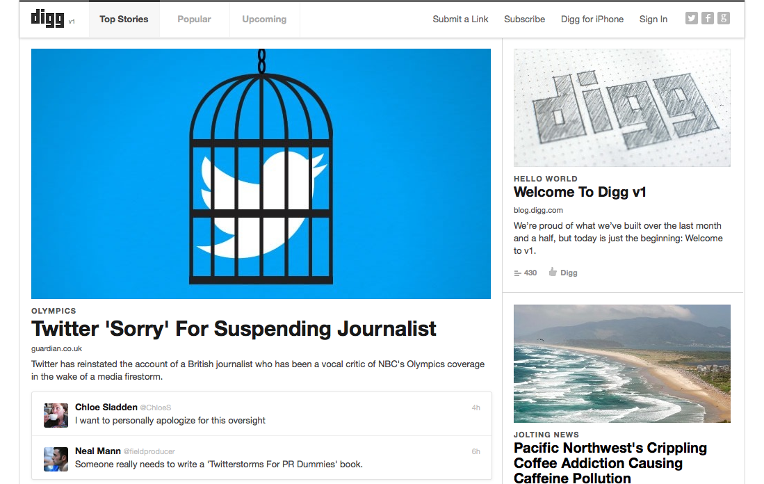
After many a stumble and many a fall (and many an executive departure), Digg struggled to revitalize its brand and its traffic in 2012. The new site scraps all of old Digg’s algorithms and interfaces, leaving little room for gaming the results and lots of room for questions.
The story: “By contrast, it took Digg’s new owners about six weeks to completely reimagine the site as well as formulate a plan to restore Digg to its former glory. It was completely rebuilt from scratch, which is why the team is calling this the new version 1. … The new Digg is already more inviting than the one I saw over the past two years.”
8. Foursquare’s redesign
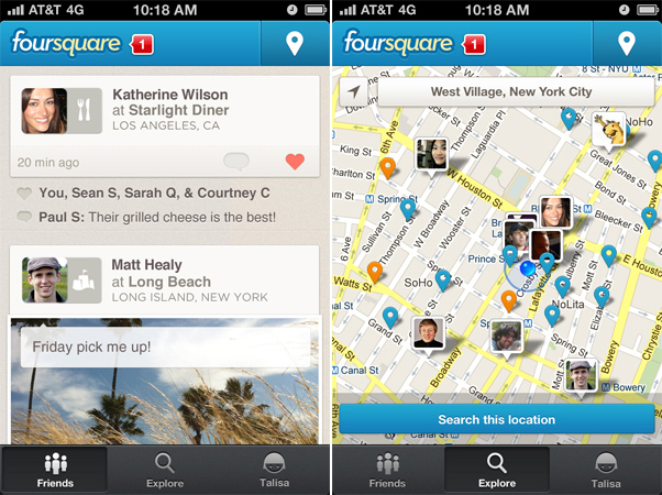
Facing increasing competition from place-based features on major social networks, Foursquare pulled out all the stops for a new look and feel in 2012 — one that simplified its interface and encouraged interactions between users.
The story: “Alex Rainert, Foursquare’s head of product, told VentureBeat that the company decided five to six months ago that it wanted to redesign its experience from the ground up. ‘We decided to pull the pieces apart and put them back together again,’ Rainert said. ‘We want to create the richest experience possible.'”
7. Rdio’s double-whammy
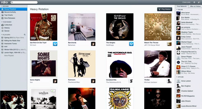
One redesign wasn’t good enough for ol’ Rdio. In 2012, the streaming music service had two back-to-back redesigns. The first, announced at SXSW in Austin, Texas, showed off new social features. The second introduced some minor tweaks that made Rdio look more than ever like iTunes.
The story: “The new design takes a healthy amount of influence from Apple’s ubiquitous iTunes player. The left-hand bar features playlists and navigation, and the center shows songs and albums. The right-hand bar, with social activity and connections, appears to borrow from streaming music competitor Spotify. Unlike iTunes, which is steeped in years of minor tweaks and updates, Rdio’s web-based player is probably much faster for many users.”
6. Vimeo blows it up

In 2012, web design in general got an overdose of the high-end magazine aesthetic. Big, full-bleed images and glossy, minimalist interfaces were all the rage. Vimeo took that approach with videos as well. The result was good enough to print.
The story: “Vimeo has essentially had the same design since 2007, and while users of popular sites often protest design changes, this one comes off as much more sophisticated and smooth. Vimeo CEO Dae Mellencamp told us, ‘There were tons of features and functions we wanted to add, so we’re using a new code base. We’ve put video front and center.'”
5. YouTube’s multiple personalities

Not to be outdone, YouTube made some changes in 2012, as well. Overall, it seemed the Google-owned video kingpin finally realized it had two distinct user groups: the content creators and the content watchers. So YouTube gave the creators their very own app while turning the main site’s focus toward the lean-back viewer’s interests.
The story: “I’ll admit that the only time I really scan through my feed/guide of activity on YouTube is when I first log in. Beyond that, I rarely think to scan through it for new stuff to watch. These changes may fix that.”
4. eBay goes Pinterest-y
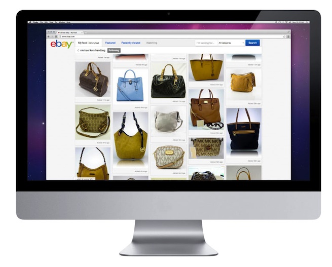
The Pinterest Grid was one of the trends we identified as leading the pack in 2012. One of the more appropriate and interesting implementations of that retail-friendly aesthetic was the new eBay homepage.
The story: “eBay’s previous design is similar to something you’d recognize from late ’90s websites, with products/auctions arranged into boring vertical lists. The only eye-catching elements were thumbnails for each auction listing. By contrast, the new web interface concentrates much more on product images. The homepage adopts the familiar pinboard-style design used on Pinterest, while the product and profile pages are much less cluttered.”
3. Facebook’s continued Timeline-itization

We did a deep dive on Facebook Timeline back in the fall of 2011 before it had officially launched worldwide. Even then, we knew this aesthetic would mark a huge turning point for the network’s engineer-driven utilitarian look and feel. In 2012, the Timeline look-and-feel marched on, taking over Pages, friendships, and even the company’s mobile apps.
The story: “Facebook design guru Sam Lessin, who captained the Timeline design, said in Tuesday’s show-and-tell session that Timeline ‘wasn’t ever meant to be just about people, just for humans. It’s a phase shift for the company overall and how we think about identity. … We always start with people. We’re Facebook, that’s kind of what we do … and then we do it for other types of organizations that also have a story and want to be able to tell it.'”
2. Twitter’s new profiles
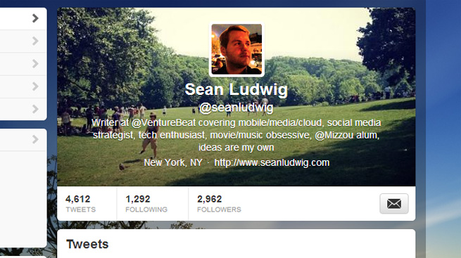
The “new-new Twitter” saw the once-simple site transform into a sleek social network with plenty of bells and whistles to keep easily distracted users entertained. In a nod to universal human vanity, Twitter also rolled out new profile pages, complete with big, glossy photos.
The story: “An all-new header photo — somewhat reminiscent of Facebook’s cover photo — now helps your Twitter profile stand out better. Rather than just a few pixels for a headshot or a logo, the new header photo can display much more: multiple images, a portrait in a setting, or whatever your creativity allows within the limits of about 520-by-260 pixels.”
1. LinkedIn’s seismic shift
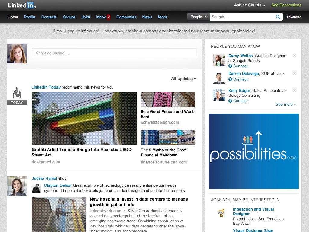
LinkedIn had been working with basically the same, stodgy interface for far too long. For the network’s older crowd of professional users, that aesthetic was probably not too much of a stumbling block. But in 2012, new designers and developers started revealing slick new mobile apps, pretty profiles, and a radically more beautiful and more interesting way to read news on the site.
The story: “The new stream is intended to be lightweight, easy to scan, and easy to interact with in a way that doesn’t burn up too much of your own personal CPU. Quick sharing, liking, and commenting now seems more natural from the new homepage. ‘We’re always looking for new ways to make the homepage experience better, more efficient and a place where you can come everyday to get what you need to be productive and successful,’ said LinkedIn exec Caroline Gaffney. ‘This is just the beginning of many more exciting, new features we plan to bring to the Homepage to offer more customization and functionality.'”
Grand Prize: Metro, Windows’ salvation

While users may or may not be confused by Microsoft’s new arrays of flat, colorful panels and ever-changing mosaics, Metro (whatever you want to call it — we’re sticking with Metro) is the toast of the design community. The aesthetic looks good on everything from mobile home screens to old-school desktop email. It’s even inspiring more than a few knockoff looks around the web and mobile apps — a slimy but sincere form of flattery that shows Microsoft still has what it takes to surprise and delight us.
We knew Windows 8 had won when someone ported the design over to the iPhone. But Metro shines brightest in — where else? — the new Windows 8 operating system.
The story: “Windows 8 is vital to the future of Microsoft and the PC market because it blends a touch-centric interface with the Windows we’ve known for years. It’s not for everyone, especially casual Windows 7 users that refuse to relearn Windows. But power users and those who embrace change well will find a lot to like here.”
Top image credit: NinaMalyna, Shutterstock