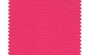
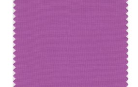
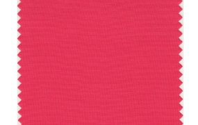
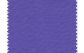
Many iPhone and iPad users are angry with the color palette on Apple’s new iOS7. Some have even compared it to the Easter bunny on weed. But a few of the color world’s most influential experts like the choices because they fit current design trends towards lightness and harmony.
A color trend is the end result of a long process. It usually starts with designers analyzing the emotional outlook of the culture, which includes political and economic movements. When U.S. mood was uneasy leading up to Y2K, colors reflected that. Today, at the tail end of a long war and recession, many of us want to feel happy and secure. That’s why we’ve gravitated towards colors that bring about those emotions, like the purples and orange-tinged reds in iOS 7.
There is no question iOS 7 is influenced by modern color trends. Apple designers choose colors based on their own exhaustive process, but as Pantone Executive Director Leatrice Eiseman told me, “It would be unusual if their designers didn’t have Pantone books” for reference. Eiseman does not want to take credit for iOS colors because Pantone has no official connection to Apple. But the company’s recent color output shows it has a big indirect influence.
For the Spring 2014 report on the season’s hottest colors, top designers sent Eiseman their illustrations featuring Pantone colors. She says the most fascinating trend was the overall color balance between the submissions. Usually the trends favor one side of the spectrum. “Among the findings were pastels like sky blue, soft ornamental greens, and neutrals, and then vibrant colors. That says everyone is looking for equilibrium,” she said. IOS7 colors look similar to those in the report and that is no surprise. Versions of recently celebrated Pantone colors like Radiant Orchid and Blue Iris also show up and cover the same emotional ground of “reassurance in a complex world, while adding a hint of mystery and excitement.”
AI Weekly
The must-read newsletter for AI and Big Data industry written by Khari Johnson, Kyle Wiggers, and Seth Colaner.
Included with VentureBeat Insider and VentureBeat VIP memberships.
Shifty shades of blue
Leslie Harrington, principal of LH Color, says the new ranges of blue in iOS 7 are a great choice because they’re based on a sophisticated design idea that portrays a harmony of color.
The new blues are divided between red-tinged blues near purple that convey mystery, warmth, and sophistication, and bright blues imbued with a cool, incandescent quality. The main icons for Safari, Mail, App Store, and Weather apps all show this daylight-to-midnight transition. Harrington says the cool/warm dichotomy shows Jony Ive and company had a distinctive design idea: To reflect in the software color the capacity of Apple products to contain multitudes of features that work together perfectly.
The iPhone, of course, is both an entertainment device and business tool. “A reason you move away from [tech] blue from an emotional standpoint is purple has a double edge-sword. It’s happy and sad. Calm and exciting,” Harrington told me. This design is also why the official iPhone wallpapers look best: Their purples and blues match tints in the icons and together make something busy and complex look harmonious.
The value of color harmony has been proven through data. Stats firm Kissmetrics found that successful beauty and anti-aging products with purple tones “soothe and calm” users. And Eiseman says proper colors always drive sales. “It’s not fluff. People don’t just divine a color when you’re spending millions of dollars in development. You need to be careful about the color you choose.” Of course, color appreciation can be subjective. One person can associate purple to youth and happiness while another will see dogmatic monarchy and the L.A. Lakers.
Flat design enhances contrasts
Yes, IOS 7 design is finally flat, replacing the real-world object mimicry of skeuomorphic design. Flatness, it turns out, supports color contrasts and makes UIs easier to use.
Single color contrasts with flat white spaces are efficient choices for UIs. They focus the eye on major tasks and help avoid clutter. On the calendar app, for example, bright red circles identify dates clearly while red typefaces emphasize navigation buttons. In a skeuomorphic calendar, gray shades would compete with reds for attention and take up too much space. Instead, the flat buttons pop off the screen. The red-white contrast also has the emotional effect of playfulness as opposed to alarmist, because of the red’s place in the orange/magenta spectrum.
Aaris Sherin, Associate Professor of graphic design at St. John’s University, says contrast-centered design is needed to overcome the limitations of mobile devices.
“Colors need to work for viewing on the reduced size of a person’s phone. There has to be enough contrast between hues for visual differentiation on a small scale and there must be adequate contrast with any background.” The high contrast ratio between the thin fonts and white backgrounds is one feature that clears out available space and makes the font easier to read.
“Color linking” thinking that ties in to the icon color is another space-saving feature, according to Harrington. The color helps a user know his location and allows him to concentrate on content. “[On iOS 7], Notes is yellow, iTunes is red, Clock is black, Mail is blue…they are working to use color as an identifier and quick reference. You see [this type of] red text and you know you’re in iTunes.” Even though users become used to UI navigations after a time, color linking makes the experience feel gracefully swift.
The most talked-about color contrasting comes in the form of “glass” transparencies. When the grey-hued glass sits on top of app and background layers, colors are transformed from sharp to diffuse (adding gray always makes color lose saturation). Harrington says this creates dynamic backgrounds that make the monochromatic icons and fonts on the glass stand out. It’s also effective from an emotional point of view. Like the purple hues, transparencies grant the UI with a dual complementary feel of simplicity and complexity.
Comfort amid complexity
According to Anat Lechner, Professor of Management and Organizations at NYU, screens with saturated pastel colors make people feel comforted. She thinks modern people have a high comfort level with recurring change. The fixed overlays that change in color depending on the background are a prime example of this in iOS 7:
“[The layer design] is not confusing. We all now expect bright colors. We are increasingly addicted to more stimulation, gradation, nuances. Everything has temporariness to it, short shelf life. We’re not looking for anything fixed [or] stable. We came to terms with instability… [It feels like] sometimes it’s there, sometimes not. It’s not committed. It’s reflective of the times.”
Aaris Sherin thinks the use of transparent gray glass for the sliders subdues background colors in a way that’s similarly appealing: “Most users have at least a dozen third party apps on their phone… That’s a LOT of visual information. By paring down the [hues], Apple’s designers give users a rest from information overload.”
Harrington saw this new comfort with complexity at a recent meeting. Colorists brought high-resolution photos of up-close structures (including the Brooklyn Bridge) with color they’d found appealing. The images had “a layeredness of color” that showed people had learned to manage complexity through ultra-focus. “It’s a microscopic perspective we take on things. When you look at the iOS 7 home screen, it has the same up-close, zoomed-in perspective [and] complex color. That is a trend. A lot of blurring between colors.”
The emotional resonance of white space also reflects the search for comfort. William Lidwell, author of Universal Principles of Design, thinks Apple chose white because it’s a mood enhancer. “The color space between bright, pure colors and white is the continuum of playfulness. As a bright, pure blue gets lighter approaching white, it increasingly takes on the properties of white. In this way, lighter colors generally set a playful emotional tone [in iOS 7].” Harrington believes Apple’s monopoly on white hardware products might have more to do with it. Since many see web-based white space and think Google, this is a good opportunity for Apple to expand its turf.
Major influences
Sherin says colors in other creative mediums have clearly influenced Ive and company, none more so than Japanese graphic design.
“Color [in Japan] is used to enhance content without the specific visual associations designers are subject to in the West. For instance, pastel colors may not be considered serious enough for a business logo or an article on banking in the U.S…. Colors work together but don’t take themselves too seriously.” Bright color enhances serious task-based content in iOS 7 similarly, like when the bright red action box pops up in the new swipe control animation in the email app.
Lechner sees the Japanese connection as well. “iOS [is] very sweet and Japanese. If you go to Tokyo to the quarter where they have all the gadgets, Akihabara, [iOS 7 has] almost the exact color gain in that region,” she told me.
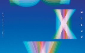
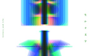
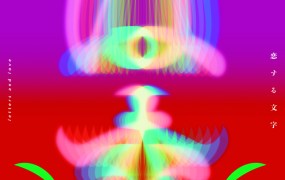
Japanese graphic design that seems like a huge inspiration is the work of Mitsuo Katsui. A well-regarded graphic designer in the late 20th century, Katsui is known for his vibrant use of colors in motion, often placed within wide, single-color blank spaces. Katsui’s abstract forms also often use transparencies to highlight contrast effects. A glance at his posters reveals a direct connection to iOS. Apple’s ID team has been known to look to Japan for inspiration, even hiring top Japanese designers like Shin Nishibori onto the team.
Video game influences are also apparent. Sherin believes the saturation of colors convey the feel of youth and games. Anat Lechner, though, thinks the gaming feel is more than an aesthetic reference. She says it’s a clue to future products: “The look and feel of it is so much like a game console. I began to think about how much movement across verticals into game-ification [Apple has made]. I think it is referencing a way of the future [where] the gamification of our lives is increasingly the reality in which we live. They’re already there in terms of the color language they’ve used.” It’s possible the colors foretell the UI of Apple’s long-awaited TV project. After all, Apple’s main home-entertainment competitor will be Microsoft’s Xbox.
All of these plays for emotional resonance through color will succeed. After all, Apple minimized risk by tying well-researched trends to the most successful consumer products ever. As long as its designers keep their eyes out for the next trend and implement them elegantly as always, they’ll likely get the bulk of the credit and make the most difference. That’s what happens when creative artists control the reins of the most powerful company in the world.
Jose Fermoso is a freelance reporter. He is a researcher and reporter for the upcoming book Jonathan Ive: The Genius Behind Apple’s Greatest Products. Twitter @fermoso.
VentureBeat's mission is to be a digital town square for technical decision-makers to gain knowledge about transformative enterprise technology and transact. Learn More
