Gabe Sumner works as a product manager for Sitefinity CMS by Telerik, a maker of products used in the web development industry.
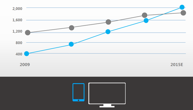
Mobile devices are already outselling desktop computers, and we’re seeing a steady rise in Internet traffic originating from these devices.
In fact, by 2015, we expect the majority of Internet traffic will come from mobile devices. It’s therefore understandable that organizations are feeling a lot of pressure to address mobile. Unfortunately, this extreme focus on a single factor (mobile) overlooks the broader trend looming on the horizon.
The reality we’re confronting (and that mobile is a part of) is that Internet access is becoming pervasive, and increasingly we’ll gain this access through a myriad of devices with varying capabilities. The challenge for organizations is how to offer compelling experiences on all of these devices.

It’s not a binary problem
Because “mobile” is the new kid on the block, it’s completely natural to view it as an alternative to what we were doing before. As a result, we’ve created phrases like “the mobile web” to describe the alternative view of the Internet presented to mobile devices. But what’s the contrast to the “mobile web” — the “normal” web?
Want more on the mobile web and responsive design? Look no further than MobileBeat 2013, VentureBeat’s flagship mobile conference for developers, entrepreneurs, and everyone with skin in the global mobile game.
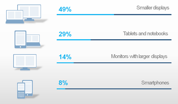
Although it’s easy to see how we arrived at this dual web perspective, it does not mirror reality at all. There is only one Internet. However, there is a wide spectrum of devices used to access it. For example, look at device usage statistics for the web. The data will reveal not two devices, but rather a parade of devices. Like circus performers, you’d find an endless stream of devices of all shapes, operating systems, and screen sizes ranging from widescreen displays, laptops and netbooks, to tablets and smartphones. Plus, there is much diversity within each of these device classes that adds to the landscape complexity.
With this foundation, you can recognize how creating two websites, forking, is insufficient to address marketplace diversity. Organizations focusing on two narrow form factors in “desktops vs. mobile,” by definition neglect many others. Forking then quickly becomes unsustainable when trying to account for every new device class (ie: widescreen, netbooks, tablets, etc.). A separate website for each one? Most organizations struggle to maintain one website, let alone multiple variations.
Clearly we need a more scalable strategy to confront today’s reality.

One web to rule them all
Responsive web design (RWD) is championed as a best practice for addressing the myriad of devices on the market now, and those yet to be imagined. It’s based on HTML standards (CSS3), is naturally SEO-friendly, and is supported by modern browsers. It enables an organization to create a single website that adapts for any device because the technique specifies different styles for different devices.
For example, a website might have three columns that easily display on a desktop computer. However, on a small smartphone these columns exceed the screen width. RWD enables an alternative set of styling to be specified that transforms three columns into three rows for narrow screens.
This is an oversimplification of RWD, but it conveys the general idea. Using this technique, organizations can focus on creating and maintaining a single experience that becomes optimized for an unlimited number of devices. Put bluntly, RWD is the only mobile strategy that scales to address the full scope of devices we’re facing today.
But what about content creation? How does that fit into the mix? For the past several years, most web content is published by non-developers. Content management systems and various other tools have enabled people who know nothing about HTML or coding to, nonetheless, create web content. RWD severely complicates this workflow.
The website needs to transform based on the device. Content authors need to understand that what you see isn’t always what you get. And then there are the realities behind creating layout transformations, handling images, etc. Although RWD remains the only viable mobile content strategy, it is far from simple to implement.
Don’t resurrect the webmaster
With the RWD strategy in place, organizations must next look to the logistics of implementation so they can remain agile and receptive to business opportunities. While RWD is complex to set up, it need not be a daily hindrance to content creation. The right web content management solution will have tools developers can leverage to create powerfully simple content authoring experiences.
Once the site is developed, there should be no barriers preventing users from creating or editing content. Templates, widgets, and established responsive rule sets can make it ridiculously simple to unleash the marketing prowess of your non-technical staff. Gone are the days of “webmaster as gatekeeper.” The right platform will make authoring and managing content a seamless experience for everyone while still protecting mobile experiences employing RWD.
Valid alternatives
While RWD is a clear best practice for the reasons described, I’ll readily admit there are alternatives to it. RWD results in a device-agnostic experience, one experience for all devices. However, there are legitimate reasons to pursue a “device specific experience,” which is a unique experience for a particular device. Some devices have distinctive capabilities (geolocation), or limitations (tiny screens, bad Internet connections) that make a dedicated experience worth pursuing. In other cases, the device itself can tell you something about user context.
This combination of insights and hardware capabilities can suggest the need for specialized experiences, chiefly available through native mobile apps and/or dedicated mobile websites. These are just a few examples, and there are many others that demonstrate how RWD isn’t the singular best solution for all circumstances. But whether RWD or not, effective content management tools are critically important—especially those embracing RWD.
RWD is driving mobile development tools because it is the best way to accommodate the endless stream of mobile devices on the market today and those devices coming down the road. Consequently, tools must evolve to both embrace RWD and help non-developers manage and maintain RWD websites so they remain the valuable business assets they should be.
Technology is most powerful when it transforms business paradigms, and RWD is doing just that.
Gabe Sumner works as a product manager for Sitefinity CMS by Telerik, a maker of products used in the web development industry. Gabe provides strategic planning and guidance to ensure Sitefinity is meeting the current and future needs of its customers. From his diverse background as a programmer, marketer and manager, Gabe is able to provide a highly holistic view of website management. He brings this same insight to his presentation work for webinars, conferences, and analysts to help elevate the conversation around where the industry is and should be headed.
VentureBeat's mission is to be a digital town square for technical decision-makers to gain knowledge about transformative enterprise technology and transact. Learn More

