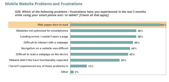
A recent Keynote study of the preferences and expectations of smartphone and tablet users shows that a majority of website visitors want a fast download from the desktop (sub-3 seconds) and tablets (sub-3 seconds) and that their expectations for smartphones isn’t far behind (4 seconds or less). (See above table.) What’s more, the study shows that smartphone and tablet users are actively going to mobile websites in large numbers for shopping. Survey respondents reported that slow loading web pages was the number one source of frustration.
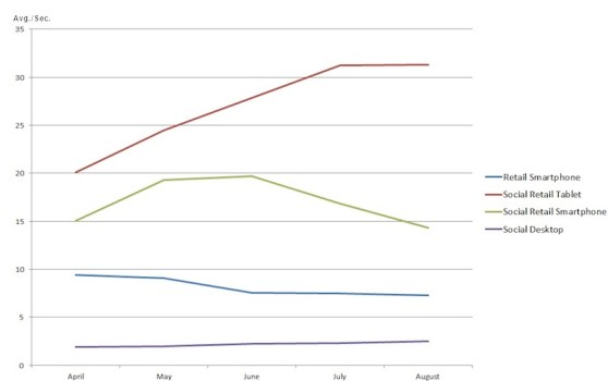
Unfortunately, when it comes to Social Retail startups on the smartphone or tablet, there are probably a lot of frustrated visitors. Social Retail sites delivered an average load time of 2.16 seconds, which is in line with user expectations. However, from an iPhone they’d need to wait an average of 12.77 seconds to get to the home page and worse yet, it would take 26.47 seconds from an iPad over a 3G connection.
When we compare the Social Retail experience on a smartphone to the average (7.28 seconds) of more established brands for the same week in our retail smartphone index, we see that the new kids on the block are nearly twice as slow. The good news for social shopper is that the trend over the past few months seems to be showing improvement. But what’s troublesome is that Social Retail websites are now loading 10 times slower than what users want.
So where are Social Retailers missing the boat when it comes to delivering a good experience across all three screens? Many of these sites are making the same common mistakes that would lead to a frustrated user. Let’s take a look at some examples:
Gilt
Meeting expectations from the desktop, they aren’t faring as well on the iPhone. The size of their mobile site is rather large (554 KB) and using 9 domains, delivering 41 images and 55 elements can be contributing to slow speeds. Also, following mobile best practices of combining Cascading Style Sheets and JavaScript, and keeping JavaScript at the bottom could help them improve their 15.56 response time. But on the iPad, the speeds are much slower. Here they’re using 19 domains and not following many of the same best practices. Compounding this they’re delivering 2,232 KB of content over the mobile network.
Living Social
Living Social is doing better than the average with respect to speed (download rate) for the iPhone user delivering a clean, simple website designed in accordance to many mobile best practices. However with 300 KB of content it is on the heavy side. So why such is the site so slow for the iPad user? Firstly, they’re delivering nearly 2 MB of content with over 150 elements. They aren’t combining Cascading Style Sheets or JavaScript, have oversized images and aren’t following other W3C best practices. Worse yet, they make the iPad user go through a 3 step registration process that isn’t required of smartphone users. Websites are important for all retailers because they’re far more discoverable than apps which require a download from an app store. Three additional steps needed to get to a home page increases the likelihood of user abandonment.
Living Social was not the only Social Retailer requiring upfront registration, and collecting information is very important in Social. But if fake information will get you to the destination, companies should weigh what’s gained in collecting junk data against the potential loss of real prospects.
RueLaLa
RueLaLa seems to be the one Social Retail site with good response times from the desktop and iPhone, and better than average speeds for tablet users. On the smartphone they’ve kept their site down to 80 KB and limited to 12 objects, in line with the size of top performing mobile sites. The tablet is where they stand to improve. Reducing the site from the current 600KB size and following design best practices can speed up their 14.23 second download.
RueLaLa also presents smartphone and tablet users a splash screen to promote their downloadable app. A splash screen is like an interstitial ad, but users must click through to remove it from the page. The splash screen adds weight to the page but more importantly, it can be a distraction for a potential visitor coming to a site for the first time. For Social Retailers trying to be discovered, carefully consider if a splash screen is the right strategy. You may increase app downloads, but if it’s at the sake of having your products discovered, and purchased, the cost may be too great. Also, remember that smartphone and tablet users may actually prefer the web over apps. Trying to push them down a different path could end up in a less than satisfying experience.
For the full data from this month’s Startup Shootout, see below. As always, we are including VentureBeat’s load times too.
VentureBeat's mission is to be a digital town square for technical decision-makers to gain knowledge about transformative enterprise technology and transact. Learn More


