Steve Blank is a retired serial entrepreneur and has been a founder or participant in eight Silicon Valley startups since 1978. This article originally appeared on his blog.
Every startup I see invariably puts up a competitive analysis slide that plots performance on a X/Y graph with their company in the top right.
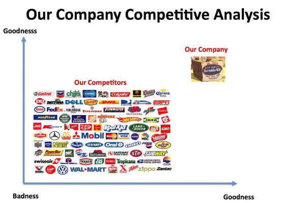
Above: Traditional competitive analysis slide
The slide is a holdover from when existing companies launched products into crowded markets. Most of the time this graph is inappropriate for startups or existing companies creating new markets.
The X/Y axis competitive analysis slide is a used by existing companies who plan to enter into an existing market. In this case the basis of competition on the X/Y axes are metrics defined by the users in the existing market.
This slide typically shows some price/performance advantage. And in the days of battles for existing markets that may have sufficed.
But today most startups are trying to ressegment existing markets or create new markets. How do you diagram that? What if the basis of competition in market creation is really the intersection of multiple existing markets? Or what if the markets don’t exist and you are creating one?
We need a different way to represent the competitive landscape when you are creating a business that never existed or taking share away from incumbents by resegmenting an existing market.
Here’s how.
The Petal Diagram
I’ve always thought of my startups as the center of the universe. So I would begin by putting my company in the center of the slide. In this example the startup is creating a new category – a lifelong learning network for entrepreneurs. To indicate where their customers for this new market would come from, they drew the 5 adjacent market segments: corporate, higher education, startup ecosystem, institutions, and adult learning skills that they believed their future customers were in today. So to illustrate this they drew these adjacent markets as a cloud surrounding their company. (Unlike the traditional X/Y graph you can draw as many adjacent market segments as you’d like.)
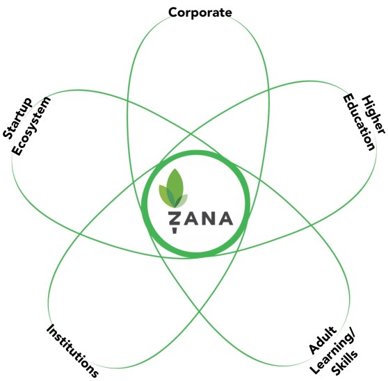
Above: Your startup at the center
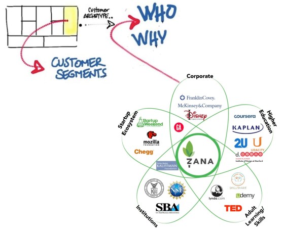
Then they filled in the market spaces with the names of the companies that are representative players in each of the adjacent markets.
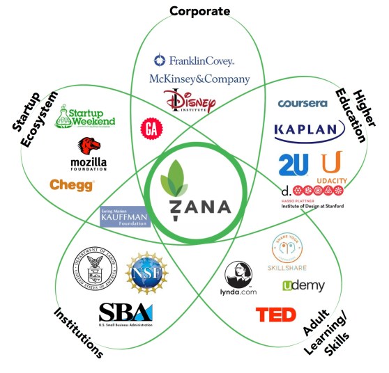
Above: Fill in the segments
Then they annotated the private companies with the amount of private capital they had raised. This lets potential investors understand that other investors were interested in the space and thought it was important enough to invest. (And plays on the “no VC wants to miss a hot space” mindset.)
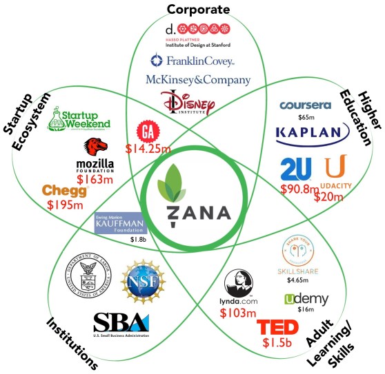
Above: Show capital raised
Finally, you could show the current and projected market sizes of the adjacent markets, which allows the startups to have a “how big can our new market be?” conversation with investors. (If you wanted to get fancy, you could scale the size of the “petals” relative to market size.)
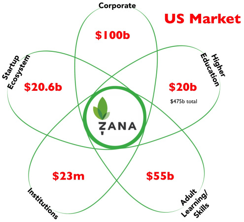
Above: Show sizes of adjacent markets
The Petal Diagram drives your business model canvas
What the chart is saying is, “we think our customers will come from these markets.” That’s handy if you’re using a Lean Startup methodology because the Petal Chart helps you identify your first potential customer segments on the business model canvas.
Above: Use the petal diagram to show where your customers will come from
You use this chart to articulate your first hypotheses of which customers segments you’re targeting. If your hypotheses about the potential customers turn out to be incorrect, and they aren’t interested in your product, then you go back to this competitive diagram and revise it.
Update: I’ve heard from a few entrepreneurs who used the diagram and had investors tell them, “it looks like you’re being surrounded, how can you compete in that market?”
Those investors have a bright future in banking rather than venture capital.
Seriously, I would run away fast from a potential investor who doesn’t or can’t understand that visualizing the data doesn’t increase or decrease the likelihood of success. It only provides a better way to visualize potential customer segments.