Electric hues
Color is a basic yet powerful compositional tool for manipulating eye direction and mood. One of Digital Futurism’s most noticeable characteristics is pushing colors into an extreme contrast, using saturated glowing hues against a dark backdrop. The end result can be striking, multiplying the effects a color has on the audience.
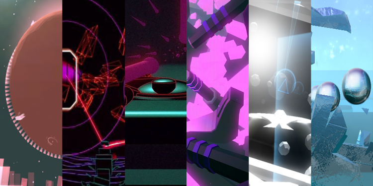
Out of the group of game designers that I questioned, Richard Flanagan’s Fract leans toward a wider variety of strong color use. Flanagan kindly shares the thought process behind his color decisions, “Each main area of the game is designed around one of the three [musical] synthesizers: bass, lead, and pad synths. Not only is each of these areas distinguished by mechanics and sound, but by aesthetic. At a high level this is colour systems, landscape topology, and architecture. All of which were chosen based on the intended emotional state of each area and its respective synesthetic feel.”
Flanagan gives an example: “The lead mountains are peppered with bold pink energy amid sharp and aggressive geometry. This mimics the role of a lead synth, to stand out and be prominent in the mix of the musical styles that helped inspire the game. This visual grammar is further developed in the cyan bass caves and fluro-green pad dams, with even more gradation going on with each respective area and puzzle.”
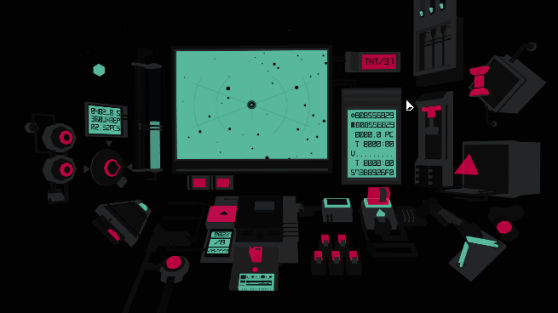
Righi Riva also uses saturated colors in MirrorMoon EP, but his intent behind these choices is slightly different from Flanagan’s. Fract’s primary concern with color appears to be in creating mood and metaphors based around synth, where MirrorMoon EP’s palette seems much more concerned with functionality.
In Righi Riva’s game, players are in a world where nothing is conventionally explained and everything is a visual puzzle, including starting a game. I’m not suggesting that the colors in MirrorMoon EP don’t have metaphorical or analogous meanings, but their primary goal here is to guide the player through the experience, in some cases associating color with in-game functionality.
Righi Riva explains: “We have a lot of different planets in MirrorMoon EP and color is a powerful tool to differentiate them. More specifically we use colors as a visual indicator to the end game, we don’t reveal specifically, but color can provide information of how far the player is from the end planet, which in MirrorMoon EP it is not necessarily the main objective. The lower the detail, the bigger a differentiator color can be.”
“To give you an example,” Righi Riva continues, “a red forest and a green forest are first and foremost forests, while a green cube and a red cube are mainly green and red respectively. Color is also used to indicate function and intractability in the game, especially in the navigation sequence.”
Righi Riva follows up to explain his secondary goal for MirrorMoon EP’s color design. “In all scenes, though, we use color as a way to convey the other-worldly setting of MirrorMoon EP: both the nature and the technology in the game are meant to feel alien, beautiful but not welcome, calm but mysterious, harmonious but mystifying,” he says. “That calls for the high contrast, unnatural but somewhat pastel color palettes of MirrorMoon EP.”
Unlike Flanagan’s and Righi Riva’s games, Forrest San Filippo’s Race the Sun breaks away from the saturated hues of Digital Futurism and adopts a more toned-down palette. “Our game has very little color, so when color appears it has a more striking effect,” Filippo says. “One example in Race the Sun is the moving objects. At first, the world is mostly static and gray, but when you start seeing red objects, they start moving and trying to smash you. Even in that instance the red is pretty subtle, but it seems more prominent against all the gray. Rather than go with a bold saturated color to contrast the bland landscape, we kept things pretty desaturated.”
“For us, this seems to keep things in balance emotionally.” Filippo continues, “The game is really intense and we’ve had a lot of folks mention that the experience is a balance between freaking out and a zen-like state. I think the softer colors contribute to that.”


