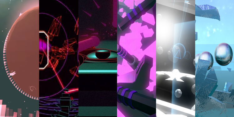
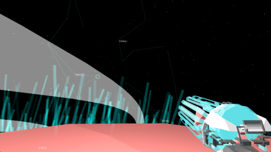
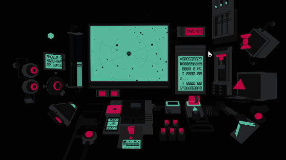
An electronic cyberart trend has been bobbing in and out of the video game psyche for the last two decades, and it’s seeing an upswing with modern independent game developers. Games like MirrorMoon EP, Race the Sun, Fract, and Smash Hit have adopted this low-fi movement’s visual genetics and have ensured its influential spread to another generation of players. Like the current explosion of the retro inspired sprite movement, its simplicity makes it convenient for developers working on a small budget looking for a quick turn around from the prototype stage to final product launch. In exchange, it commands an art direction that is purposeful, with an intent that is honestly crafted.
It’s a style that gaming culture introduced to mainstream audiences in the early ’80s, but its exposure was not tied to a video game per say, but more a movie about video games: Tron.
Tron’s legacy is best known as a major introduction of 3D computer graphics technology in feature film special effects. For many, it was also an early glimpse into a new abstract fantasy world of cyber-consciousness, a world where rudimentary electronic building blocks would try to imitate real world objects in electric color. This visual style, however, wouldn’t pick up in video games until at least a decade later, when the capability to create real-time graphics out of primitive 3D polygon models would become more accessible.
One of the biggest video game influences of this style came out of Sega’s last big development renaissance in the late 1990’s, with the release of Tetsuya Mizuguchi’s Rez on the Dreamcast. We can cite games that used this art direction before Rez, but these didn’t resonate with developers and players to the same degree. When I ask people to name this visual style, the same two descriptors come out of their mouths: Tron-like and Rez-like.
Curious about the recent growth of this art style within games, I’ve reached out to four indie developers who have all created vastly different interactive experiences from each other, but whose art direction shares this very distinctive low-fi 3D cyber look — and asked for their perspectives on this fascinating visual style. In part one we’ll cover a little bit of naming convention and art history, then dive right into the distinctive visual characteristics of this art direction.
Digital futurism?
While I was digging for information on this style, it surprised me that I did not run into a term for it. Referring to this art style as “Tron-like” and “Rez-like” is too informal and sloppy. It needs a name. I eventually had to scrape by with a few discussions on the Internet, hoping someone had coined a good name for the style, which also disappointingly fizzled out without a solid recommendation.
Then I decided to coin a name myself, pieced together with two words that stuck out while combing for a proper term: “Digital Futurism”.
Those words resonate with what I feel a “Tron/Rez-like” art direction is. A few types of Futurism exist, but they all share a key element of being fascinated with the possibilities of forward-thinking designs, architecture, and ideas. Tron also employed several concept artists who were heavily influenced by the look of the original movement, including Syd Mead who is a famous concept artist for other Futurist influenced films such as Alien and Blade Runner (and is coined as a “Visual Futurist”).
Where futurism tends to be occupied with the “could be one day” technology of the real world, our subject concentrates on what a high tech vision of the future may look like inside the rules of a digital universe — hence a vision of “Digital Futurism.”
Unfortunately, Futurism has a political and social problem. The earliest version of the movement originated in Italy during the early 1900s by poet Filippo Tommaso Marinetti, who linked Futurism to the fascist ideals of the time. Although Futurism celebrated the imaginative visions of a future built off of ingenuity and speed, it also had very strong opinions about how to get there, who should benefit, and by what means. Marinetti glorified war as a great cleanser of society and violence as a positive tool of oppression.
One of the participants in this discussion, Pietro Righi Riva of Santa Ragione (creator of MirrorMoon EP), had his own perspective on my use of the term, “Personally and being Italian, we wouldn’t like our work being called a ‘Futurism’ because that art current had some strong social and political connotations that are very much in contrast with what we believe in. And even some of the themes of Futurism, [such as] strength, violence, power … are not things that are really present in our production, nor part of our philosophy as authors. Although Fotonica, our first game, was very much about speed and vertigo, it was so in a way that did not glorify strength and power, but rather tried to capture levity.”
“Futurism is something that is part of our cultural background of course,” Righi Riva explains, “but mainly for the aesthetic contribution to painting and visual imagery in general along, together with other European movements like Cubism … they [Cubism and Futurism] had in common the way they both tried to represent different perspectives and moments in time on a single canvas.”
Righi Riva sees the art style from a different angle and suggests a slightly different name, “The term Futurism kind of evokes an idea of visions from the future, while low-poly would be more of a retro-futurism, since it evokes the early days of computer graphics and certainly not what we imagine games to look like in the future. So Digital Futurism can be a little misleading, not quite fully communicating that digital low-fi art style you are referring to.”
Righi Riva brings up several good points, aside from just the darker political side of Futurism, and I respect his perspective on the topic. For the sake of clarity, however, the other participants and I refer to the art style as “Digital Futurism.” Perhaps beyond this article, a discussion can be continued and we can try to find a better name for this visual style?
Electric hues
Color is a basic yet powerful compositional tool for manipulating eye direction and mood. One of Digital Futurism’s most noticeable characteristics is pushing colors into an extreme contrast, using saturated glowing hues against a dark backdrop. The end result can be striking, multiplying the effects a color has on the audience.
Out of the group of game designers that I questioned, Richard Flanagan’s Fract leans toward a wider variety of strong color use. Flanagan kindly shares the thought process behind his color decisions, “Each main area of the game is designed around one of the three [musical] synthesizers: bass, lead, and pad synths. Not only is each of these areas distinguished by mechanics and sound, but by aesthetic. At a high level this is colour systems, landscape topology, and architecture. All of which were chosen based on the intended emotional state of each area and its respective synesthetic feel.”
Flanagan gives an example: “The lead mountains are peppered with bold pink energy amid sharp and aggressive geometry. This mimics the role of a lead synth, to stand out and be prominent in the mix of the musical styles that helped inspire the game. This visual grammar is further developed in the cyan bass caves and fluro-green pad dams, with even more gradation going on with each respective area and puzzle.”
Righi Riva also uses saturated colors in MirrorMoon EP, but his intent behind these choices is slightly different from Flanagan’s. Fract’s primary concern with color appears to be in creating mood and metaphors based around synth, where MirrorMoon EP’s palette seems much more concerned with functionality.
In Righi Riva’s game, players are in a world where nothing is conventionally explained and everything is a visual puzzle, including starting a game. I’m not suggesting that the colors in MirrorMoon EP don’t have metaphorical or analogous meanings, but their primary goal here is to guide the player through the experience, in some cases associating color with in-game functionality.
Righi Riva explains: “We have a lot of different planets in MirrorMoon EP and color is a powerful tool to differentiate them. More specifically we use colors as a visual indicator to the end game, we don’t reveal specifically, but color can provide information of how far the player is from the end planet, which in MirrorMoon EP it is not necessarily the main objective. The lower the detail, the bigger a differentiator color can be.”
“To give you an example,” Righi Riva continues, “a red forest and a green forest are first and foremost forests, while a green cube and a red cube are mainly green and red respectively. Color is also used to indicate function and intractability in the game, especially in the navigation sequence.”
Righi Riva follows up to explain his secondary goal for MirrorMoon EP’s color design. “In all scenes, though, we use color as a way to convey the other-worldly setting of MirrorMoon EP: both the nature and the technology in the game are meant to feel alien, beautiful but not welcome, calm but mysterious, harmonious but mystifying,” he says. “That calls for the high contrast, unnatural but somewhat pastel color palettes of MirrorMoon EP.”
Unlike Flanagan’s and Righi Riva’s games, Forrest San Filippo’s Race the Sun breaks away from the saturated hues of Digital Futurism and adopts a more toned-down palette. “Our game has very little color, so when color appears it has a more striking effect,” Filippo says. “One example in Race the Sun is the moving objects. At first, the world is mostly static and gray, but when you start seeing red objects, they start moving and trying to smash you. Even in that instance the red is pretty subtle, but it seems more prominent against all the gray. Rather than go with a bold saturated color to contrast the bland landscape, we kept things pretty desaturated.”
“For us, this seems to keep things in balance emotionally.” Filippo continues, “The game is really intense and we’ve had a lot of folks mention that the experience is a balance between freaking out and a zen-like state. I think the softer colors contribute to that.”
Primitive shapes
Digital Futurism’s roots are strongly tied to the aesthetic limitations of early computer graphics, which have caused a distinct visual style of exposed construction in some of its worlds. For example, the edges of 3D models are rarely smoothed, revealing the hard planar nature of the polygons that construct the object. In other cases this effect is taken a step further, highlighting the edges and revealing the topology of an object’s mesh.
These are things that artists working on today’s realism focused titles would go to great lengths to hide, but in Digital Futurism the basic building blocks of 3D computer art are highlighted and celebrated.
Filippo explains why he finds this aspect of Digital Futurism more appealing than other photo realistic art directions. “I think there is an honesty to the style that feels refreshing. I, myself, have grown completely tired of 3D art attempting, and mostly failing, to look photo realistic. When it comes to some 3D games or CGI movies, I honestly can’t understand why they didn’t just film actors.”
Flanagan follows a similar line of thinking, but goes further into his opinion on the photo realistic polygonal pipeline. “I can’t speak on behalf of other games using a similar visual theme, but for me it’s a result of a kind of love/hate relationship with polygons,” Flanagan says. “I think they’re beautiful and are an awesome result of the sacrifices we made in order to achieve early 3D graphics, but as a workflow to achieve photo realism they’re kind of all wrong in my opinion.”
Flanagan explains his perspective making a comparison to vector art, “It’s a bit like hyper-real vector art … it’s an impressive technical achievement, but outside of a few useful edge cases, why do we bother? There are a lot of parametric modeling and design methods that seem much more geared towards actual creativity and not pushing vertices around, but I think we’re a good ways a way from doing that stuff in real time.”
Digital Futurism’s embrace of low-fi 3D objects exposing their basic polygonal construction also allows for a style of purposeful abstraction. The history of video game art is a history of digital minimalism and abstraction, as the limits of real-time rendering made it necessary. For example, a square pixel in an Atari 2600 game could be anything: a bullet, a ball, maybe even a power pellet. Mario’s sprite in the original Super Mario Bros. is an abstract shape of a cartoon Italian plumber. We see Mario because he is being suggested with intelligent use of a severely tight pixel limit. In today’s Digital Futurism, abstraction is done primarily for artistic expression and has less to do with working within technical limitations.
Filippo touches on this change. “When I play a game that isn’t trying to hide the vertices, it just feels more pure and intentional. I think that the representational style also provides a better foundation for storytelling. Every art form relies on the imagination of the person experiencing the art — and some forms engage the imagination to greater extent than others. Representational visuals often make the brain fill in the blanks, so to speak, and force a deeper sense of engagement.”
Flanagan shares a similar viewpoint. “I feel as though polygons are a direct nod to the medium — the ‘transmission mechanism’ of digital games,” he says. “There is something undeniably romantic about that idea to me and perhaps speaks to your [Stephen’s] perception of the construction of objects. That and the fact that this polygonal look can more-or-less only happen in virtual worlds is exciting and should be celebrated more.”
Flanagan also points out a creative advantage to going this route, “It’s also a lot further away from any uncanny valley or suspension of disbelief dissonance that could otherwise ruin the experience … assuming the player can become comfortable with the polygonal look to begin with.”
Righi Riva, however, strikes at the core of the issue. “We also think there’s something related to the nature of the 3D objects as pure abstract objects though. Like in painting, one can make use of colors in a very elaborate way, to produce realistically looking images, or use them more plainly to achieve pure monochromatic abstraction.”
Righi Riva illustrates the difference between the two creative philosophies. “In the first case, we almost forget about the medium we are using in order to deceive the eye of the viewer,” Righi Riva says. “In the other case we are explicit about the medium that we are using, the artwork participates in the debate about the nature of the medium itself. So when we use 3D primitives or make the polygonal nature of 3D objects visible, it is because we believe there’s a genuine quality in the raw nature of polygons that makes them visually compelling and expressive.”
Working within the confines of low-fi can also provide different visual tricks for the artist to use, as Righi Riva points out, “…working in low poly[gons] is a limitation that forces artists to condense meaning, creating iconic forms. That is always a surprisingly rewarding exercise! As far as recognizing primitives into more complex object, there is a compelling psychological theory that involves Geons as fundamental units of understanding 3D objects, that is worth looking at!”
The theory Righi Riva mentions is known as recognition by components. The basic premise is that the human brain recognizes certain complex objects by breaking them down to their basic shapes, known as Geons. These Geons are then stored in our memory. So when we collectively think of a wagon, we see a rectangle for the base, four cylinders for the wheels, and a long rectangle for the handle.
Righi Riva also explains the concept of shapes built out of hard planes being more readable than those with smoother gradations, “Finally, a rendering that feels realistic and physical, is harder to achieve on a soft edges, smooth normal model. There is a counter intuitive property in play, where more abstract looking materials and shapes are more believable as hard, crystal-like objects, than they are when they are supposed to look soft. In other words, non low-poly representation shows the technological limitations more as faults than features of the visual style.”
In part 2, we dig a bit deeper into the low-fi nature of the movement and how it relates to the prototype stage, its influence on audio in the video game medium, and our guest developers’ reasons for choosing to work in this art style.
VentureBeat's mission is to be a digital town square for technical decision-makers to gain knowledge about transformative enterprise technology and transact. Learn More


