In part 1 of this 2 part series on Digital Futurism, we covered a small bit of history on this unique visual style including its links to the original early 1900s Italian movement. We also discussed some of the fundamental aspects of the visual make up of Digital Futurism, specifically the style’s use of color and low-fi 3D polygon assets.
In this second part, we’re going to look at the early stages of working in Digital Futurism, the art direction’s connection with audio in the video game medium, and finally what our developer’s inspirations were for working in this visual style.
Prototype vs. release

Above: MirrorMoon EP concept art by Gabriel Brombin.
The idea of low polygonal objects as an aesthetic and not a technical necessity got me thinking about the prototype stage of 3D game development. When prototyping, designers utilize primitive placeholders as temporary art assets while working on the foundation of a game’s design. During this stage, someone could easily have a happy accident and stumble into a Digital Futurism look. This got me curious about how different the art direction in the final version of these games compared to their prototypes.
Dennis Gustafsson, the programmer for Smash Hit, confirms some of this theory. “The art style turned out how we envisioned it in the beginning. It’s pretty close if not better than what we originally wanted it to be,” he says. “We wanted it to have a minimalist setting, but the rendering be realistic. Like an abstract world in a realistic environment.”

Above: Early Smash Hit screenshot.
Forrest San Filippo’s (Race the Sun) answer caught me off guard. “There would be a massive difference between the two. At first glance a game with minimalistic art can seem like it would be easy to whip together — but it can actually take quite a bit of refinement to get minimalism right,” he says. “We went through lots of iterations on every aspect of the art [for Race the Sun] before we were happy with it.”
This comes as a surprise to me, because if I were a gambling man, I would have lost the farm betting Race the Sun’s release would be the closest to its prototype. This doesn’t imply anything negative, as it would’ve been a beautiful prototype, but primitive shapes seem to play a big factor not just in Race the Sun’s art direction, but game design as well.
MirrorMoon EP’s release art direction, on the other hand, was much closer to its prototype. Pietro Righi Riva, lead on MirrorMoon EP, discusses his game’s early look. “Oddly enough, some of the elements that defined MirrorMoon EP were there since the beginning,” he says. “Since many visual elements are tied to the gameplay, the general look of the game took shape during the first 72 hours. For instance, the locked X axis for the first person camera that frames the game in a very specific way.

Above: 2012 Game Jam version of MirrorMoon
“The difference you would notice, though, is that the final version is more detailed and polished. Lots of little things here and there that, in the end, makes a huge difference between a sketch and a finished render.”
Righi Riva adds, “The biggest difference is, of course, Gabriele Brombin’s contribution to the project. He contributed many details to the final look, such as the more detailed rocky landscape and the more monumental look of the artifacts you’ll encounter in your journey.”
Righi Riva goes on to introduce the work of Gabriele Brombin, an illustrator and graphic artist working on MirrorMoon EP. Brombin has worked in styles similar to Digital Futurism in other mediums and I definitely see a relationship between the visuals in MirrorMoon EP and his graphic novel, The Sand Sea and the Plateaux of Mirrors.
Above: A piece from “The Sand Sea and the Plateaux of Mirrors,” a graphic novel from Gabrielle Brombin.
“The other huge difference is that, in the prototype we did not have the navigation scene,” Righi Riva said, “which contributes a lot to the overall aesthetic of the game, by introducing the style of technology present in the MirrorMoon EP universe.”
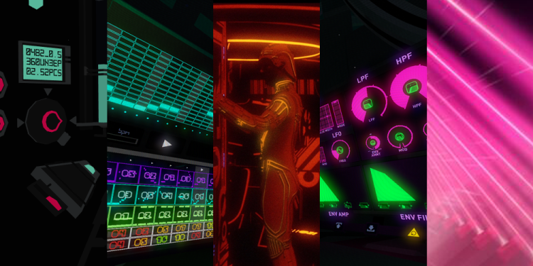
On Fract, designer Richard Flanagan explains how he also discovered some of the game’s visual style early, but it was not necessarily similar to Righi Riva’s experience. “The prototype relied on a few very simple material styles and due to the limitations of the free engine I was using [which was] …’Unity 2 dot something’ at the time,” he said. “I did not have access to any full screen effects. There were also only three global lights in the entire game, providing crude three-point lighting to every object in the space equally. The positive side effect to these limitations was just that: limitations. I was free to develop a visual language within these restrictions, which in my mind was not only quite effective, but at the time … 2010 … fairly unique.
“The release version of the game maintained the highly polygonal look, with sprawling terrain and strong colors, but updated the aesthetic in a few substantial ways. First and foremost was the inclusion of glow. Glow was added as a means to further enhance the visual language of the world, bring attention to important energy sources and objects that the player should notice.”

Above: An early screenshot of Fract after the team had worked out glow effects.
“In the same vein,” Flanagan said, “lighting was greatly expanded upon. While we maintained a set of simple global lights, objects and spaces were now lit with many more lights, building a greater sense of hierarchy, guiding the player and defining spaces more clearly.”
“A full CRT-esque effect was also added,” Flanagan says. “Not only was this effect in line with the setting, being inside a digital world, but it was used to distinguish between the two main ways the player interacts with the world; exploration mode and hologram mode, which is a wholly new visual system from the prototype. We further use this effect in the distance, like a fog, with the screen grain becoming stronger the further away you look. This effect helps establish the distance of objects from the player and also subtly begs the question, ‘just what side of the screen is the player on?’”
Flanagan concludes, “While the look of the prototype and release are quite different, I don’t feel as though one is better than the other. Both aesthetics are appropriate for the respective worlds. The release is more evolved but one could equally argue that the prototype is more precise. I can see myself exploring both of these visual styles again in the future.”
