Influences
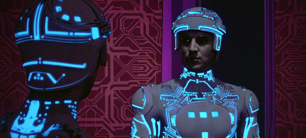
Above: Tron: The beginning of Digital Futurism.
The best way to wrap up this look at Digital Futurism may be to go back to where we started: What influenced these creators to run with their Digital Futurism-like art directions?
Gustafsson found influences in two places, the first in the real world. “Instead of trying to do something realistic, we wanted to mix the realistic physics with a totally unrealistic setting. So we have the sound … the audio … are also pretty much based in realism,” he says. “So we wanted to contrast that with a very abstract environment. It’s very architectural in a way. I remember doing early level design … I tried to do something like the Getty Museum in Los Angeles … it kind of worked.”
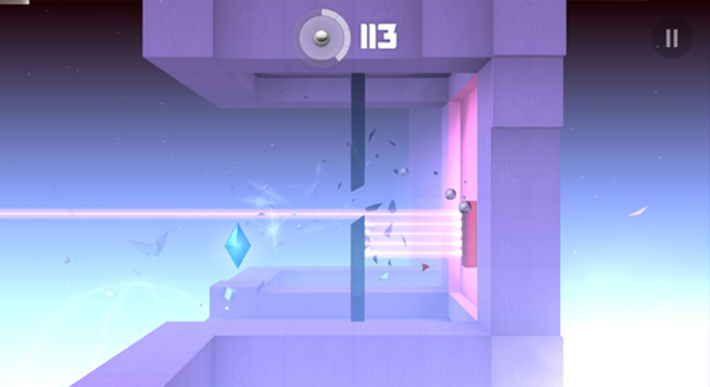
Above: Smash Hit
Gustafsson also found influence in an aspect of an old job. “I use to work for an old physics engine company and we would put out these demos where you don’t really pay attention to the graphics, but rather try to show off the dynamics,” he says. They look similar, like these simplistic graphics, but still add all the realistic shadows and lighting that creates this sort of aesthetic. That’s where some of the inspiration [for Smash Hit] came from.”
Righi Riva’s initial influences on MirrorMoon EP, on the other hand, came from a need for practicality. “We had many influences in MirrorMoon EP for the art style, but what it is important to know is that the game art style is something we created around gameplay and so many of the visual features are there because of a design necessity … buildings and artifacts transparency and height allowing navigation … color palettes of planets mapping the distribution content in the galaxy and allowing identification of interact-able elements,” he said.
That need for practicality was not just a solution from a functional design issue, but also from a need for quick turn around in production, which Righi Riva explains, “It’s finally worth mentioning that MirrorMoon EP started as a jam game, and that of course would have precluded a more detailed visual style, given that we wanted the game to look cool from the start. We tend to try to get the atmosphere of a game right before we design the rest. This might be the case for many indie projects, where more realistic visual styles are simply not affordable or achievable, leading us to experiment with other visual forms.”

Above: MirrorMoon EP
Filippo paints a more trial-and-error approach to discovering Race the Sun’s look. “From the start we knew the game would be somewhat minimalistic, but we didn’t know how that would play out in the art style. We experimented with a more literal style and found it to be really bland. It could have been that we aren’t very good 3D artists, but I don’t think we would have been happy with that style — even if the models and textures were perfect. Once we hit on the idea of using simple representational shapes, the look of the game just started clicking with the mechanics.”
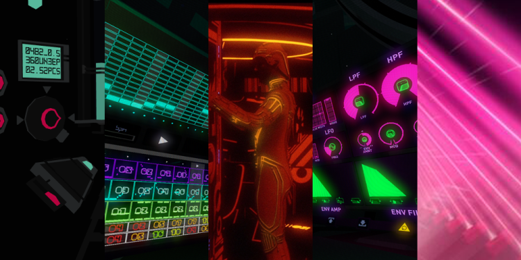
Flanagan, however, pulled from the allure of computer graphics itself. “The art style [for Fract] was a result of quite a few things, from influences, aesthetic philosophies, synthesthesia, and straight up nostalgia,” he said. “I grew up in an era where early computer graphics were promising the idea of virtual worlds. These early attempts were crude and absurd by today’s standards, but in my opinion had a charm and imagination that few contemporary examples have guiding them now.”

Above: Pushing boundaries with Fract.
“While films like Tron were an obvious aesthetic influence,” Flanagan said, “I was more impressed by the unrestricted creativity that was being seen in the computer graphics world in the era where wireframes and polygons were all we had. Designers just weren’t holding back as a result of the restrictions, and that ‘screw it, let’s make it weird’ approach has been very inspirational. I am constantly impressed by the steps we’ve made in achieving photorealism, but I am equally disappointed by the effort spent on what is perhaps the lowest possible hanging fruit in terms of aesthetic in video games. We have the power to simulate just about anything, why not explore the unexplored or the yet to even be imagined?”
Flanagan wraps up. with a cool perspective on Digital Futurism as a whole. “Another driving factor in developing the look of Fract was that I have always had a strong connection to work created that is honest about its origins or medium. Perhaps it’s because I am a maker and a tinkerer, but I’m fascinated by the apparatus as much as the message. This ‘digital futurism’ aesthetic is very honest about where it came from, as it could basically not exist outside of a computer. This excites me, and I’d like to see more games tinker with this from both an aesthetic and mechanical approach.”
As would I.
End of line…for now
I’d like to thank Pietro Righi Riva, Richard Flanagan, Forrest San Filippo, Henrick Johanson, and Dennis Fustaffson for taking the time out of their busy schedules to have this conversation with us. I’ve provided a list of links below that will provide more information on the games discussed here…including some extras of past and upcoming titles that may compliment further discussion on Digital Futurism.
MirrorMoon EP (PC)
Race the Sun (PC)
FRACT (PC)
Smash Hit (IOS, Android)
REZ (SEGA Dreamcast, Xbox Live Marketplace)
Amplitude (Sony PlayStation 2, Sony PlayStation 3, Sony PlayStation 4)
Frequency (Sony PlayStation 2)
Metrico (Sony PlayStation Vita)
VentureBeat's mission is to be a digital town square for technical decision-makers to gain knowledge about transformative enterprise technology and transact. Learn More
