

In part 1 of this 2 part series on Digital Futurism, we covered a small bit of history on this unique visual style including its links to the original early 1900s Italian movement. We also discussed some of the fundamental aspects of the visual make up of Digital Futurism, specifically the style’s use of color and low-fi 3D polygon assets.
In this second part, we’re going to look at the early stages of working in Digital Futurism, the art direction’s connection with audio in the video game medium, and finally what our developer’s inspirations were for working in this visual style.
[aditude-amp id="flyingcarpet" targeting='{"env":"staging","page_type":"article","post_id":1516399,"post_type":"feature","post_chan":"none","tags":null,"ai":false,"category":"none","all_categories":"games,","session":"C"}']Prototype vs. release

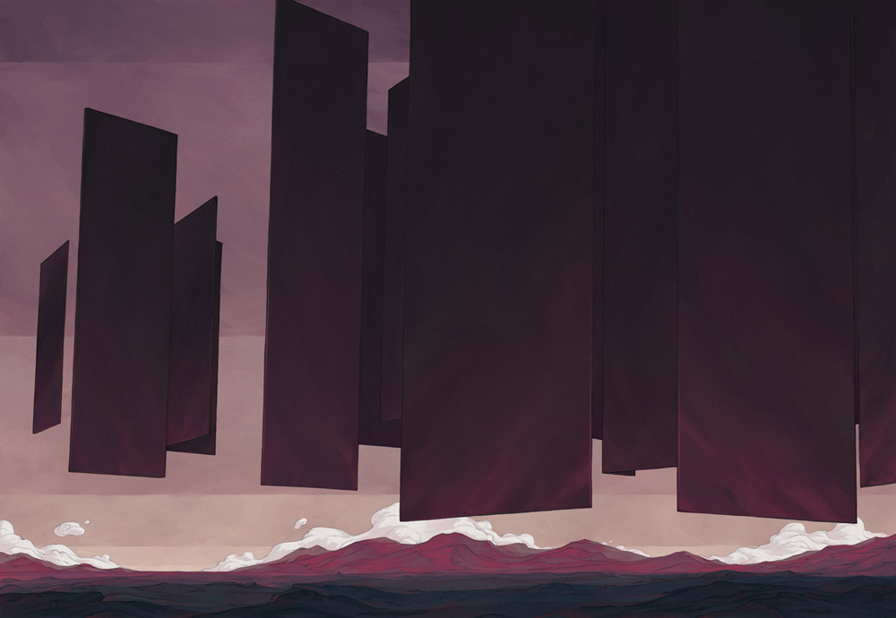
Above: MirrorMoon EP concept art by Gabriel Brombin.
The idea of low polygonal objects as an aesthetic and not a technical necessity got me thinking about the prototype stage of 3D game development. When prototyping, designers utilize primitive placeholders as temporary art assets while working on the foundation of a game’s design. During this stage, someone could easily have a happy accident and stumble into a Digital Futurism look. This got me curious about how different the art direction in the final version of these games compared to their prototypes.
Dennis Gustafsson, the programmer for Smash Hit, confirms some of this theory. “The art style turned out how we envisioned it in the beginning. It’s pretty close if not better than what we originally wanted it to be,” he says. “We wanted it to have a minimalist setting, but the rendering be realistic. Like an abstract world in a realistic environment.”

Above: Early Smash Hit screenshot.
Forrest San Filippo’s (Race the Sun) answer caught me off guard. “There would be a massive difference between the two. At first glance a game with minimalistic art can seem like it would be easy to whip together — but it can actually take quite a bit of refinement to get minimalism right,” he says. “We went through lots of iterations on every aspect of the art [for Race the Sun] before we were happy with it.”
This comes as a surprise to me, because if I were a gambling man, I would have lost the farm betting Race the Sun’s release would be the closest to its prototype. This doesn’t imply anything negative, as it would’ve been a beautiful prototype, but primitive shapes seem to play a big factor not just in Race the Sun’s art direction, but game design as well.
MirrorMoon EP’s release art direction, on the other hand, was much closer to its prototype. Pietro Righi Riva, lead on MirrorMoon EP, discusses his game’s early look. “Oddly enough, some of the elements that defined MirrorMoon EP were there since the beginning,” he says. “Since many visual elements are tied to the gameplay, the general look of the game took shape during the first 72 hours. For instance, the locked X axis for the first person camera that frames the game in a very specific way.

Above: 2012 Game Jam version of MirrorMoon
“The difference you would notice, though, is that the final version is more detailed and polished. Lots of little things here and there that, in the end, makes a huge difference between a sketch and a finished render.”
Righi Riva adds, “The biggest difference is, of course, Gabriele Brombin’s contribution to the project. He contributed many details to the final look, such as the more detailed rocky landscape and the more monumental look of the artifacts you’ll encounter in your journey.”
Righi Riva goes on to introduce the work of Gabriele Brombin, an illustrator and graphic artist working on MirrorMoon EP. Brombin has worked in styles similar to Digital Futurism in other mediums and I definitely see a relationship between the visuals in MirrorMoon EP and his graphic novel, The Sand Sea and the Plateaux of Mirrors.
[aditude-amp id="medium1" targeting='{"env":"staging","page_type":"article","post_id":1516399,"post_type":"feature","post_chan":"none","tags":null,"ai":false,"category":"none","all_categories":"games,","session":"C"}']
Above: A piece from “The Sand Sea and the Plateaux of Mirrors,” a graphic novel from Gabrielle Brombin.
“The other huge difference is that, in the prototype we did not have the navigation scene,” Righi Riva said, “which contributes a lot to the overall aesthetic of the game, by introducing the style of technology present in the MirrorMoon EP universe.”
On Fract, designer Richard Flanagan explains how he also discovered some of the game’s visual style early, but it was not necessarily similar to Righi Riva’s experience. “The prototype relied on a few very simple material styles and due to the limitations of the free engine I was using [which was] …’Unity 2 dot something’ at the time,” he said. “I did not have access to any full screen effects. There were also only three global lights in the entire game, providing crude three-point lighting to every object in the space equally. The positive side effect to these limitations was just that: limitations. I was free to develop a visual language within these restrictions, which in my mind was not only quite effective, but at the time … 2010 … fairly unique.
“The release version of the game maintained the highly polygonal look, with sprawling terrain and strong colors, but updated the aesthetic in a few substantial ways. First and foremost was the inclusion of glow. Glow was added as a means to further enhance the visual language of the world, bring attention to important energy sources and objects that the player should notice.”
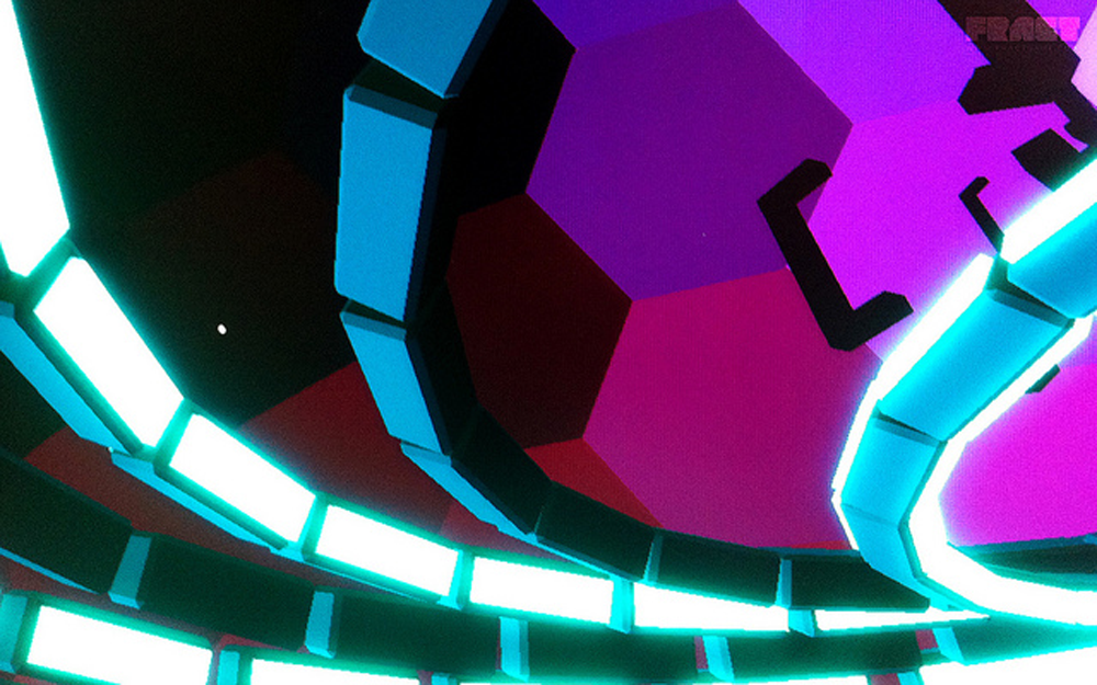
Above: An early screenshot of Fract after the team had worked out glow effects.
“In the same vein,” Flanagan said, “lighting was greatly expanded upon. While we maintained a set of simple global lights, objects and spaces were now lit with many more lights, building a greater sense of hierarchy, guiding the player and defining spaces more clearly.”
[aditude-amp id="medium2" targeting='{"env":"staging","page_type":"article","post_id":1516399,"post_type":"feature","post_chan":"none","tags":null,"ai":false,"category":"none","all_categories":"games,","session":"C"}']
“A full CRT-esque effect was also added,” Flanagan says. “Not only was this effect in line with the setting, being inside a digital world, but it was used to distinguish between the two main ways the player interacts with the world; exploration mode and hologram mode, which is a wholly new visual system from the prototype. We further use this effect in the distance, like a fog, with the screen grain becoming stronger the further away you look. This effect helps establish the distance of objects from the player and also subtly begs the question, ‘just what side of the screen is the player on?’”
Flanagan concludes, “While the look of the prototype and release are quite different, I don’t feel as though one is better than the other. Both aesthetics are appropriate for the respective worlds. The release is more evolved but one could equally argue that the prototype is more precise. I can see myself exploring both of these visual styles again in the future.”
Electric rhythm

Above: The Amplitude reboot fits Digital Futurism.
While a specific style of audio design doesn’t accompany Digital Futurism, I have noticed that music-heavy game designs seem to gravitate toward this art style. The precursors to Guitar Hero: Harmonix’s Amplitude and Frequency, are heavy adopters of this visual aesthetic. Rez also contained gameplay that manipulated the audio heavily based off of how well you were doing.
I realize that none of the games discussed here involve audio to the same degree as these examples, but I still wanted to get their perspective on why audio-centric game design seems to gravitate toward Digital Futurism.
[aditude-amp id="medium3" targeting='{"env":"staging","page_type":"article","post_id":1516399,"post_type":"feature","post_chan":"none","tags":null,"ai":false,"category":"none","all_categories":"games,","session":"C"}']
Henrick Johansson, artist on Smash Hit, understands its impact. “On an emotional level, you’re in this abstract other worldly setting. If you have music that resonates with that setting, you can create a powerful experience that feels immersive,” Johansson says. “I think it’s just being so different from reality that makes it work so well with music.”

Above: Smash Hit
Flanagan suggests that it may have more to do with the nature of working in a visual style that demands legitimate intent. “If a designer is developing a game with this aesthetic theme, they are already taking a risk for the sake of imbuing their project with something very intentional and deliberate,” he says. “I would assume that other aspects of the experience would be treated with similar consideration, whether it be sound design, music, UV, or narrative. That’s not to say photorealistic games can’t do the same, or digital futurist games don’t phone it in from time to time either, so perhaps that’s a bit of a leap on my part.”
Filippo, however, hints that Flanagan may not be taking as big of a leap as he thinks. “For Race the Sun, we used an intentionally stripped down soundtrack that may not be what you would expect for a high speed game,” Flippo said. “We’ve gotten lots of compliments about the music, which at first was really surprising. Then we realized that the simplified graphics and controls allowed the music and sounds to take a larger role in the overall experience.”

Above: Can the visual aesthetics of Digital Futurism amplify audio’s effect?
It’s Righi Riva, again, that digs a bit deeper into this theory. “I think it’s more of a factor of being generally more aware of the aesthetic implications of an artwork that leads to a more conscious audio design effort,” Righi Riva said. “We don’t particularly find a direct connection between dedicating a lot of attention to the auditory experiences our games provide and this particular art style.”
[aditude-amp id="medium4" targeting='{"env":"staging","page_type":"article","post_id":1516399,"post_type":"feature","post_chan":"none","tags":null,"ai":false,"category":"none","all_categories":"games,","session":"C"}']
“If we had to guess, we would say that people with similar sensibilities to ours will tend to also think a lot about the sound landscapes, understanding that what makes a game world is not a linear sum of the components ‘audio plus video plus interactivity’ … but rather a synesthetic convergence of these elements that directly influence each other. It is a bit of the Kuleshov Effect idea applied to multimodal representation.”
The Kuleshov Effect that Righi Riva mentions is a cinematic editing technique that Russian filmmaker Lev Kuleshov came up with in the early 1900s. Kuleshov took a static close-up shot of the famous silent-era film actor, Ivan Mosjoukine, staring into the camera with a blank expression. Kuleshov then shot footage of a bowl of soup, a child laying in a coffin, and a beautiful woman. He edited all of these shots together, with Mosjoukine’s stare coming before and after each shot. The result is that the bowl of soup, the coffin, and the woman had audiences implying an emotional expression to Mosjoukine’s blank stare. In this case, they thought he was expressing hunger, despair, and lust.
Alfred Hitchcock also explains the phenomenon.

In the case of Digital Futurism, maybe the low-fi visuals of the low polygon art direction naturally strengthens the audience’s reception to specific types of audio?
[aditude-amp id="medium5" targeting='{"env":"staging","page_type":"article","post_id":1516399,"post_type":"feature","post_chan":"none","tags":null,"ai":false,"category":"none","all_categories":"games,","session":"C"}']
Righi Riva appears to be heading towards that conclusion, “It is possible that a more low fi, less visually rich or intensive experience allows for more integrative and expressive soundscapes…balancing out the bareness of the low-poly environments.”
Influences
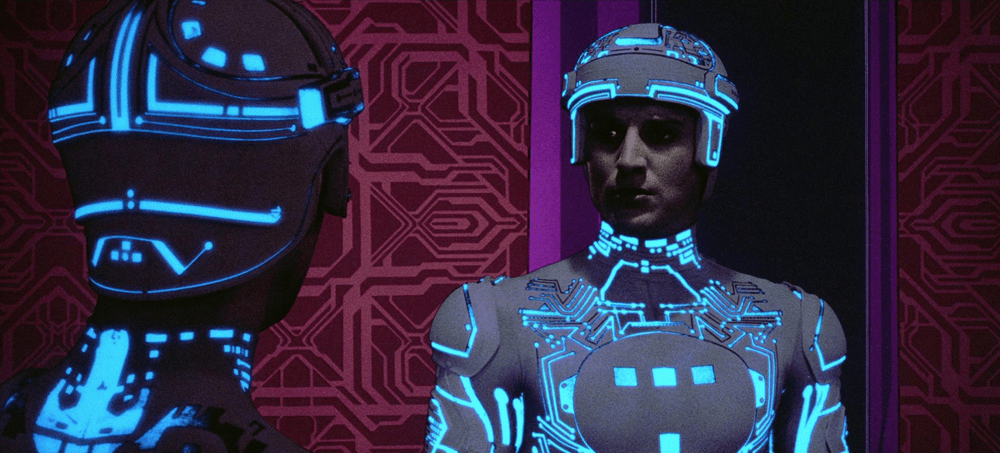
Above: Tron: The beginning of Digital Futurism.
The best way to wrap up this look at Digital Futurism may be to go back to where we started: What influenced these creators to run with their Digital Futurism-like art directions?
Gustafsson found influences in two places, the first in the real world. “Instead of trying to do something realistic, we wanted to mix the realistic physics with a totally unrealistic setting. So we have the sound … the audio … are also pretty much based in realism,” he says. “So we wanted to contrast that with a very abstract environment. It’s very architectural in a way. I remember doing early level design … I tried to do something like the Getty Museum in Los Angeles … it kind of worked.”
Above: Smash Hit
Gustafsson also found influence in an aspect of an old job. “I use to work for an old physics engine company and we would put out these demos where you don’t really pay attention to the graphics, but rather try to show off the dynamics,” he says. They look similar, like these simplistic graphics, but still add all the realistic shadows and lighting that creates this sort of aesthetic. That’s where some of the inspiration [for Smash Hit] came from.”
Righi Riva’s initial influences on MirrorMoon EP, on the other hand, came from a need for practicality. “We had many influences in MirrorMoon EP for the art style, but what it is important to know is that the game art style is something we created around gameplay and so many of the visual features are there because of a design necessity … buildings and artifacts transparency and height allowing navigation … color palettes of planets mapping the distribution content in the galaxy and allowing identification of interact-able elements,” he said.
That need for practicality was not just a solution from a functional design issue, but also from a need for quick turn around in production, which Righi Riva explains, “It’s finally worth mentioning that MirrorMoon EP started as a jam game, and that of course would have precluded a more detailed visual style, given that we wanted the game to look cool from the start. We tend to try to get the atmosphere of a game right before we design the rest. This might be the case for many indie projects, where more realistic visual styles are simply not affordable or achievable, leading us to experiment with other visual forms.”

Above: MirrorMoon EP
Filippo paints a more trial-and-error approach to discovering Race the Sun’s look. “From the start we knew the game would be somewhat minimalistic, but we didn’t know how that would play out in the art style. We experimented with a more literal style and found it to be really bland. It could have been that we aren’t very good 3D artists, but I don’t think we would have been happy with that style — even if the models and textures were perfect. Once we hit on the idea of using simple representational shapes, the look of the game just started clicking with the mechanics.”
Flanagan, however, pulled from the allure of computer graphics itself. “The art style [for Fract] was a result of quite a few things, from influences, aesthetic philosophies, synthesthesia, and straight up nostalgia,” he said. “I grew up in an era where early computer graphics were promising the idea of virtual worlds. These early attempts were crude and absurd by today’s standards, but in my opinion had a charm and imagination that few contemporary examples have guiding them now.”

Above: Pushing boundaries with Fract.
“While films like Tron were an obvious aesthetic influence,” Flanagan said, “I was more impressed by the unrestricted creativity that was being seen in the computer graphics world in the era where wireframes and polygons were all we had. Designers just weren’t holding back as a result of the restrictions, and that ‘screw it, let’s make it weird’ approach has been very inspirational. I am constantly impressed by the steps we’ve made in achieving photorealism, but I am equally disappointed by the effort spent on what is perhaps the lowest possible hanging fruit in terms of aesthetic in video games. We have the power to simulate just about anything, why not explore the unexplored or the yet to even be imagined?”
Flanagan wraps up. with a cool perspective on Digital Futurism as a whole. “Another driving factor in developing the look of Fract was that I have always had a strong connection to work created that is honest about its origins or medium. Perhaps it’s because I am a maker and a tinkerer, but I’m fascinated by the apparatus as much as the message. This ‘digital futurism’ aesthetic is very honest about where it came from, as it could basically not exist outside of a computer. This excites me, and I’d like to see more games tinker with this from both an aesthetic and mechanical approach.”
As would I.
End of line…for now
I’d like to thank Pietro Righi Riva, Richard Flanagan, Forrest San Filippo, Henrick Johanson, and Dennis Fustaffson for taking the time out of their busy schedules to have this conversation with us. I’ve provided a list of links below that will provide more information on the games discussed here…including some extras of past and upcoming titles that may compliment further discussion on Digital Futurism.
MirrorMoon EP (PC)
Race the Sun (PC)
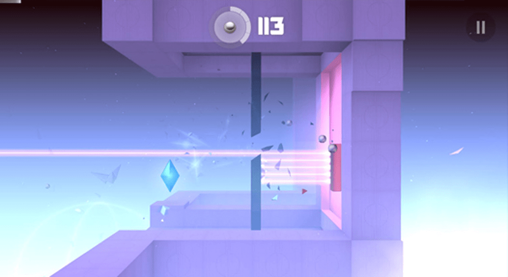
FRACT (PC)
Smash Hit (IOS, Android)
REZ (SEGA Dreamcast, Xbox Live Marketplace)
Amplitude (Sony PlayStation 2, Sony PlayStation 3, Sony PlayStation 4)
Frequency (Sony PlayStation 2)
Metrico (Sony PlayStation Vita)