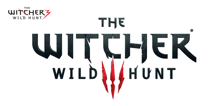
The number three in the logo for The Witcher 3: Wild Hunt is really subtle, and there’s a good reason for that.
Polish developer CD Projekt Red wanted its latest title to appeal to all gamers, not just those already steeped in its lore. So it deliberately played down the fact that the game is a sequel in its redesigned logo — first revealed in May 2014 — making the number three appear like a claw mark or a mask to those new to the series.
It was a smart marketing move, as The Witcher 3 is the most successful game launch of the year in the U.K., and it topped the Japanese charts last week. We’re still waiting on U.S. sales figures, but it’s likely on that list as well. If gamers were scared to pick it up because they’d missed the previous Witcher games, it might not have fared so well.
“This is the first time we’ve launched a game across all platforms,” CD Projekt Red’s head of marketing and PR Michał Platkow-Gilewski explained to MCV. “It’s our debut on a Sony system and our first game on Xbox One. We had to somehow address the potential issue of gamers being afraid of not knowing the previous games.”
“We modified the logo, but the ‘three’ is still there in the form of the Hunt’s mark,” he said. “Those who know this is the third part will see the ‘three.’ Those who start fresh will see a claw mark or a mask. Communication-wise, I think it’s a really good decision.“
Beyond the logo, CD Projekt Red also made sure the game made sense to series newcomers from the very beginning.
“Wild Hunt is created in such a way that players can hop in without knowing the previous games and the universe,” said Platkow-Gilewski, “so the title and logo of the game had to somehow reflect that. Look at the first scene of the game. We see a woman, and long-time fans will know who the woman is well before we explain.”
VentureBeat's mission is to be a digital town square for technical decision-makers to gain knowledge about transformative enterprise technology and transact. Learn More
