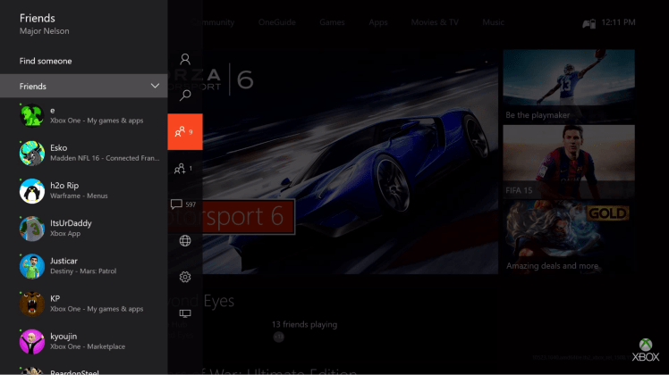
The Xbox One is about to get a makeover.
Microsoft announced this morning that it is rolling out what it is calling the “new Xbox One experience” for select gamers that are in the console’s preview program. Those people will get the chance to try out a user interface that Microsoft claims is sleeker and speedier for navigating while playing games or using video apps like Netflix or Hulu. This early preview phase rolls out to more preview members over the next few weeks leading up Microsoft unleashing the update on everyone in November.
This is an important update because the Xbox One’s interface is one of the few things that critics point to as a reason the PlayStation 4 is better. It’s clear that Microsoft built the system around the voice-controlled Kinect peripheral that no longer ships with most versions of the console. That left a user experience that is clunky and slow to get around in with a controller. And while the Xbox team at Microsoft has regularly patched in new features into the Xbox One since it launched in 2013, the system has never quite had an update like this one that could close the gap that Sony’s system has built up.
Check out the video below to see Xbox evangelist Larry Hryb go over what’s different:
Primarily, this update is about decreasing load times and highlighting important information so that players can access apps and games in a more logical way.
Microsoft made some of the most drastic changes to the homescreen. Pins are now on the bottom of the screen, and you can quickly jump between what you’re looking at and the last thing you were doing by hitting the trigger buttons.
The Xbox One designers also introduced a new guide system that provides faster access to parties, friends, messages, and notifications. It’s a pop-out menu from the left hand side, and you have two ways to get to it. If you’re on the homescreen, scroll to the left and the guide overlay will pop up. And if you’re in a game, just double tap the Xbox button, and it instantly loads. That’s right — Microsoft is claiming this will get rid of those terrible loading screens you had to wait through any time you tried to snap your an app like “Friends.”
Since this is a big redesign, you should expect plenty of other differences, but those are the big ones. And we’ll go hands on with this as soon as possible to let you know if it’s truly better. Of course, since this is just a preview, Microsoft is also promising to take all feedback to make the new Xbox One experience even better by the time it goes live for everyone.
https://twitter.com/majornelson/status/644904841974710272
VentureBeat's mission is to be a digital town square for technical decision-makers to gain knowledge about transformative enterprise technology and transact. Learn More

