This new logo takes minimalist to a new level.
Oculus launched a new webpage this morning that shows off its new branding for the first time. The virtual reality platform group dropped the eye-themed logo, simplifying the look with a widened “O.” This change comes just ahead of the Facebook-owned company’s first E3-timed press event, slated to kick off Thursday in San Francisco.
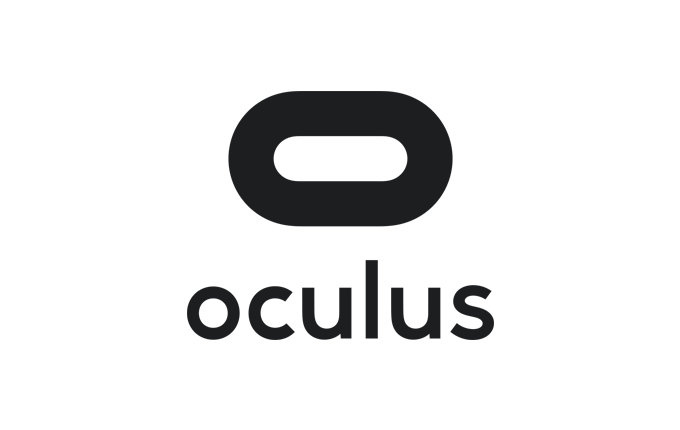
Oculus’ logo looks something like a head-mounted display, but the company’s press kit labels it as “stadium.” This change has the company moving away from an eye logo, which was likely intended to represent virtual reality. But this could be seen as a watchful eye, and it does not pair well with privacy problems owner Facebook has seen in its past.
The wording also sees an update, going lowercase, with a rounded look that complements the new logo.
Designers Cory Schmitz, Mackey Saturday, Nicolaus Taylor, and Jon Malkemus collaborated on the new design for Facebook and Oculus. Schmitz has been responsible for many other gaming-related logos, including designs for studios such as Sony Santa Monica, cloud-gaming tech firm Shinra Technologies, and Sucker Punch (the studio behind the Infamous action games).
Oculus’s press briefing begins at 10 a.m. Pacific, where many expect it to announce new developments for its platform as well as exclusive games a week ahead of the 2015 Electronic Entertainment Expo, one of the game industry’s biggest tradeshows.
VentureBeat's mission is to be a digital town square for technical decision-makers to gain knowledge about transformative enterprise technology and transact. Learn More
