The light bar
The DualShock 4 is also a simplified version of the PlayStation Move (not the archaic Sixaxis) motion-based controller and works in conjunction with the separately sold PlayStation Camera. So, similar to the original Nintendo Wii’s Wiimote, you will have just one device for both traditional and motion controls.
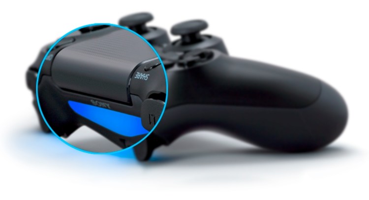
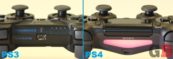
The PS Camera senses your position by communicating with the LED-powered light bar that’s sitting between the shoulder buttons on top of the DualShock 4. Technologically speaking, this doesn’t work that differently than the PS3 Move, except that it’s slightly less precise and doesn’t pick up depth. “We don’t want the controller to be flying around the room,” said Toshimasa Aoki, the manager of Sony Computer Entertainment’s product planning department, in an exclusive interview with GamesBeat. “It’s a more simple PlayStation Move usage. Instead of detecting X, Y, and Z [axes], it’s detecting just X and Y — where you are in the room.”
Like with the PS3 Move, the PS4 light bar emits a baby-soft glow and can change colors according to what the developers want to display. In Shadow Fall, for example, this represent your health status: green at first, yellowish to orange when getting shot, and red when dead.
Thankfully, the golf-ball-on-a-stick design of the old PS Move is gone. “We didn’t want a big sphere [on the DualShock 4],” said Aoki with a laugh. But the odd thing is, the light bar is actually pointed and angled away from the player, aiming a little downward toward the floor. Sure, it’s not as out there as PS Move’s giant bulb, but it might be a bit too subtle. We asked Aoki about this, but naturally, he and his team have already thought this through. “With the very first prototype,” he tells us, “we had the light bar more out, so that you could see it from a top view. But several people mentioned that a lot of gamers play in the dark, and they don’t want something to be too visible. If it’s too bright and distracting, it can break [the game experience], especially if it’s a horror game. So we made it pretty subtle, more secondary. If gamers see it off their hands or on the floor, it’s nice to have, but they don’t have to look down to check on it.”
And why the triangular shape for this “bar”? It was originally a square in early prototypes, but the team felt it made the controller too bulky, like the bottom of the Xbox 360 joypad with its protruding battery pack. This was especially true since the light-bar area also had to accommodate a mini-USB port for charging [see picture above].
The current flat “V” design helps slim things down for the hands that go underneath and to either side. Sony liked the look so much that it made the L2 and R2 triggers a little more triangular as well to match.
The Share and Options buttons
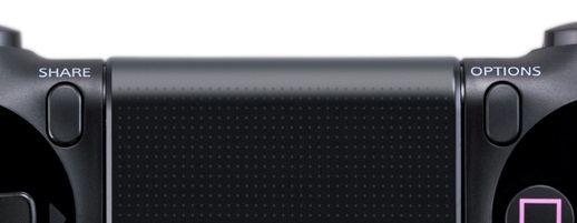
New Share and Option buttons are in, and ol’ Start and Select are out. This seems odd at first. These elder statesmen of buttons have been around for literally decades now, but think about it: How often do you use them to “start” or “select” anything these days? “People still say that there are too many buttons on controllers,” said Aoki on when the team was trying to figure out how to incorporate a new “Share” function. “We didn’t really want to add a new one. So we had a debate about which button is not really used in games. Everybody said Select, of course. Obviously. That was [a big deal for] us to decide to delete one of the buttons that’s been there since the Nintendo era.”
So Options is for most menus (like we used to get from Start), while Share is for showing off gameplay video. “The idea first came from the game teams,” said Aoki. “We were discussing how the PS4 has that second chip that’s recording the game in the background. The idea was that we should be able [access] that simply with one button press, instead of going back to the home menu and using the GUI [graphical user interface] to share. Especially right now, where a lot of users are uploading game videos to websites. It’s becoming a really big thing. Streaming, as well.”
Right now, Share is a dedicated system button, meaning developers can’t take it over to use for their own purposes. It works directly with the console to send out videos and screenshots. “Of course, in the future, we might change that, but currently, it’s dedicated to that sharing feature,” said Aoki.
And what about those developers who do want or need that extra Select button? The answer seems so obvious now. “One of the questions that came up was, ‘Hey, we lost one button. What should we do?’ But our response was always, ‘The touchpad is also a button. It’s clickable.’ Also, if you press on the right or left side [of the touchpad], the game knows. You could change that to different buttons. So you lose one hardware button, but you gain a thousand buttons,” said Aoki with a laugh. “It should be fine. They were like, ‘Oh, yeah, true.'”
The speaker and headset jack
Sony actually considered giving the DualShock 4 an onboard microphone at one point, for gamer-to-gamer voice communications. Instead, it went with a simple headset jack and audio speaker (located right below the touchpad), for the best of Xbox 360’s and Wii’s controller worlds.
“When you are trying to speak while pressing buttons, you get a lot of odd noise [with a controller-based microphone],” said Aoki. “We tested it, but it just didn’t work. But the speaker is nice to have. [It’s] not a must, but a lot of teams said they could send personalized streams out to each controller, and that could be a nice addition.”


