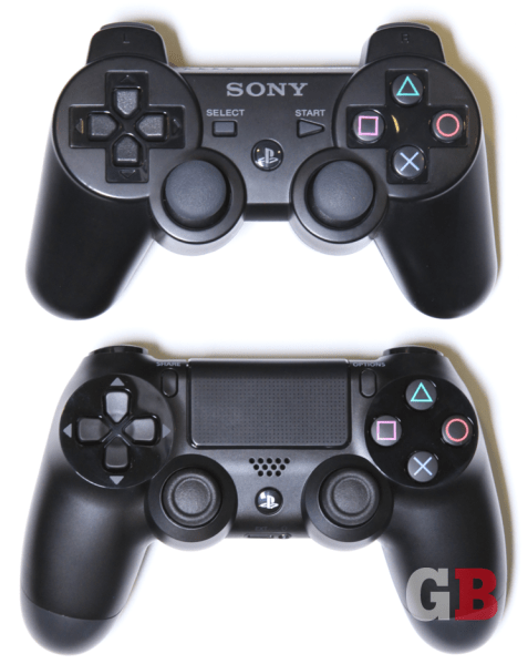
This is part of our ongoing series about games and trends of the upcoming next generation. For the Xbox One version of this article, go here.
The PlayStation 4 controller:
- Part 1: The weird stuff that could’ve been
- Part 2: What’s new with the analog sticks and D-pad
- Part 3: What’s new with the buttons and triggers
- Part 4: A close look at the touchpad, light bar, and everything else
The PlayStation 4 was controller was almost … weird — something perhaps better suited as science-fiction movie prop than for playing God of War. No buttons? Strange round shapes? The engineers and hardware designers at Sony really tried rethinking the design of the upcoming console’s primary input device — no bad ideas in a brainstorm and all that.
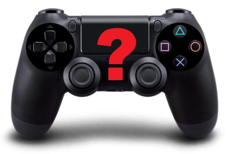
In the end, familiarity and functionality prevailed, and the DualShock 4 controller [pictured above] will end up looking like its predecessors from previous PlayStations. Without having tried the early, “out there” prototypes (for which Sony stubbornly and understandably won’t provide images) for ourselves, we can’t say whether that’s ultimately a good or bad thing. We suspect “good,” however, since the DualShock 4 contains several significant improvements over the DualShock 3 — enough so that we’re pretty sure no one will ever want to go back to that PS3 gamepad. Plus, the game developers themselves helped to design this thing — and we always have the PlayStation 9 to look forward to for those sci-fi ideas.
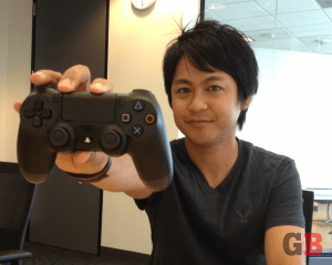
It started in 2010 when Toshimasa Aoki joined Sony Computer Entertainment’s product planning department as its manager. Previously, he was an engineer at Sony on the Walkman, PlayStation Portable, and PS3 teams — mainly dealing with disc drives. But three years ago, he was tasked with creating the new controllers and the user-interface inputs in time for the PS4’s launch on Nov. 15.
Unlike with Sony’s PlayStation Vita handheld console, whose interface was, strangely enough, the very final part of the portable machine’s design, the company started planning for the DualShock 4 controller from the beginning. It looked at a lot of radical ideas, not originally beholden to the traditional layout that PlayStation-generation gamers are used to.
Stick shift
“At the very start, we were thinking of drastically changing the controller,” Aoki told GamesBeat in an exclusive interview. “We tried out new devices, changing the form factor. We’d start from there and then try to talk to the game teams and tweak toward what the best form would be to have for those new devices. So we made, I don’t know, more than 20 prototypes. Some had no buttons, just touch panels. Some were rounded. All this crazy stuff.”
Not all of the initial concepts thrown around were completely original — you could even argue that the touch-panels idea that Aoki mentioned was heavily influenced by Nintendo’s Wii U GamePad or Apple’s iPad. But that wasn’t unusual for Sony to take a look at what on the market was working for consumers. Heck, the designers even looked to the Xbox 360 controller for inspiration.
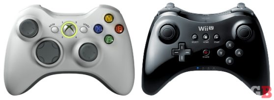
“For the analog sticks,” said Aoki, “we did test having the analog sticks on top, since the Xbox has the left side on top [above the D-pad]. Especially from the shooter teams — we got feedback that that’s what they wanted. They knew that consumers liked the 360 for shooters.”
Sony tried just about every combination of analog-stick placement possible. Two sticks on the bottom, like current PlayStation controllers. Two sticks offset, like with the Xbox 360. Even two sticks on top, mirroring what Nintendo’s doing now with the Wii U GamePad and Pro Controller.
“We already had made a prototype and denied that version,” said Aoki of the right-stick-on-top layout. “When Nintendo came out with that, we were like, ‘Wow, that’s just like our prototype!’ That surprised us. But yeah, we decided that it just wouldn’t work. People are used to having the buttons up there, and this moves the most-used button — the X — so far away [from your right thumb]. If we moved the X up there, it just breaks all the muscle memory. The right hand mostly goes for both buttons and sticks, but the left hand stays on one or the other and usually doesn’t switch around [between the left analog stick and the D-pad]. That’s why it’s OK to switch around the left side. But switching the right side really breaks the gamer’s experience.” We agree.
Sony’s own game developers had a say in this as well. By the time the company put early prototypes of the new controller in devs’ hands, some of them had already started making PS4 games. They tried keeping an open mind when offering Sony feedback, but some of them already had preconceived notions about how everything should be laid out.
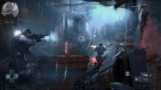
“We always kept in mind that it was a controller for a platform and not just for our games,” said Tommy de Roos, the lead gameplay programmer at Guerilla Games, makers of the first-person shooter (and PS4 launch title) Killzone: Shadow Fall. “Of course, we tried to push the things we really wanted forward. Every studio pushed for their own thing. We pushed for the headphone jack. I think [Drive Club developer Evolution Studios] pushed for better gyros, because they want to experiment with steering there. It was a mix.”
You know what they say about old habits, though. “They were fixed on how they would use [the DualShock 4] in their shooter games.” said Aoki of Guerilla, adding that he heard a lot of “this thing would just not work with our game” from various developers on the different prototypes. Sucker Punch Productions is working on a new Infamous, for example, so that group also wanted a more traditional control scheme for its open-world action series. These teams were already working on their respective launch titles (which may not necessarily mean “at launch,” by the way), so going crazy on controller design seemed less appealing to these game makers.
Aoki estimates that about half the developers Sony talked to wanted to make incremental improvements to the status quo, and the other half had an “anything goes” attitude, mainly from those who were just wrapping up their PS3 titles and didn’t have a PS4 project started yet — and therefore, didn’t have any plans locked in.
But different studios specialize in different genres, and it’s impossible to please everyone. So Sony would only seriously consider something if approximately 80 percent of the feedback supported that — much tougher than a simple majority vote.
In the end, Sony stuck to tradition as far as analog-stick placement goes. “The feedback from the user test team said that we needed to test this version, the Xbox version, and this version,” said Aoki. “[But having the two sticks symmetrical on the left and right sides] is kind of in our DNA. The prototype team, myself, and also the management team really felt that having this look is the PlayStation look, and we had to keep that.”Touchy subject
The DualShock 4 does have a bunch of small improvements that you may not even notice unless someone pointed them out to you (which we plan on doing in this series) — the angle on the edges of the analog pads, the indentation on the D-pad, the spacing around the face buttons, etc. They’re almost all noteworthy. Trust us that you won’t ever want to go back to the DualShock 3 after reading about these. But none of these tweaks are as noticeable or obvious as the new touchpad, sitting in the middle of the controller.
It has a touch-sensitive surface that recognizes positional finger presses and small swipes, like a miniaturized iPhone or Wii U GamePad. You can click the whole touchpad, too, as if it were a single oversized button. But despite its monolithic presence, there’s literally nothing to look at here. “A touchscreen was another idea that we had,” said Aoki. “We actually tested it, but [besides cost factors], our game teams felt like having to look down at the controller is not what they want to do. They want to have the consumers concentrated on the big picture that they show [on the TV].”
Sony toyed with many different iterations of touch-this and extra-screen that. The PlayStation 4 will have a lot of companion devices, such as tablets that can display extra info or the PS Vita portable gaming system as a “Remote Play” controller. But the product folks originally looked at a lot of those as possible primary sources of input. “The game teams had ideas,” said Aoki. “Some tried out [all-touchscreen controls], actually. They felt that it would be a good new input which the buttons or the sticks can’t do.”
Those ideas included a single touchscreen replacing the main face buttons (X, Square, Triangle, and Circle), which was one of the early considerations. (“The vote on that was probably 100-0,” said Aoki, laughing.) Sony also tried a touchpad on the rear, similar to the PS Vita. In its offices is even one prototype where people can move a touchpad around to different spots on the controller.
But the familiar PlayStation layout trumped all. When you buy the PlayStation 4 this November, the touchpad will be right in the center of the controller, but all the sticks, triggers, and buttons are where everyone expects them to be. “The developers love the touchpad, but only as the secondary input,” said Aoki. “Of course, as it evolves and people get used to the touchpad, it may become more primary.”
To be continued:
- Part 1: The weird stuff that could’ve been
- Part 2: What’s new with the analog sticks and D-pad
- Part 3: What’s new with the buttons and triggers
- Part 4: A close look at the touchpad, light bar, and everything else
Photo credit (DualShock 3/4 comparison shot): Ryan O’Donnell
Special thanks to Stephen Kleckner for the Photoshop help.
VentureBeat's mission is to be a digital town square for technical decision-makers to gain knowledge about transformative enterprise technology and transact. Learn More
