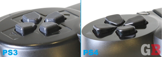
This is part of our ongoing series about games and trends of the upcoming next generation. For the Xbox One version of this article, go here.
The PlayStation 4 controller:
- Part 1: The weird stuff that could’ve been
- Part 2: What’s new with the analog sticks and D-pad
- Part 3: What’s new with the buttons and triggers
- Part 4: A close look at the touchpad, light bar, and everything else
One innocuous Tweet about the PlayStation 4 controller led to a small flurry of replies, which in turn, led to this series of feature articles. How’s that for the power of social media?
Never liked the PS3 controller for first-person shooters but the PS4 version feels good. Solid, heavier, nice triggers and sticks.
— Shoe (@DanShoeHsu) June 12, 2013
This past June at the game-industry trade show E3 (the Electronic Entertainment Expo), Sony let the press get hands-on with its upcoming PS4 console, due out Nov. 15. In particular, this was the first time we got to try out the new controller with a first-person shooter, launch title Killzone: Shadow Fall.
This is a big deal because — and this is absolutely just a nonscientific observation of ours — gamers generally hate the PlayStation 3 joypad for shooting things. The DualShock 3 controller feels light and insubstantial, it has very loose analog sticks for moving and aiming, and the back shoulder buttons — well, they’re more squeeze balls than triggers.
So when I barely addressed these issues in fewer than 140 characters, I was surprised at the reaction. People seem really excited and hopeful for a new-and-improved DualShock controller. And except for those whose hands are now permanently time-, heat-, and pressure-molded to only fit the Xbox 360 joypad comfortably, they won’t be disappointed.
In part two of this series, we take a look at the improvements that Sony has made to the two analog sticks (shooter fans are going to love the changes) and the D-pad (which went through a lot more testing and revising than you might suspect).
Warning: You’re about to get some very detailed information, including some from several exclusive interviews. Why? Because all of these seemingly insignificant nips and tucks add up to a controller that just feels right. “Small details really do make a difference,” Shadow Fall director Steven ter Heide told GamesBeat. “Everyone notices the touchpad and the headset jack and all that sort of stuff, not necessarily the small changes that make it feel a lot better.”
The analog sticks
The two analog control sticks may arguably be the most important components on a console input device. For most games, your thumbs rarely leave them, and without them, you literally can’t get anywhere. Here’s what’s changed.
The tops:
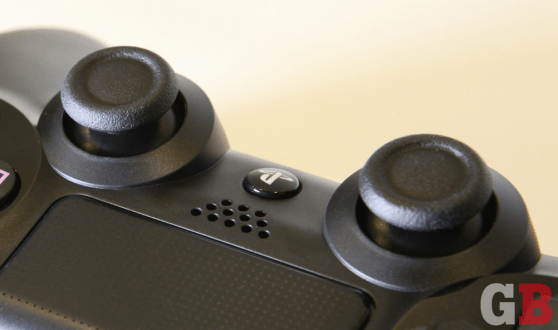
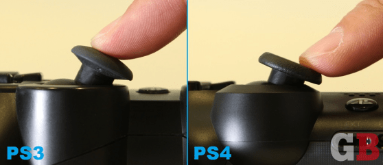
Some people prefer domed, convex pads for their analog sticks, as they provide a smoother surface to push around, especially from the edges. But it seems the overall consensus is that this shape wasn’t the best for performance. “We knew it was slippery,” said Toshimasa Aoki, the manager at SCE’s product planning department, of the DualShock 3 stick tops. “The shape never felt completely right,” said Guerrilla’s lead gameplay programmer, Tommy de Roos, who, along with ter Heide, gave input to Sony on the design of the DualShock 4.
The new tops for the PS4 are more or less concave, with a recessed center, but they’re much more nuanced than that, attempting to satisfy fans of both styles.
“We tried concave, fully convex, and different types of ridges,” said Aoki. “The convex, it just slips off. We knew that even if we changed the material, that would still happen. The concave one — when you have your thumb in the middle, it fits, and it’s pretty good. But in user tests, a lot of users still [pushed the stick tips from the side]. When you’re using the concave one, it kind of hurt a lot for those people [because of the sharper edge]. So the decision was to go with the ridged version.”
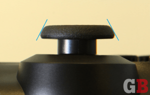
The DualShock 4 design for the analog stick tops enab gamers to rest their thumbs right in the middle of the pad and push in all directions without any slippage. This also allows people to push the sticks from the sides, touching a flatter surface without feeling a sharper rim. Sony even went as far as angling the outside of these ridges to maximize comfort for those thumbing things from the sides.
The height:
Sony maybe knows better than most that some gamers have dainty hands. Just look at Microsoft’s original Xbox controller to see the lack of that awareness.
On the DualShock 4, Sony lowered the heights of the analog sticks for one reason: to let those smaller digits move around to other parts of the controller more easily. More specifically, Sony didn’t want the sticks to get in the way of thumbs trying to reach the new touchpad (more on that later) that’s sitting up top.
The stiffness:
Driving-game and shooter developers don’t seem to agree on how stiff they want their analog sticks to be. Sony actually loosened up the DualShock 3 in response to feedback from the team behind its best-selling racing-game series. “Actually, the DualShock 2 was really stiff,” said Aoki of the old analog sticks. “DualShock 3 became really light because of the feedback from the Gran Turismo team. Since they use it for steering, if it’s too stiff, when you’re going back and forth a lot, you get tired, so they wanted to make it lighter.”
But Gran Turismo has taken a — ahem — backseat to the Call of Dutys of the world as far as popular genres are concerned. “Now, for the shooters, especially for the right stick — [those developers] wanted more precise aiming,” said Aoki. “Also, having the dead zone smaller, it doesn’t have to be that light. After testing different types of stiffness, right in between DualShock 2 and Dual Shock3 was the best stiffness that people liked. We decided to use that.” (More on that dead zone on the next page.)
Those who aren’t fans of shooters, however, needn’t worry. Aoki and his team pinged many different developers — large and small — of different genres to get their feedback on the DualShock 4. Although he said Sony gave all the studios equal weight in this input, he did admit that some had more sway than others.
“We went out to third parties — not just Sony Worldwide Studios — about the stiffness of the sticks,” said Aoki. “We sent them three or four different types of stiffness and height on the sticks. Those third parties also had their user test teams test out which stiffness was best for their games. But of course, we list out the actual comments they give, and we always write who said what. So that might have weighted things a little, especially when Guerrilla says something specific; when Santa Monica, The God of War team, says something; or when Naughty Dog says something. But especially for the stick part, we asked the big shooter teams about that.” (Naughty Dog is the developer of The Last of Us and the Uncharted series.)
The angles:
Do shorter analog sticks mean a smaller range of motion? Slightly — it’s comparable to what gamers are used to now on the DualShock 3. (“It’s still larger than the Xbox 360’s,” claims Aoki.) But trimming this down was actually intentional on Sony’s part.
“When you go all the way from right to left — if you do that continuously, it’s a pretty big thumb movement,” said Aoki. “The user tests we do are like two hours of gameplay. People commented that their thumbs and joints got fatigued. Having less motion that way, but being able to control with the same precision, was a lot better.”
The dead zone:
Analog sticks are invisible to the controller and the console itself until they’re pushed beyond a tiny circle known as the dead zone. It’s important to have this void because you don’t want your character moving whenever a small breeze wafts over your DualShock. If the dead zone is too small, the controller becomes too twitchy. If the dead zone is too large, then players have to push too hard before their on-screen avatars do anything.
With a slightly smaller far-left-to-far-right motion in the analog sticks, Sony would have to make up for those lost degrees by packing in more data in the existing range. This means reducing the dead zone from the DualShock 3 to the DualShock 4 (to get in more information and movement), which also makes the controls a bit more sensitive.
As buttons:
The left and right sticks also represent the L3 and R3 buttons, respectively, and Sony has made them both easier to click for the DualShock 4. “That was feedback from the shooter teams,” said Aoki. “The DualShock 3 — when the sticks are straight, it’s easy to press them down. But it was really hard when they were angled or sideways. So we fixed that as well.”
But how many times have we inadvertently clicked in R3 in Call of Duty, knife-slashing out into empty air when we weren’t in melee range? “Yeah, accidental presses also happened with the DualShock 3,” admits Aoki. “That’s a balance [issue for us]. You can press the sticks easily now, but you don’t want accidental presses, so we don’t want to make it too easy to press.”
The D-pad
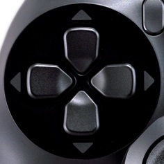 Most people probably don’t give much thought to the plus-shaped pad, using it for little more than menu navigation or some quick-select shortcut — unless your gaming sessions consist of a lot of Hadouken and Shoryukens, that is. Those fighting-game moves from the Street Fighter series require precise up-down-left-right directional joystick/joypad movement that analog sticks can’t deliver as sharply. This may seem like pretty niche use, but enough gamers care about it that Microsoft redesigned its D-pad on the 360 controller a few years back.
Most, however, still consider the PlayStation’s D-pad to be tops in the biz (as far as first-party controllers go), and surprisingly, Sony spent quite a bit of energy in attempting to improve this often-overlooked piece of plastic.
The feel:
Without having the benefit of testing this on a few matches of Street Fighter IV, we can’t say if the DualShock 4’s D-pad is legitimately better or not compared to its predecessor. But we’d be surprised if it doesn’t win everyone over. You’re going to think we’re crazy, probably noticing very little different from these pictures alone, but our left thumbs fell in love on first touch.
The four sides, or “buttons” (everyone calls them that even though it’s all one piece of plastic underneath), are more pronounced. Some of this is due to the D-pad sitting atop a flat, shiny area (versus the old one nesting within a grooved surface). And some of this is due to the shape of each protrusion (more on that below). “For us, it was important that you could feel the different button presses,” said ter Heide, “that it would all make sense from a muscle memory point of view. You would immediately feel where the button was and which direction you could push it in. I think that’s something that we improved over the PS3. They have a little bit more definition to them.”
“There’s more of a click to it as well,” adds de Roos. “You feel the press.”
The shape:
Apparently, not everyone presses on the D-pad the same. “There were two different types of people using the D-pad,” said Aoki. “There were people going around the sides, and people who [keep their thumbs] in the middle. Both were complaining that after extended gameplay, their thumbs hurt. We made a design to try to match both types of users.”
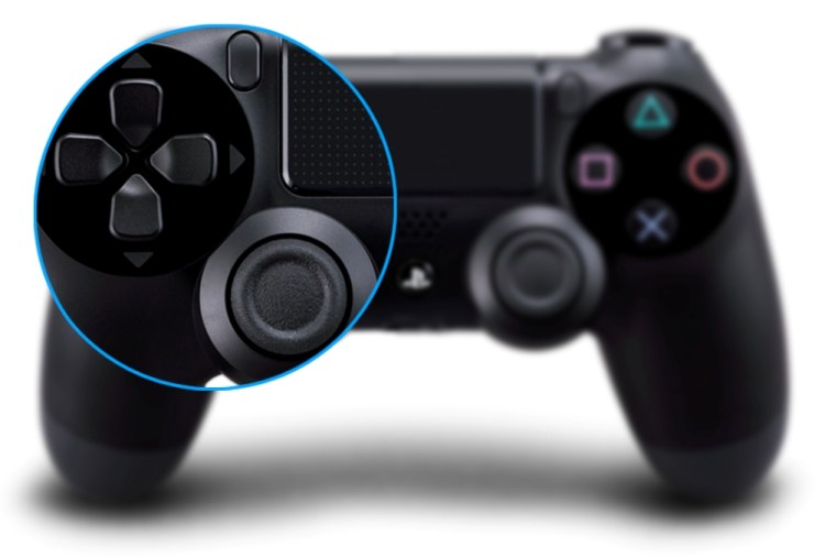
The new D-pad has a dip in the middle. The four buttons all converge into a slightly recessed, circular pit where thumbs can sit and fit more comfortably. Then, as you move from the center outward, the buttons become wider and angled higher, until they almost end in a ridge. The edges are all around sharper as well.
To sum it up, the DualShock 4 D-pad has a deeper valley in the middle and a more concave shape overall. The net effect is a form that keeps thumbs in place and buttons that feel more distinct. We’re not sure the “people going around the sides” will like the higher edges, but Sony certainly put in the time and went beyond simple clicking around menus in its research. “Especially for the D-pad tests, we used a lot of Street Fighter, of course,” said Aoki with a smile.
To be continued:
- Part 1: The weird stuff that could’ve been
- Part 2: What’s new with the analog sticks and D-pad
- Part 3: What’s new with the buttons and triggers
- Part 4: A close look at the touchpad, light bar, and everything else
Photo credits on watermarked images: Ryan O’Donnell
Special thanks to Noah Marshall and Stephen Kleckner for the Photoshop help.
VentureBeat's mission is to be a digital town square for technical decision-makers to gain knowledge about transformative enterprise technology and transact. Learn More
