This is part of our ongoing series about games and trends of the upcoming next generation. For the Xbox One version of this article, go here.
The PlayStation 4 controller:
- Part 1: The weird stuff that could’ve been
- Part 2: What’s new with the analog sticks and D-pad
- Part 3: What’s new with the buttons and triggers
- Part 4: A close look at the touchpad, light bar, and everything else
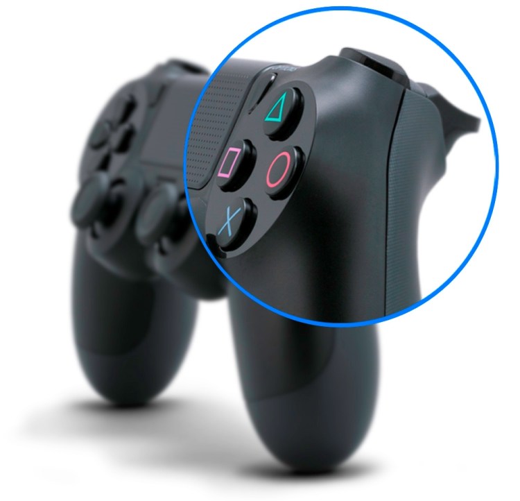
Today, with the help of some exclusive interviews, we take a very close look at the changes Sony made to the primary buttons on the new DualShock 4 controller for the upcoming PlayStation 4 console. The iconic face buttons — X, Square, Triangle, and Circle — haven’t changed much. But the shoulder keys have gone through a major redesign that should thrill most gamers when the system releases Nov. 15.
The face buttons
Let’s get this out of the way first: The face buttons on the DualShock 4 are fundamentally the same as they are on the PS3’s DualShock 3. Outside of Sony, those reading this article may be the only ones who can say what has changed. “A lot of people liked the feeling of the [DualShock 3’s] buttons,” said Toshimasa Aoki, the manager at Sony Computer Entertainment’s product planning department. “We made them as much the same as possible [for the DualShock 4]. I don’t think you would feel a difference.”
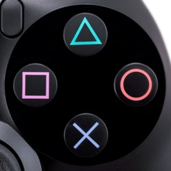
And no one’s changing the world-famous PlayStation symbols, either. “They’re so iconic,” said Tommy de Roos, the lead gameplay programmer for Guerrilla Games (makers of PS4 launch title Killzone: Shadow Fall and one of the studios that gave early input on the new controller). “There was a strong urge against changing that.”
The function:
Although the new face buttons feel the same, they don’t necessarily behave the same as their predecessors — again, not that many people will notice or even care. Older controllers can sense how hard or soft you’re pressing the front four buttons to provide a limited range of input, not just “on” or “off.” For example, maybe a firm, forceful push of the X would cause you to accelerate faster in a racing game than if you just lightly tapped it.
“With the DualShock 3, we were able to get analog data, which games didn’t really use,” said Aoki with a laugh. “For DualShock 4, we deleted that, and now it’s all digital. The mechanism inside is a little different, and the data that games get is different.”
The layout:
We bet you never knew that the DualShock 3 controller’s face buttons aren’t spaced equally apart: Square and Circle are just a teeny tiny bit farther apart than Triangle to X. No, seriously. Go take a look.
When Aoki pointed this out to us, we were a bit surprised. We never realized. “Nobody noticed it,” he told us. “Actually, when we were testing and laying it out, we said, ‘Hey, the DualShock 3 isn’t really the same distance there.'”
That’s changed on the DualShock 4, and the face buttons now form a perfect square. This tweak wasn’t just to appease some anal-retentive engineer at Sony. It’s to make a little room. “When we designed the DualShock 4,” said Aoki, “we wanted the touchpad to be in the middle and as large as possible but not enough to make the controller really big. We made the square and circle a little closer, so they’re the same distance as all the buttons. That saves horizontal space to have more for the touchpad.”
The shoulder buttons
While X, Square, Triangle, and Circle didn’t get their face-button-lifts, the four bumpers on the top of the controller went through some major changes, all for the much, much better. Starting with the most obvious … .
The shape:
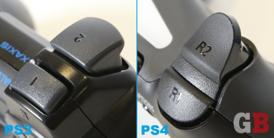
The formerly bulbous shoulder buttons in the back row, L2 and R2, are now curved inward, making them trigger-shaped like on the Xbox 360 controller. Shooter fans should obviously be pleased. “The triggers feel a lot better now,” said Shadow Fall’s director, Steven ter Heide. “They feel a lot more natural.” So natural that the Killzone team has made R2 the “shoot” button for its upcoming PS4 outing, when traditionally it’s been R1 in this first-person-shooter series. (You can opt for either in the game’s settings.)


