According to both Morris and Alam, a lot of these notions just didn’t click with the testers or the game developers. “We do these sorts of sanity checks to make sure that we’re doing the right thing,” said Morris. “You start out with assumptions about what will be an improvement for the end user. We have to stop and say, are we really doing the right thing? Is this valuable? We had three different groups that we’d [check with]. We had regular users that our research team would recruit from the area. We also had ties to some fairly elite users that had high Xbox Live Gamerscores. We also had a lot of industry veterans from our Halo, Forza, and other internal Microsoft Studios teams that have been gaming for decades. So we made sure we were addressing regular casual gamers, all the way up to people who have been gaming for decades and are so used to what they have today.”
“We investigated, and we built prototypes. [Many of these experimental features weren’t] really important. Our core base didn’t appreciate them,” said Alam.
Big spenders
We find it slightly amusing that Microsoft went from not wanting to modify the Xbox 360 controller to making hundreds of prototypes — the ones you see in these photos are only a small fraction — and playing with some out-there experiments. Funnier still, “don’t change anything” eventually gave way to a humongous investment in researching, prototyping, testing, and manufacturing.
Initially, Alam told us that Microsoft spent “hundreds of millions” of dollars on creating just the controller, not counting the rest of the Xbox One. When we asked for clarification (backed with wide eyes and an agape mouth), he told us, “I don’t want to go into specifics, but it’s over $100 million for sure. Between the tooling of the device, the investments we made in process technology, and the engineering work that went into it, we invested a lot to get this thing right.”
As a quick example of how U.S.-government-spending-like this all is, Microsoft spent millions alone in getting the X/Y/A/B face buttons to appear the way they do, with the colored letters popping in a very specific fashion. (More on that in part three.)
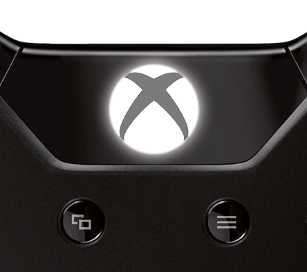
Another example is the revamped Guide button that sits in the top-center of the controller that accesses most system functions and the dashboard from which you launch games and other applications. It’s now flat (compared to the domed shape from the Xbox 360), but it has a thin layer of metal covering a light bulb underneath, which creates a soft white illumination everywhere but the “X” part of the Xbox logo.
Just this alone took months of fine-tuning and multiple layers of plastic to get a consistent glow to come through the metal without any bright hotspots. According to Alam, this wasn’t a simple engineering feat. “On the console itself, [the lit Xbox logo] is easier because you have unlimited power,” he said. “On this controller, you don’t. You’re running off a battery. You have to be very careful with how you light the LEDs, how much current they consume, and how to make sure that it’s still uniform. Again, the investment required is tremendous. The Guide button is a work of art.”
It wasn’t as though Microsoft just signed a check for “hundreds of millions” of dollars right up front. Alam’s team started smaller and had to prove to the bosses that it was making smart decisions each step of the way. “The company is happy to invest,” he said. “The point was to make sure we did it right. Each time you ask for more money, you have to go through a gate where you’re like, ‘Hey, look at what we’ve delivered so far. We have to take it just a little bit more.'”
Those gates have racked up quite the tab, even for a mammoth company like Microsoft. But no one seems to be looking back. “No, it’s not a drop in the bucket,” said Alam, laughing. “For any company, when you spend that much money, you have to make sure that the output is amazing. This team bet its careers on this. We were all in. When we went in and said we wanted to do this, we didn’t anticipate it was going to be tweaking a little bit of plastic here or there. That was not the intent. My management team said, ‘Either you’re going to make changes, and you’re going to believe in the changes you make, and you’re going to make sure that they’re amazing — or you’re not touching this thing.'”
To be continued:
- Part 1: Projectors, smells (!), and other stuff that didn’t make it in
- Part 2: What’s new with the analog sticks and D-pad
- Part 3: What’s new with the buttons and triggers
- Part 4: A close look at the new rumble, faster speed, smooth design, and everything else
Photo credits (nonstock shots): Jeff Emtman. Special thanks to VentureBeat reporter Tom Cheredar for the image-editing help.
VentureBeat's mission is to be a digital town square for technical decision-makers to gain knowledge about transformative enterprise technology and transact. Learn More


