This is part of our ongoing series about games and trends of the upcoming next generation. For the PlayStation 4 version of this article, go here.
The Xbox One controller:
- Part 1: Projectors, smells (!), and other stuff that didn’t make it in
- Part 2: What’s new with the analog sticks and D-pad
- Part 3: What’s new with the buttons and triggers
- Part 4: A close look at the new rumble, faster speed, smooth design, and everything else
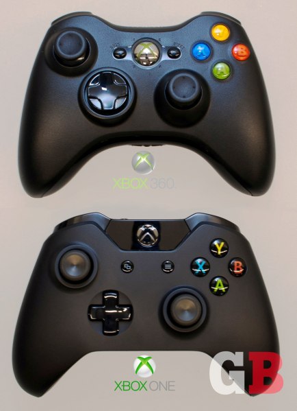
A lot of gamers consider the current Xbox 360 controller to be the best — the pinnacle of feel-right, work-right design when it comes to kicking soccer balls, slicing ninjas, speeding on asphalt, or putting bullets into zombies’ heads. And the higher-ups at Microsoft know it. That’s why, initially, they didn’t want to change anything about it for its next-generation console, which comes out Friday.
Yes, in an alternate universe, we get the exact same controller again for the Xbox One.
And from outwardly appearances, it might not seem like the company has done much to it. The familiar layout and shape are still intact. It has similar buttons, triggers, and analog sticks. And you don’t immediately notice any new features like you do with the PlayStation 4 controller and its touchpad and light bar, for example.
But how did Microsoft go from “don’t mess with it” to investing well over $100 million in researching new ideas (including a device that emits smells) — and then end up with a controller that looks more or less the same but is greatly improved a lot more ways than you’d think?
GamesBeat got an exclusive, behind-the-scenes look at the whole process, which we’ll share with you throughout this four-part series. Today, we look at early prototypes, some crazy functions that didn’t make it in, and where all that money went.
Microsoft has done a lot of research and knows full well that consumers generally favor the modern-day Xbox 360 controller over all others from the previous generation. Yet its employees know that a relevant company is never a complacent one. “We knew that there were things we could improve, even though it was the best-in-class controller,” said Microsoft senior industrial designer Quintin Morris.
Zulfi Alam, Xbox’s general manager for accessories, agrees. Years ago, without even knowing yet what he and his team wanted to improve, he was pushing for change: “When we started this program, I went and said, ‘Hey, we need to think about redesigning the Xbox 360 controller.’ The reaction was vociferously negative. ‘Are you guys crazy? This is the best-in-class controller. People love this.'”
Funny how both Morris and Alam independently used the words “best in class” in separate, exclusive interviews with GamesBeat, but we can’t really refute it. Very few gamers will say they prefer the PlayStation 3 or Wii U controllers for the most popular genres like first-person shooters. Even Sony acknowledged this and took inspiration from the Xbox 360 for its DualShock 4.
This doesn’t mean, however, that Microsoft didn’t look at what the other guys are doing. “We absolutely look at our competition, because we respect the competition,” said Alam. “But quite frankly, in the controller space, we are convinced that our device is the best in class. I think it’s a well-known fact. You double-check and look around you to make sure you’re not missing anything, but we weren’t encumbered by saying, ‘Hey, go copy that.'”
(Hmm, we wish Microsoft would stop being so coy about where it thinks its 360 controller ranks.)
Golden hands
The bosses eventually gave in, but they weren’t necessarily all in — at first. Caution still dictated what Alam and company could do. “We were told, ‘Fine, go ahead and invest in this space, but make sure you review and counter-review everything. Make sure you build prototypes up front. Make sure you get them tested with golden hands,'” said Alam. “That was the bar. The bar was extraordinarily high.”
Some of you reading this article might have those fabled “golden hands.” This is how Microsoft internally labels hardcore gamers who end up understanding the minutiae of the controllers better than the people who designed them. It may seem like counterintuitive business, trying to appease the core players instead of making a more mainstream-accessible input device. But 1) that’s what the motion-sensor camera Kinect is for, which is included with each system, and 2) surprisingly, this ended up being a common thread in our research into the Xbox One’s controller. Not only is Microsoft going after the enthusiast gamers, but it’s going after the most hardcore of the hardcore, including the e-sports crowd. (As you read further into this series, you’ll see what we mean.)
And keeping those golden digits happy means one thing right up front: Don’t screw with the basic layout. “People invested a lot of time in learning this,” said Morris. “The muscle memory of being able to hit these buttons really quickly gets imprinted on you, so you can do it without thinking. The people who had invested that time would lose the benefit of all their experience [if we changed too much].”
Basic tests
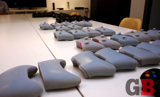
Microsoft’s first tweaks for a new controller focused on the overall size and how it’d fit into hands, golden or otherwise. Using the Xbox 360 controller as a starting point, the engineers would make plastic-molded or 3D-printed prototypes that were each 1 millimeter wider or narrower than the last, testing a full range of up to plus or minus 8 millimeters. “That gave us the ability to test, with actual users including women and children, which width feels best,” said Morris. “We tested with more than 500 people throughout the course of the project. All ages, all abilities.”
We’re pretty certain that an Andre the Giant type might have a different opinion on how beefy the controller should be compared to someone considerably more dainty. You’d think Microsoft would just take some sort of average to appease everyone, but that wasn’t really the case. “Ultimately, you don’t really get a definitive answer out of [these user tests],” said Morris. “You get a general opinion that points you in the right direction. It’s not so black-and-white as ‘this is the right answer for this attribute.’ You test each attribute to understand them, but … ultimately you’re testing [how everything comes together].”
Morris and his team then looked at different thicknesses and shapes of the grips (or “lobes,” as he calls them), plus the angle of the triggers, different styles of analog sticks, and more. You can see some of the different ideas in the pictures in this article, and we’ll discuss each component in more detail in the next few installments of this series.
Eventually, once the engineers narrowed down some of the options, they went away from solid molds and started building working models for testers to try out, using Xbox 360 controller innards to make them function with live games. “We knew that you couldn’t design a new controller without letting people play with it,” said Morris. “[A solid, mold-only] prototype would not suffice to let people experience what it was like.”
(Continued below, after the photo gallery)
Screens, speakers, displays, projectors, and … smells
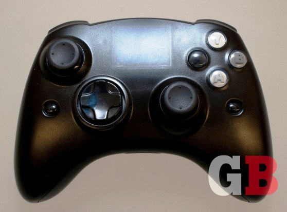
Despite all this “best in class” talk, Microsoft did experiment with extracurricular, sometimes far-fetched ideas for the new controller. “We had a whole bunch of brainstorm sessions and built hundreds of models,” said Alam. “We looked at concepts like adding displays to the controller. We looked at concepts like adding smell.”
Mind you, they didn’t just look at them. They actually built all these as working prototypes. So yes, somewhere in Microsoft’s R&D labs exists an Xbox One joypad that can raise a literal stink. “We built small slugs of different types of smells that could actually come out of a controller,” said Alam. “Like, as you walked through a jungle, you’d smell the flora.”
Microsoft also built test controllers that has some features that its competitors are using now, such as a touchpad (PS4), camera (Wii U), and speakers (both). But “each one of these ideas fell down,” said Alam. Some of that is because the company’s philosophy toward the controller is the same as it is toward the console in general: The Xbox One and the television should be the two most important things in the living room, working together. “You’ve got a great TV with a better speaker than we could ever put in this controller,” said Morris. “And it made more sense to [not make players look down at a display], keeping the user’s attention on the TV. We really want them to be immersed in the experience that’s happening in front of them.” Plus, with an extra screen, “You’re burning battery life like there’s no tomorrow — not a great idea,” said Alam.
The camera seemed a little redundant, too, since each console comes with the updated Kinect, which already does what MS would’ve wanted a controller version to do. “It was one of our more extreme ideas,” said Alam. “Not only is it context-aware of what’s going on, it’s looking at you and picking up stuff like your heartbeat. You can infer some biometrics from cameras.”
And when Microsoft mentions displays, it doesn’t just mean an extra little screen on the joypad. It actually experimented with having a tiny projector which would beam out ambient visuals around the player. This was also nixed due to battery-life issues and Microsoft’s desire to keep gamers focused on the TV.
According to both Morris and Alam, a lot of these notions just didn’t click with the testers or the game developers. “We do these sorts of sanity checks to make sure that we’re doing the right thing,” said Morris. “You start out with assumptions about what will be an improvement for the end user. We have to stop and say, are we really doing the right thing? Is this valuable? We had three different groups that we’d [check with]. We had regular users that our research team would recruit from the area. We also had ties to some fairly elite users that had high Xbox Live Gamerscores. We also had a lot of industry veterans from our Halo, Forza, and other internal Microsoft Studios teams that have been gaming for decades. So we made sure we were addressing regular casual gamers, all the way up to people who have been gaming for decades and are so used to what they have today.”
“We investigated, and we built prototypes. [Many of these experimental features weren’t] really important. Our core base didn’t appreciate them,” said Alam.
Big spenders
We find it slightly amusing that Microsoft went from not wanting to modify the Xbox 360 controller to making hundreds of prototypes — the ones you see in these photos are only a small fraction — and playing with some out-there experiments. Funnier still, “don’t change anything” eventually gave way to a humongous investment in researching, prototyping, testing, and manufacturing.
Initially, Alam told us that Microsoft spent “hundreds of millions” of dollars on creating just the controller, not counting the rest of the Xbox One. When we asked for clarification (backed with wide eyes and an agape mouth), he told us, “I don’t want to go into specifics, but it’s over $100 million for sure. Between the tooling of the device, the investments we made in process technology, and the engineering work that went into it, we invested a lot to get this thing right.”
As a quick example of how U.S.-government-spending-like this all is, Microsoft spent millions alone in getting the X/Y/A/B face buttons to appear the way they do, with the colored letters popping in a very specific fashion. (More on that in part three.)
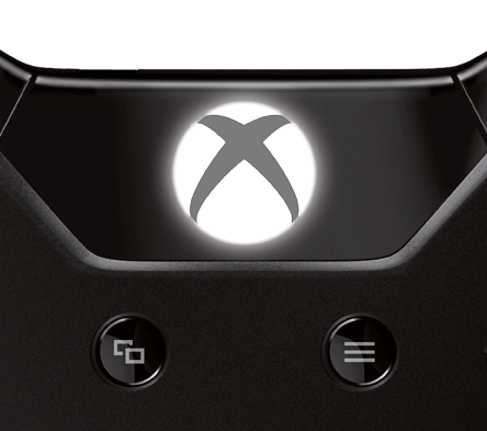
Another example is the revamped Guide button that sits in the top-center of the controller that accesses most system functions and the dashboard from which you launch games and other applications. It’s now flat (compared to the domed shape from the Xbox 360), but it has a thin layer of metal covering a light bulb underneath, which creates a soft white illumination everywhere but the “X” part of the Xbox logo.
Just this alone took months of fine-tuning and multiple layers of plastic to get a consistent glow to come through the metal without any bright hotspots. According to Alam, this wasn’t a simple engineering feat. “On the console itself, [the lit Xbox logo] is easier because you have unlimited power,” he said. “On this controller, you don’t. You’re running off a battery. You have to be very careful with how you light the LEDs, how much current they consume, and how to make sure that it’s still uniform. Again, the investment required is tremendous. The Guide button is a work of art.”
It wasn’t as though Microsoft just signed a check for “hundreds of millions” of dollars right up front. Alam’s team started smaller and had to prove to the bosses that it was making smart decisions each step of the way. “The company is happy to invest,” he said. “The point was to make sure we did it right. Each time you ask for more money, you have to go through a gate where you’re like, ‘Hey, look at what we’ve delivered so far. We have to take it just a little bit more.'”
Those gates have racked up quite the tab, even for a mammoth company like Microsoft. But no one seems to be looking back. “No, it’s not a drop in the bucket,” said Alam, laughing. “For any company, when you spend that much money, you have to make sure that the output is amazing. This team bet its careers on this. We were all in. When we went in and said we wanted to do this, we didn’t anticipate it was going to be tweaking a little bit of plastic here or there. That was not the intent. My management team said, ‘Either you’re going to make changes, and you’re going to believe in the changes you make, and you’re going to make sure that they’re amazing — or you’re not touching this thing.'”
To be continued:
- Part 1: Projectors, smells (!), and other stuff that didn’t make it in
- Part 2: What’s new with the analog sticks and D-pad
- Part 3: What’s new with the buttons and triggers
- Part 4: A close look at the new rumble, faster speed, smooth design, and everything else
Photo credits (nonstock shots): Jeff Emtman. Special thanks to VentureBeat reporter Tom Cheredar for the image-editing help.
VentureBeat's mission is to be a digital town square for technical decision-makers to gain knowledge about transformative enterprise technology and transact. Learn More


