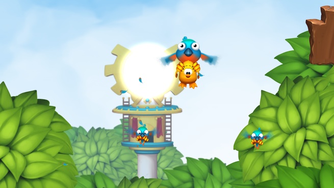
Creative writing classes preach how you should always “show,” not “tell,” your characters and scenes. The more descriptive you are, the better it is for the reader.
Toki Tori 2 (out for Wii U and PC sometime this year) takes this lesson one step further — you won’t find any text in the game telling you what you need to do or what the story’s about. It even lacks a traditional title screen.
On developer Two Tribe’s latest blog post, freelance director Niels ‘t Hooft reveals why the development team decided to get rid of text altogether in its puzzle-platforming game.
I’m told that it all started as a clever way to cut the development budget, which is game dev jingo for both time and money. If your game has thousands of words in it, and you want to reach a broad international audience, you have to translate everything into at least a dozen languages. It’s easy to see that you might prefer spending the necessary budget on gameplay polish!
So someone said: What if we just skip the writing? If we don’t have any words, we don’t have to translate them either. Thinking about this idea, the team at Two Tribes got philosophical about text, especially tutorials.
After spending some time with it last year, I don’t find this too surprising. Two Tribes co-founder Collin van Ginkel handed me a Wii U GamePad without saying much about Toki Tori 2. I found it refreshing to just explore Toki Tori’s world and figure out how the levels shape and influence the deceptively simple gameplay.
It was Hooft’s job to craft the wordless story. He explains:
Writing without words: That was a fun challenge for me, too. We kicked ideas around for a while and ultimately came up with a couple of interactive cut scenes that explain what’s wrong with the island and why. Well, not everyone may notice everything. But it’s all there!
Two Tribes did have to make an exception to this rule: One of the requirements of getting Toki Tori 2 on Nintendo’s eShop is that it had to include an in-game manual.
VentureBeat's mission is to be a digital town square for technical decision-makers to gain knowledge about transformative enterprise technology and transact. Learn More

