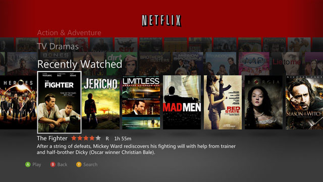
To go along with yesterday’s massive Xbox Live updates, Netflix has pushed out a new user experience for the Xbox 360. The Netflix application has undergone a complete overhaul, providing people with a completely new look and several new features.
The new Netflix for Xbox has a similar look and feel to Xbox Live’s new dashboard. The previous scrolling navigation is there, but with a new look that predominantly features stacked rows of movie and TV art, broken down by category. The new style is meant to enhance and improve browsing Netflix offerings with an Xbox Kinect.
Netflix boasts that the updated app displays three times more titles on the screen when you’re browsing and more titles overall in the app. The categories remain largely unchanged; you still see Recently Watched, Queue and all the strangely specific genres that Netflix thinks you like, such as “Witty Independent 20th Century Period Pieces.” Once new feature is that after a few seconds Netflix will show a screenshot of a scene from whatever movie or TV show you have selected on the main navigation screen.
Playing videos with the latest Netflix update has changed. You can now watch a TV show or episode while browsing episodes or reading a description of the video. Once a video has reached its end, Netflix will display a banner below the video that lets you play another episode (for TV shows) or end playback. For those familiar with using Hulu, the banner will seem familiar, as it has a similar look and feel.
If you have an HD TV and/or a surround sound system, the update ushers in better picture and sound quality with support for 720p HD streaming and Dolby Digital 5.1 surround sound. This update also brings Netflix to some Latin America Xbox owners. Chile, Brazil, Mexico, and Columbia can now stream Netflix on a Xbox 360.
While the new Netflix look has delivered significant changes to the look and feel of the app, it has also taken some features away. The ability to watch videos with a group of people on different Xboxes, aka the Party feature, is seemingly missing, and that has angered some Xbox owners. Also, while the app shows you on its home screen which buttons to press on the Xbox controller to play a video, there are no such cues with the banner that appears at the end of a video. I can imagine they designed this with Kinect users in mind, but for those navigating with a controller it can be confusing.
Some people, myself included, found issues with video playback in general. It could have just been overloaded servers from the Xbox Live update, but playback was choppy and had issues with freezing.
While this update was meant to seamlessly blend with the new Xbox Dashboard, many have lashed out against Netflix. Over on the Netflix blog you can read comments of complaints about the update, issues with playback and anger over the loss of the Party feature. While the look of the new Netflix is sleek and stylish, it doesn’t seem to be getting much praise.
VentureBeat's mission is to be a digital town square for technical decision-makers to gain knowledge about transformative enterprise technology and transact. Learn More

