Want smarter insights in your inbox? Sign up for our weekly newsletters to get only what matters to enterprise AI, data, and security leaders. Subscribe Now

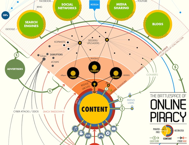
If someone were to layout all the important organizations, factions, companies, and components of the war on online piracy into a comprehensive battle map, it would look like the infographic below.
The “map” is basically visualized as a region of space with a sun-like “content” circle placed directly in the center, with shells of DRM and DMCA wrapped around it. Beyond that, the infographic, which was created by visual data startup Visual.ly, has several layers that each identify a portion of the ecosystem driving the war on piracy. There are waves of file restrictions and take-down notices as well as various “zones” of copyright violators. Each zone has an appropriate mix of organizations, as you can see below. (I found the “Safe Harbor” zone to be the most interesting, personally.)
And while I could explain each portion in detail, it’s probably best to just give it a closer look.
“We wanted to do something on online piracy but the data is, by its nature, elusive,” Visual.ly Creative Director Jess Bachman told VentureBeat. The startup’s main focus isits data visualization service that allows people to create visually appealing infographics, which can then tell a story using the otherwise bland data from various APIs as well as publicly available information.
Visual.ly also provides its users with a platform to share cool infographics from around the web. Occasionally, the company even produces its own original infographics, such as the recently published Battlespace of Online Piracy.
In regards to Visual.ly’s inspiration for Battlespace, Bachman added:
“Activity outside the legal system is hard to track. The other issue is that online piracy is a very convoluted and connected topic. There are so many players, platforms and processes, that it’s hard to know where to begin when talking about it. So we thought a relationship diagram would be a good way to orient the uninitiated to online piracy. Additionally, a comprehensive relationship diagram can pay service to all parties involved. While most news media focus on the MPAA and RIAA, there are other powerful lobbying groups like the BSA and ESA. Similarly, we often think content gets on the Piratebay and then onto people’s hard drives, but there are other steps and parties involved like release groups and seeders. When trying to get a handle on a complicated issue, perspective is paramount. That is what this graphic provides.
Let us know what you think of the infographic in the comment section. (Click image to enlarge.)