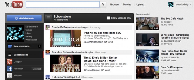
YouTube redesigned its home page yesterday to add emphasis on “channels,” but the site’s users are up in arms about the changes.
[aditude-amp id="flyingcarpet" targeting='{"env":"staging","page_type":"article","post_id":360695,"post_type":"story","post_chan":"none","tags":null,"ai":false,"category":"none","all_categories":"media,","session":"D"}']The popular video site added “channels” in a left column that can be selected to show videos in a wide middle column. Google+ and Facebook are integrated as channel feed options, as well as other users you have subscribed to previously. The right column on the home page shows recommended videos.
Most likely, the site is doing this because it will integrate its own professional channels as options to follow, as it tries to get more regular TV viewers to frequent the site. Back in October, it was reported that Google had allocated $100 million for original programming channels, and the site is also working with celebs like Jay-Z and Ashton Kutcher on content.
AI Weekly
The must-read newsletter for AI and Big Data industry written by Khari Johnson, Kyle Wiggers, and Seth Colaner.
Included with VentureBeat Insider and VentureBeat VIP memberships.
Some choice comments on the official video introducing the changes, titled “Get More Into YouTube,” show how users are reacting. Most users are angry, with the intro video collecting 9,644 dislikes and 3,044 likes by mid-day Friday.
Davve941018 wrote: “Have you fired the pathetic excuse of a web designer that came up with this abomination of a design yet?” wrote .
KriegKadaver wrote: “They’re turning YT into TV, pretty soon there will be no interaction, and you will not be able to find any actual useful vids at all, only the crap that partners paid YouYube to shove into your homepage.”
Screwbacca556 wrote: “Next year, the site will just be a picture of a middle finger.”
Although, user CrashWhiz might have summed up the attitudes to the changes best by saying:
“Whenever YouTube does something new, people claim to hate it, and they wish for the old layout. But in the end, everyone gets used to it and completely forgets how it was before. So, the next time they change the layout, everyone will be praising this one.”
[aditude-amp id="medium1" targeting='{"env":"staging","page_type":"article","post_id":360695,"post_type":"story","post_chan":"none","tags":null,"ai":false,"category":"none","all_categories":"media,","session":"D"}']
What do you think of the site’s changes?
VentureBeat's mission is to be a digital town square for technical decision-makers to gain knowledge about transformative enterprise technology and transact. Learn More
