Much has been said about the challenges app developers have encountered while tackling their designs for the Apple Watch. As is often the case with any game-changing device, there are a whole host of new considerations to keep in mind — everything from the functionality to the aesthetics needs a fresh take. With these new perimeters in mind, our design team at Avaamo spent months prior to the official Apple Watch launch, testing and retesting our business messaging app. Throughout the design process, we found that in order to build an effective app, it was critical to keep three key principles in mind.
1. Keep it minimal
First and foremost, the Apple Watch was consciously designed to be used as little as possible. You really get that sense immediately when you use it. Its raison d’être, according to Ives and the Apple Watch design gurus, was to solve a growing problem mostly created by Apple itself: The iPhone is taking over our lives with constant connectivity, buzz and distraction. Yes, we want engagement and connection, but how can we filter the interruptions in a manner that doesn’t remove us from our immediate experience? The answer is simple: You must design something to not be used.
You must shorten the interaction. You must get people in and out as quickly as possible. In fact, Apple’s User Interface Guidelines recommend that developers keep all interactions under 30 seconds. Thirty seconds actually feels like an eternity if you hold the watch upright that long, and it is quite uncomfortable. For example, for the Avaamo messaging app, we initially tried to replicate our iPhone app on the Watch. It became immediately apparent that this full featured approach took far too long and was frankly intolerable.
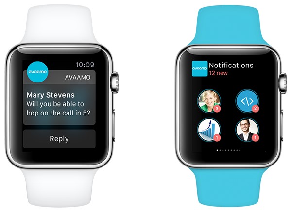
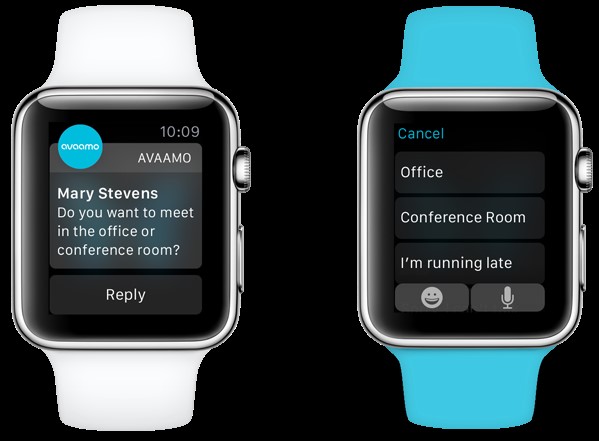
As a result, we decided to center our design and UX on the built-in Notifications and Glances. We wanted users to see new or recent messages and be able to respond to them immediately, without ever having to get into the app. For incoming notifications, they had to be actionable: Get the message and respond or dismiss. To quickly reply, we spent a lot of time creating our own business emojis and also came up with a suite of the most relevant canned text responses. This may seem strange, but we actually found ourselves using this feature the most and are constantly updating the options to make them even more useful and contextually relevant (more on this later).
AI Weekly
The must-read newsletter for AI and Big Data industry written by Khari Johnson, Kyle Wiggers, and Seth Colaner.
Included with VentureBeat Insider and VentureBeat VIP memberships.
Glances provide a second, or backup, level of notifications displaying a concise summary of recent messages. Glances aren’t for every app, but we felt they worked particularly well for ours since it is a messaging app. A glance occurs when the user swipes up on an activated Watch. Many apps have a glance view, so you often find yourself swiping through quite a few. To cut through the clutter, our solution was to make it as visual and striking as possible: We eliminated text altogether to only show the avatars of the most recent messages. We love the simplicity of glances and are brainstorming ways to incorporate a glance-style notification or display into our iPhone app.
2. Keep it colorful
You’re designing on a tiny black screen with very few elements on it. Colors SCREAM out. You’ll want to use bright, high-contrast colors for your app. The Avaamo color palette on the iPhone contained mostly subdued and slightly desaturated colors, which looked great on an iPhone with a white background. However, when we translated the same palette to the Apple Watch’s black background, it looked muddy and muted. We had to brighten and increase the contrast to really make the UI pop and give it some energy. Also keep in mind that text and icons often play a substitute role to buttons on the iPhone, so their use takes on an added importance on the Apple Watch.
One realization after seeing our app on the Watch was that it felt claustrophobic and too “listy.” Worse, it simply looked like too many other Watch apps. Scrolling with the crown was very smooth and effective, so we decided to redesign our messaging screen with a much more colorful card-style layout showcasing the user avatars. The large avatars provided warmth, quick recognition, and were easy to quickly scroll through and click.
3. Keep at it
Plan on making iterations. We did. Avaamo is trying to design the best Apple Watch app it can, but since it’s an entirely new interaction platform, there is a learning curve, and you probably won’t get it right the first time. It’s an entirely different world seeing your design on the Watchkit simulator and playing with your app on your wrist. Now that it’s released and we finally can test in the field, find bugs, and get feedback, the industry-wide Apple Watch development has only just begun. With the Apple Watch’s small, minimal screen, it is easy to rapidly design, prototype, and iterate.
The real challenge designing on the Apple Watch, where interactions are short and screen space is limited, is predicting a user’s interaction or behavior and providing the right contextual response. For example, replying to a message on the Watch is less than perfect right now. You can always do a voice response, but often this feels awkward, depending on the setting. Emoji’s are fine, but very general. Our canned text responses seem quite useful, but they’re not always specific enough. Predictive intelligence is really the next frontier, where anticipative responses are given based on specific keywords in the message. For example, if someone messages, “Do you want to meet in the office or conference room?” a series of contextually-aware responses would reveal themselves, starting with two buttons, one for “office” and one for “conference room.” Obviously, this is a long-term goal and requires some sophisticated AI integration, but thinking in a predictive way on the Apple Watch still lends itself to a better user experience in the short term.
Looking down the road
Since the Apple Watch is tethered to your iPhone, in many ways it has made it the center of Apple’s digital ecosystem (sorry, Macbook), though maybe not the innovator anymore. Many of the new cutting edge features of the Apple Watch like Force Touch, Glances, and perhaps digital touch (the “Taptic” engine) might indeed find their way back to the iPhone as they seem superior in simplicity and much less distracting. It didn’t take long for many of the best iPhone features to make their way to the Mac, and we’re likely to see a similar cross-pollination with the Apple Watch.
Ryan Alexiev is the Creative Director for Avaamo, a messaging application provider for mobile-first enterprises and mobile-first workers.
VentureBeat's mission is to be a digital town square for technical decision-makers to gain knowledge about transformative enterprise technology and transact. Learn More


