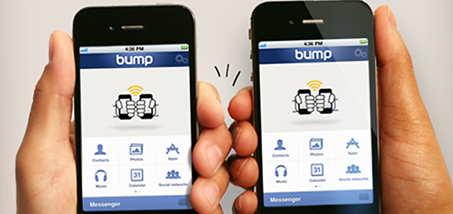
In a refreshing about-face from mobile apps’ usual version-to-version progression, the team behind phone-to-phone sharing app Bump has amputated all extraneous features from the app, mercilessly whittling it down to only two functions.
[aditude-amp id="flyingcarpet" targeting='{"env":"staging","page_type":"article","post_id":391537,"post_type":"story","post_chan":"none","tags":null,"ai":false,"category":"none","all_categories":"mobile,","session":"C"}']The Bump makers saw that most of the app’s users were using Bump for just two things: sharing photos and swapping contact info.
So for the newest version of the app, they simply cut out all the other features.
AI Weekly
The must-read newsletter for AI and Big Data industry written by Khari Johnson, Kyle Wiggers, and Seth Colaner.
Included with VentureBeat Insider and VentureBeat VIP memberships.
“In the previous UI, most people would explore one or two features, and if they didn’t find a place for Calendar or Music in their life, they’d give up the app,” co-founder Jake Mintz told us during a recent visit to VentureBeat’s San Francisco headquarters.
“Since we know these two features do fit into people’s lives, we think it really stands a better chance,” he said.
This time around, Lieb told us the crux of the matter: “Bump does less than it used to do, but it does it better.”
“We made those two actions as good as we possibly could. The app now is very much built around content,” he said.
The benefit of leaving all those fun-filled but underused features on the cutting room floor is that the Bump team was able to focus on making sharing contact info and sharing photos a bug-free and beautiful process. It’s also a lot simpler than it was in past iterations.
[aditude-amp id="medium1" targeting='{"env":"staging","page_type":"article","post_id":391537,"post_type":"story","post_chan":"none","tags":null,"ai":false,"category":"none","all_categories":"mobile,","session":"C"}']
The team “made big changes to the technology to avoid common usability failures,” said Mintz. For example, a slip-up in the “bump” gesture might lead to an awkward “re-bump.”
But no more.
“What matters for us right now is building a rich experience for the people who really want to use it,” said Mintz.
[aditude-amp id="medium2" targeting='{"env":"staging","page_type":"article","post_id":391537,"post_type":"story","post_chan":"none","tags":null,"ai":false,"category":"none","all_categories":"mobile,","session":"C"}']
One of the Bump app features that got cut was app-sharing — that is, the ability to see which apps you and a buddy or new acquaintance have in common. While the feature will remain in the Android app (the Android OS offers a simple API for calling up the full list of apps on the bumped device), the iOS version will not have this feature.
“We put a lot of energy into developing this very elaborate system,” said Mintz of the iOS app-sharing feature. “It would occasionally work perfectly, and when that happened, people loved it, but users were dissatisfied most of the time.”
Another feature that got cut was music-sharing. While the feature had tens of thousands of users, Lieb et al. questioned how often they actually used and returned to the feature. And, after all, tens of thousands was a drop in the bucket of Bump’s 77 million users — not to mention the 2 million photos that get shared on Bump every day.
“Technology is a big enabler, but it can also make things way more complicated,” he said. “We took the great part of technology and kept the simplicity of how you want to share things. Going forward, we’re going to make contacts and photo-sharing an even better experience.”
[aditude-amp id="medium3" targeting='{"env":"staging","page_type":"article","post_id":391537,"post_type":"story","post_chan":"none","tags":null,"ai":false,"category":"none","all_categories":"mobile,","session":"C"}']
In fact, the company is so focused on doing few things and doing them well that it’s also limiting the number of platforms the app will be available on. While Bump will be sticking with iOS and Android, the team is panning BlackBerry and Windows Phone — for now.
Lieb said the team would be watching Windows Phone sales figures in the future. Ultimately, however, the startup will only make apps and features that can be well maintained.
Currently, the team is working on separate apps in experimental stages; these new apps attempt to simplify problems that technology has sadly made complex.
You can bet we’ll be following up on that, so stay tuned.
[aditude-amp id="medium4" targeting='{"env":"staging","page_type":"article","post_id":391537,"post_type":"story","post_chan":"none","tags":null,"ai":false,"category":"none","all_categories":"mobile,","session":"C"}']
VentureBeat's mission is to be a digital town square for technical decision-makers to gain knowledge about transformative enterprise technology and transact. Learn More