
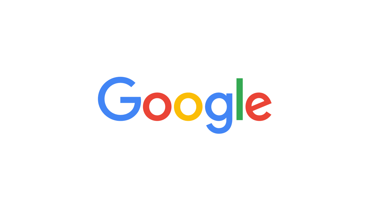
Google just unveiled its new logo. In fact, the new look is more than just a new logo: The company has revamped its whole “identity family,” which essentially refers to its whole design branding.
Google has been around for 17 years, and the company has rebranded multiple times. The original imagery was meant for a single desktop browser page, but now the company has products “across many different platforms, apps and devices” and is targeting “a world of seamless computing across an endless number of devices and different kinds of inputs (such as tap, type and talk).”
[aditude-amp id="flyingcarpet" targeting='{"env":"staging","page_type":"article","post_id":1795059,"post_type":"story","post_chan":"none","tags":null,"ai":false,"category":"none","all_categories":"marketing,media,mobile,","session":"B"}']In other words, Google is changing its logo so that it makes sense regardless of where you see it. That includes computers, phones, TVs, watches, the dashboard in your car, and so on.

Here is Google’s explanation for the change:
It doesn’t simply tell you that you’re using Google, but also shows you how Google is working for you. For example, new elements like a colorful Google mic help you identify and interact with Google whether you’re talking, tapping or typing. Meanwhile, we’re bidding adieu to the little blue “g” icon and replacing it with a four-color “G” that matches the logo.
This isn’t the first time we’ve changed our look and it probably won’t be the last, but we think today’s update is a great reflection of all the ways Google works for you across Search, Maps, Gmail, Chrome and many others. We think we’ve taken the best of Google (simple, uncluttered, colorful, friendly), and recast it not just for the Google of today, but for the Google of the future.
And here are all the animations that go along with the new branding:
The new look will roll out across all the company’s products “soon.” Indeed, if you navigate to Google‘s homepage in your respective country, you should see another animation showing the old logo being replaced by the new one:
The timing really shouldn’t come as a surprise. Last month, Google announced it will soon have a new parent company called Alphabet.
[aditude-amp id="medium1" targeting='{"env":"staging","page_type":"article","post_id":1795059,"post_type":"story","post_chan":"none","tags":null,"ai":false,"category":"none","all_categories":"marketing,media,mobile,","session":"B"}']
The rebranding keeps the same colors, but still gives Google a fresh look. The big emphasis is on the capital G, because as the company stated when it first made the Alphabet announcement, “G is for Google.”