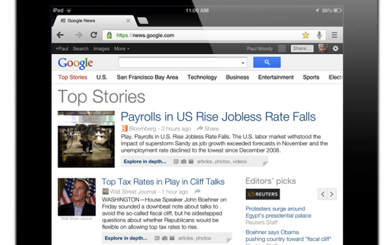
Google’s getting wiser to the tablet experience every day. Today, it debuted a minor update to Google News that makes it more pleasant to browse on the iPad or on Android tablets like the Nexus 7 and Nexus 10.
The new update lets you “swipe” left and right to switch between sections, such as “Top Stories,” “U.S.,” “Technology,” and so forth.
It’s also got a new, sans-serif font display that looks cleaner, with greater differentiation between headlines and the snippets of text teasing each story, and there’s more white space in the layout to give the stories “breathing room.”
Clicking on each story will take you to the source site, so this new interface is just for browsing headlines. Contrast that to Google’s amazingly useful (but still somewhat ugly) Google Reader app for Android tablets, which lets you plow through RSS feeds by swiping from story to story as easily as flipping pages in a magazine.
If Google brought the same clean design it uses in the new Google News to Google Reader, I’d be a happy tablet user indeed.
To check out the new look, just visit news.google.com with an iPad or Android tablet.
And don’t miss our holiday guide to the year’s best tablets.
via the Google News blog


