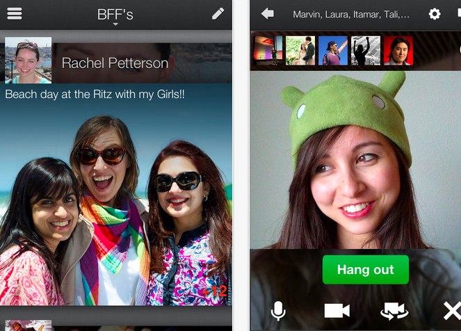
Channeling the design aesthetic of today’s hit mobile app makers, Google has released a bold, new version of its Google+ iPhone application that’s a beauty to behold.
[aditude-amp id="flyingcarpet" targeting='{"env":"staging","page_type":"article","post_id":428332,"post_type":"story","post_chan":"none","tags":null,"ai":false,"category":"none","all_categories":"mobile,social,","session":"B"}']“We’re embracing the sensor-rich smartphone (with its touchable screen and high-density display), and transforming Google+ into something more intimate, and more expressive,” Google senior vice president Vic Gundotra said.
What’s new? A smattering of updates including larger profile pictures, crisper fonts, +1 image overlays, and other user interface and visual elements that should make the experience feel more fluid and more enjoyable.
AI Weekly
The must-read newsletter for AI and Big Data industry written by Khari Johnson, Kyle Wiggers, and Seth Colaner.
Included with VentureBeat Insider and VentureBeat VIP memberships.
But those niceties are all secondary and supplementary to the new Google+ for iPhone look, a dramatic, image- and video-centric design rich with color. The design offers a content consumption experience ripe with personality. Status updates look more like art and flow on to the screen in a smooth and soothing fashion.
In the most flowery of terms, it’s “Content so immersive it remakes your mobile device into a rich carousel of beloved memories and breaking news,” as Gundotra said.
And Android owners fear not, a similar Android version with a “few extra surprises” is said to be coming in a few weeks.
The application looks and feels like a whole new Google+ — just not a whole new social network. In fact, it seems to encapsulate much of the elements of today’s contemporary mobile social applications. It especially echoes the photo-centric qualities of private social network Path and social news app Flipboard, and we’d be remiss in our duties if we didn’t mention the overlap between this app and the storytelling, visual, and emotional aspects of Facebook’s Timeline.
Borrowed or not, Google+ for iPhone, and soon Android, is certainly a radical departure from the previous design and the typical Google aesthetic. Even the just-redesigned Google+ web experience feels plain in comparison.
[aditude-amp id="medium1" targeting='{"env":"staging","page_type":"article","post_id":428332,"post_type":"story","post_chan":"none","tags":null,"ai":false,"category":"none","all_categories":"mobile,social,","session":"B"}']
Let’s call this what this is: a window-dressing with important implications for a social network that still lacks a unique purpose. In a flash, Google+, at least in mobile form, has gone from drab to fab and just begs to be touched — repeatedly.
Is it enough to draw application users into the mix and encourage them to engage and share more? We’ll let you be the judge of that.
VentureBeat's mission is to be a digital town square for technical decision-makers to gain knowledge about transformative enterprise technology and transact. Learn More
