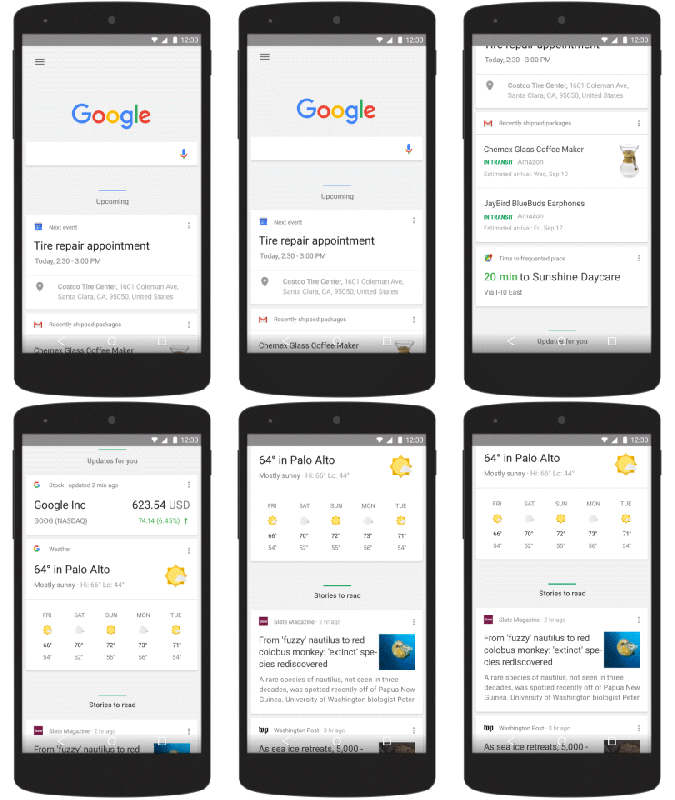
Google has released a visual update for not only Search but also its Now cards on mobile. In a blog post, the company explained that this enhancement is aimed at better relating to the way people find information.
 Starting today on mobile, users will see a simplified way of searching. What will happen now is that when you come across images, videos, news stories, and other content, you can swipe and tap to access it. No longer will you have to specify a filter to pull up the information. Conduct a search of the Mars Curiosity rover and you’ll see the results page segmented by categories — news, tweets, apps, images, etc. — with most of them allowing you to swipe to view more.
If you’re an Android user, Google has also updated the homepage of its Google app. Now cards will be organized by category in a predictable fashion to help you get the most out of your day. The company said that over time, Now cards will shift and change size to highlight the more important ones.
This visual update coincides with the debut of a new Google logo.
VentureBeat's mission is to be a digital town square for technical decision-makers to gain knowledge about transformative enterprise technology and transact. Learn More
