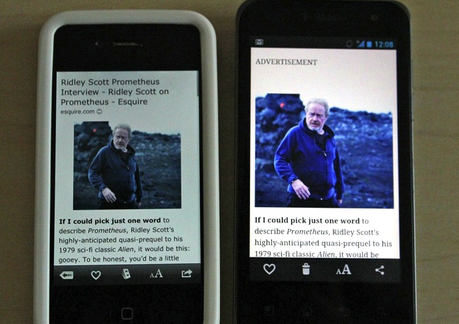
 When I heard Instapaper unveiled an Android app Monday, I quickly made my way to the Google Play store, forked over $2.99, and downloaded the app, which lets you save long articles to read offline later. My excitement fizzled after playing around with an app with a bland interface that didn’t perform as well as its popular iOS counterpart.
Similar to Instapaper’s website, the new Android app’s design is dead simple. It’s not flashy or colorful, but has plenty of features to control how text displays in the app. You can choose a dark theme for night reading, adjust the size of the text and line spacing, and adjust the width of the body of text. If you like your text straightforward and clean, you will probably prefer the app’s interface over the colorful design of Instapaper competitor Pocket.
I grabbed an iPhone with the Instapaper app and started comparing the two versions side by side. The most notable difference between Instapaper for iOS and Android is the lack of headlines on articles in the Android app. It’s a minor difference, but for someone who enjoys context for each article they read (like me), it’s a missed feature.
Taking advantage of my larger screen 4-inch size, the article listings in the Instapaper for Android’s “Read Later” list is much more spread out than in the iPhone. I prefer the iPhone version because of its compact view.
In each article listing, there’s a headline, short excerpt, and dot markers that show how much you’ve read of each article. From the Read Later list, you can batch edit your articles to archive, delete, or move them.
The Android version of Instapaper really shines when saving articles from your phone’s browser. From the stock Android browser, Instapaper shows up in the share menu.
Instapaper is a bit of a wild card when it comes to text rendering. If you save an article on Instapaper from a HTML-heavy website, you’ll often end up with extra links, bullet points, and spaces that create clutter. This problem exists on the Instapaper website and both mobile apps, but on a smaller screen it’s more of a nuisance.
It’s not surprising that the Android app feels a bit lack-luster. Instapaper developer Marco Arment resisted making an Android version of his app and pushed the development to a third-party. He prefers the Instapaper iOS app and that’s obvious when using the Instapaper on an Android phone.
VentureBeat's mission is to be a digital town square for technical decision-makers to gain knowledge about transformative enterprise technology and transact. Learn More
