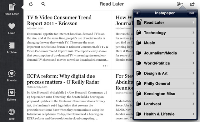
News reading app Instapaper launched a major update Monday for iOS devices that dramatically revamps its design and adds several new features, including Wikipedia integration.
[aditude-amp id="flyingcarpet" targeting='{"env":"staging","page_type":"article","post_id":341806,"post_type":"story","post_chan":"none","tags":null,"ai":false,"category":"none","all_categories":"mobile,","session":"C"}']Instapaper was already a handy tool for those who read a lot of news because it saves copies of anything you’re reading for offline use and letting you read articles your friends share on Facebook and Twitter. But now it’s even more useful, with a long list of new features that will almost certainly improve the experience of current iPad and iPhone users and could attract new users to the table.
The most noticeable part of the update is the new design for the iPad and iPhone. On the iPad, Instapaper has modeled itself more after a newspaper with grid columns that show stories as opposed to lists of stories. The iPhone version still has the list view but the navigation has been restyled.
AI Weekly
The must-read newsletter for AI and Big Data industry written by Khari Johnson, Kyle Wiggers, and Seth Colaner.
Included with VentureBeat Insider and VentureBeat VIP memberships.
“The iPad browsing interface has been completely redesigned to feel more at home in the iPad environment,” wrote Instapaper creator Marco Arment, on his blog. “Instead of just being a blown-up full-screen list, it’s now a more touch-friendly grid.”
Other important feature updates are the ability to read text as white-on-black as opposed to just black-on-white, adjust the device’s brightness inside of the app and hide the status bar on the iPhone’s screen for more reading real estate.
One more thing that deserves attention is the Wikipedia integration. Many times when I’m reading articles, there is a person or event I want to know more about. With Instapaper’s update, you can select a name or term and read more about it on Wikipedia.
Other major changes to the app spotlighted by Arment include:
• Articles in the list or grid can be swiped to reveal a quick action menu
• The in-article styling has been improved
• New settings can customize the number of Liked/Archived articles stored on device
• The iPhone font (ᴀA) panel has been redesigned to be like iPad’s
• The iPhone share forms for Twitter, Tumblr, Facebook, Pinboard, and Evernote have been redesigned
• YouTube URLs now open in the system’s YouTube app
• A new setting has been added to use Apple’s dictionary under iOS 5
• Tilt scrolling is now smoother and works better in all orientations
• The Share panel can now send to Tweetbot and The Hit List
• When updating, the entire table no longer reloads after each article downloads. It now just reloads once after the main update request, showing all (even un-downloaded) articles, and they enable themselves as they get downloaded.
• Tons of performance improvements and bugfixes
• New icon
Instapaper costs $4.99 for the iPad and iPhone. The app was solely created and developed by Arment, who is the former CTO of Tumblr.
Have you downloaded the new Instapaper app? What do you think?
[aditude-amp id="medium1" targeting='{"env":"staging","page_type":"article","post_id":341806,"post_type":"story","post_chan":"none","tags":null,"ai":false,"category":"none","all_categories":"mobile,","session":"C"}']
VentureBeat's mission is to be a digital town square for technical decision-makers to gain knowledge about transformative enterprise technology and transact. Learn More
