

More than a year ago, LinkedIn decided to give its professional social network a refresh, updating its image in order to adapt to the changing way people connect with one another, do business, and improve themselves. LinkedIn started with an updated mobile app before turning to the web with a revised Groups offering. Today the company is rolling out its most cohesive effort yet, with a redesign of the core flagship desktop app.
Some enhancements LinkedIn’s 467 million members will see include a more personalized News Feed, in which algorithms and human editors collaborate to find what’s relevant. The company said that more signals and controls have been added to show “quality content” from more than 500 influencers, millions of professionals, and publishers.
[aditude-amp id="flyingcarpet" targeting='{"env":"staging","page_type":"article","post_id":2154805,"post_type":"story","post_chan":"none","tags":null,"ai":false,"category":"none","all_categories":"bots,mobile,social,","session":"A"}']There’s now in-line real-time messaging, similar to what you’d find on Facebook. This is designed to encourage the type of conversation we’ve become accustomed to in the age of mobile and instant messaging, and it moves the platform away from email-like communication. LinkedIn has previously established conversation as a “pillar” of its service, and this is another step in ensuring people can network with each other more efficiently.
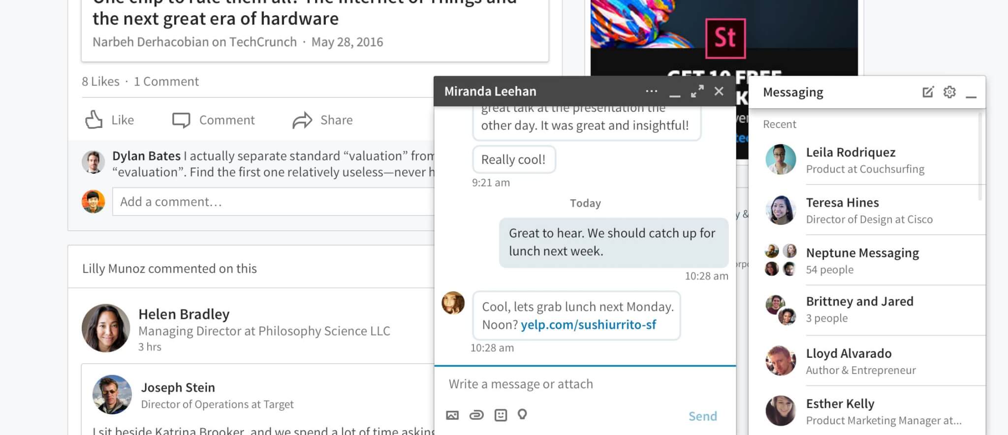
Above: In-line messaging as shown in LinkedIn’s redesigned desktop app (2017).
Search has been streamlined, so there’s one place to find people, jobs, companies, groups, and schools. No longer will members have to select specific fields, as LinkedIn is now better at figuring out what you want to find. Eventually, the social network will index individual posts published on the platform.
AI Weekly
The must-read newsletter for AI and Big Data industry written by Khari Johnson, Kyle Wiggers, and Seth Colaner.
Included with VentureBeat Insider and VentureBeat VIP memberships.
Finally, the navigation has been modified to feature LinkedIn’s key value propositions, namely messaging, jobs, notifications, your profile, your network, and search. There’s also a button that will direct you to additional offerings, such as LinkedIn Learnings, Slideshare, Groups, Lookup, and ProFinder.
Teased in September, the desktop redesign is aimed at providing what LinkedIn hopes will be a “world class, elegant, sophisticated user experience.” While the update is predominantly aesthetic, this new version has better organization, providing meaning and usefulness around the conversations and content that take place on the social network, while eliminating needless clutter. It’s essentially now on par with the mobile app and shares the same API technologies so it’s easy to update while maintaining a consistent experience across devices.
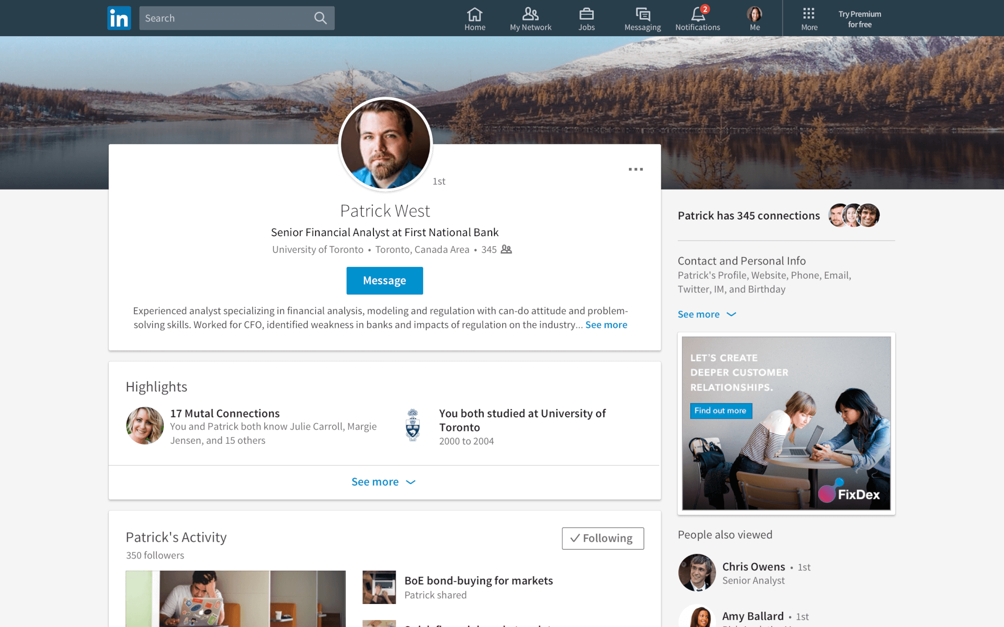
Above: Member profiles shown in LinkedIn’s desktop app redesign (2017).
“This makes [LinkedIn] simpler to understand and helps [members] understand what they should be doing with it,” said Chris Pruett, the company’s senior director of engineering, in an interview with VentureBeat. “We knew that we would do the same [redesign] with the desktop and architected the mobile backend with the mindset of treating the desktop as a platform. All are talking to the same APIs as the mobile app, which allows LinkedIn to innovate more quickly.”
He says the new site is built like a single-page application, which makes it act like an app in a browser and grants it the ability to have seamless animations and in-line messaging capability. One downside that Pruett noted was the sluggish initial load time, which he said would improve. He claimed that in early testing, the average member experience was at least 25 percent faster and that LinkedIn has seen lower bounce rates, but he declined to cite specifics. “Page load hasn’t turned members off,” Pruett claimed.
Amy Parnell, LinkedIn’s senior director of design, described the redesign as a home renovation project. Ultimately, the company narrowed it down to “six rooms.” She cites an example in which all notifications are now placed in one page so members can quickly identify work anniversaries, new jobs, birthdays, and other updates. Parnell also explained that the idea was to reduce the possibility of information overload, something that may have been an issue with previous iterations of LinkedIn.

Above: An old version of LinkedIn’s News Feed prior to the rollout of the 2017 redesign.
Open-source software plays a big part in this redesign. Pruett stated that the company built the new site using ember technologies, which LinkedIn has been an active contributor to. Though this is the first time ember has been used on the desktop, LinkedIn Learning also uses it. In order to ensure it worked — based on the needs of members — LinkedIn worked with the open-source community to rewrite a rendering engine and create a new one that allows specific code modules to be loaded when needed, based on the single-page application process the company is using.
[aditude-amp id="medium1" targeting='{"env":"staging","page_type":"article","post_id":2154805,"post_type":"story","post_chan":"none","tags":null,"ai":false,"category":"none","all_categories":"bots,mobile,social,","session":"A"}']
Although membership has increased each quarter, one statistic that still remains low is monthly active users, which currently stands around 22 percent. This weighs heavily on LinkedIn, and both Pruett and Parnell acknowledged the challenge. “We’ve spent a lot of time with the redesign thinking about how to get people re-engaged,” Parnell said. “A lot of what we do is figuring out who we could bring value to and who has forgotten about LinkedIn…A lot has to do with onboarding and educating them on the changes. A lot of the principles around the design will go a long way to help re-engage members.”
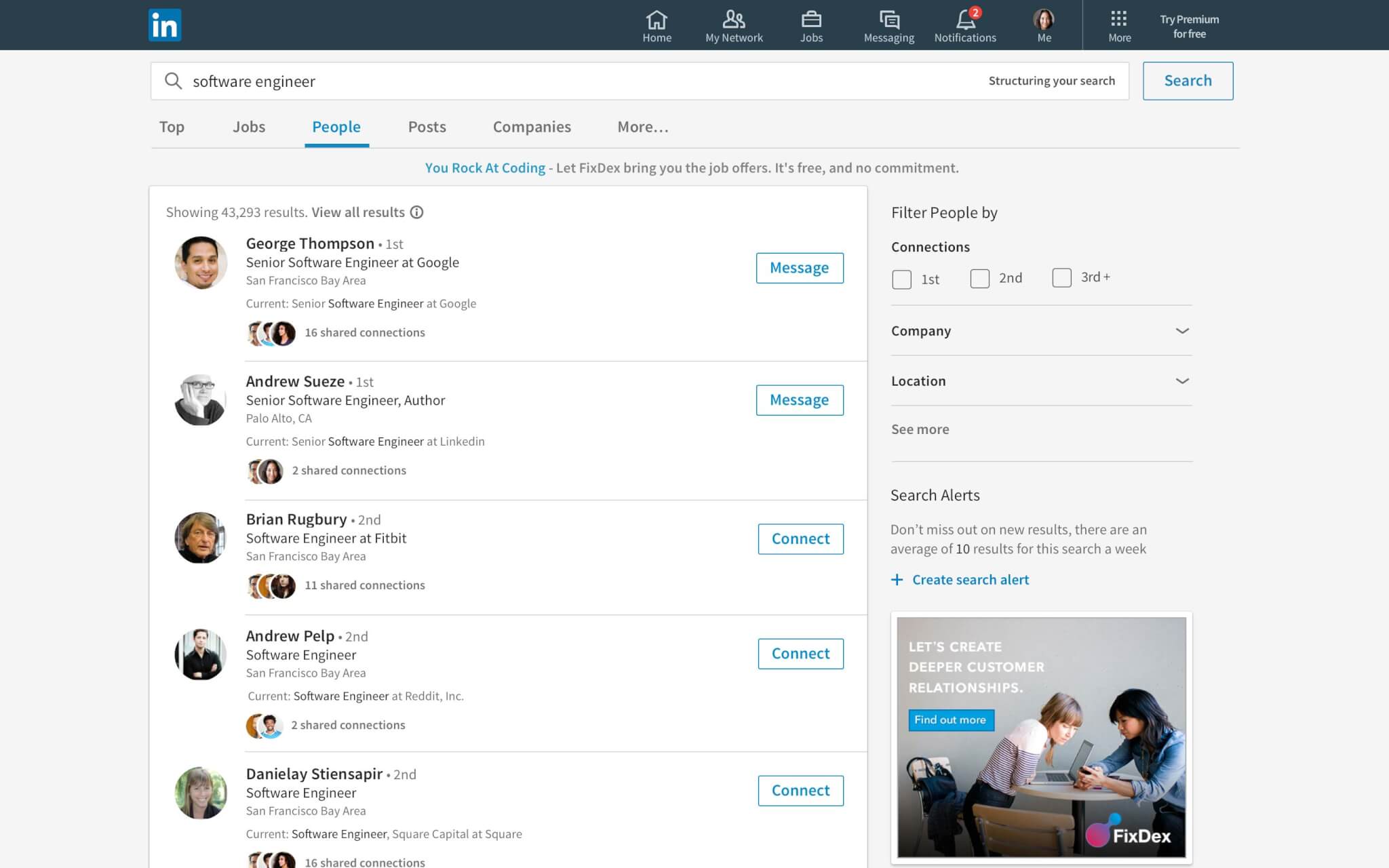
Above: Searching on LinkedIn has been improved in the 2017 desktop app redesign.
“It starts with what is LinkedIn for? What do you go to the flagship for and what not for? What are our key value propositions? What belongs and what doesn’t? How do we connect people to opportunity, help them be productive and successful?” Pruett asked. “You saw it first with mobile and now the desktop. We’re giving the flagship app more of an identity. If you tried to put LinkedIn Learning too much into the flagship, it would get cluttered because flagship isn’t an app around learning. How do we give people confidence that they’re using LinkedIn correctly?”
Right now, LinkedIn has hit a problem typically seen in tech companies when they reach a particular growth point. The company is unbundling itself, opting to refocus on two main areas for the main desktop app: conversations and content. If you want to find presentations, that’s where SlideShare comes in. Then there’s LinkedIn Learning for professional development, Groups for organized membership, Lookup for employee directories, and more.

[aditude-amp id="medium2" targeting='{"env":"staging","page_type":"article","post_id":2154805,"post_type":"story","post_chan":"none","tags":null,"ai":false,"category":"none","all_categories":"bots,mobile,social,","session":"A"}']
For many, the redesign may feel like just a new coat of paint. But what must be understood is that LinkedIn seeks to start a new chapter built around the economic graph so members can actually see what benefits they’ll get out of the service. After seeing the potential of its redesigned mobile app and Groups section, LinkedIn decided to do a complete overhaul to deliver a more unified experience.
Parnell said she’s proud of the redesign, adding that it’s an incredible achievement to have a “significant redesign for a huge consumer base.” This update is also largely aimed at the younger demographics, such as students and those just entering the workforce — the largest growing segment on LinkedIn. “We designed LinkedIn in a way where they belonged here,” Parnell said. As part of this process, the team of two to three designers worked together to create concepts before they were tested in labs and evaluated by members of the target demographic. Then after more iterations and another round of focus groups, the company was ready to roll the redesign out more broadly.
The new, simplified LinkedIn design is rolling out worldwide starting today. Once you’ve received access to it, there is no way to opt out and return to the old experience.
VentureBeat's mission is to be a digital town square for technical decision-makers to gain knowledge about transformative enterprise technology and transact. Learn More