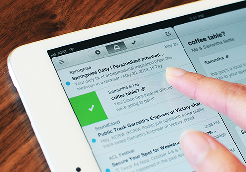
Mailbox is bringing its war on email inefficiency to another front: the iPad.
[aditude-amp id="flyingcarpet" targeting='{"env":"staging","page_type":"article","post_id":743347,"post_type":"story","post_chan":"none","tags":null,"ai":false,"category":"none","all_categories":"mobile,","session":"C"}']The email client, which launched in February on the iPhone, has been one of the most popular ways for iPhone owners to manage and reply to emails. It’s simple, clean, and according to people who use it, gets email out of the way quickly.
Mailbox for iPad, is more of the same and is, at its heart, just a blown-up version of Mailbox for iPhone — so don’t expect any big, earth-shaking changes here. The one notable shift with the app is that the message panel is now on the left side of the screen rather than the right so that it’s consistent with the iPad’s default Mail app. (The app doesn’t work in portrait mode, by the way.)
AI Weekly
The must-read newsletter for AI and Big Data industry written by Khari Johnson, Kyle Wiggers, and Seth Colaner.
Included with VentureBeat Insider and VentureBeat VIP memberships.
It’s also notable that Mailbox for iPad comes with no hints of the app’s change in ownership. Dropbox acquired Mailbox a month after its launch, though it doesn’t look like the company is eager to put its stamp on it just yet.
Also, Android owners — don’t feel left out. Mailbox says that it’s also working on a version of the app for Google’s mobile operating system, though there’s no indication of when that app will arrive.
VentureBeat's mission is to be a digital town square for technical decision-makers to gain knowledge about transformative enterprise technology and transact. Learn More

