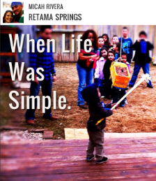
With Tiny Review, users take photos on their iPhone or iPod touch and write short, three-line captions on top of the image, Lolcat style. There’s no 140-character limit like Twitter, but there’s only enough room on each line to write the word “Mediterranean.” It’s a deceptively simple concept, but the results are compelling snapshots of people’s lives that no other app can match.
[aditude-amp id="flyingcarpet" targeting='{"env":"staging","page_type":"article","post_id":366075,"post_type":"story","post_chan":"none","tags":null,"ai":false,"category":"none","all_categories":"mobile,social,","session":"A"}']Today’s Tiny Review update adds the ability to search for photos from a global stream of uploads, find and invite friends from Facebook and Twitter, and share reviews on Twitter.
“The last thing we wanted to do a few months ago was build another photo storytelling app, but then here you are,” Tiny Review co-founder Dick Brouwer told VentureBeat. But as he and co-founder Melissa Miranda explained, you can build a product, but how it is used is beyond your control.
AI Weekly
The must-read newsletter for AI and Big Data industry written by Khari Johnson, Kyle Wiggers, and Seth Colaner.
Included with VentureBeat Insider and VentureBeat VIP memberships.
The initial concept for the Tiny Review app came out of the duo’s previous product, Journly. The idea for Journly was was to create a resource for travelers to gather quick tidbits about new cities based on the experiences of other travelers. Rather than relying on a stale guidebooks or reviews sites, travelers could get the latest scoops on hostels, restaurants and places of interest based on their location. Journly, however, never took off.
“A lot of people found themselves being quite funny and witty, and it was people who didn’t consider themselves particularly funny,” said Miranda. The experience was engaging and the results memorable, which can hardly be said for writing reviews on a site like Yelp. But people were paralyzed by the notion of creating “poetry” about places. With the name change to Tiny Review, the pressure was diminished and the concept suddenly became more accessible.
Tiny Review was recently picked as a featured app in the iTunes App Store, which helped to drive a ton of new users. But people could only see the photos of other people who were nearby, because the reviews are location-based. Brouwer says there’s been about one Tiny Review photo per user as a result, though he says many people are writing two-to-five Tiny Reviews each day. That should change with the new update. It lets you search for people by their Tiny Review name and follow your Facebook friends, which should open the gates for more photo uploading and sharing.
Adding photo filters from Aviary (as many photo sharing services now do), or creating its own is something Tiny Review could do in the future, Miranda says. The emphasis has been on speed, and Miranda says that photo filters shouldn’t get in the way of people who want their photo sharing to be fast.
Tiny Review is addictive because the captions turn mundane events and unremarkable photos into something special. “It’s more than a photo and more interesting than just plain text. Together the photo and the caption give context to what’s going on.” said Miranda. “A photo that wouldn’t be interesting on its own — you add a caption and suddenly it’s something else entirely.” One feature of the app update allows the viewer to remove the captions from a photo, and return an image to its original, pristine state (perhaps so they can add a completely different caption).
[aditude-amp id="medium1" targeting='{"env":"staging","page_type":"article","post_id":366075,"post_type":"story","post_chan":"none","tags":null,"ai":false,"category":"none","all_categories":"mobile,social,","session":"A"}']
Miranda said that seeing photos come in on Tiny Review is similar to watching the documentary “Life in a Day,” because you’re able to see life unfold in pictures around a predictable pattern. “Life in a Day” is a documentary made of video clips sent in from around the world documenting their lives on a single day.
In the morning, people share photos about coffee and breakfast, before snapping pictures from their desks, documenting their work lives. “Saturday night is all about drinking, and funny things happen, then Sunday everyone is having brunch and drinking mimosas,” Miranda said. You can see a small slice of this on Tiny Review’s website, and today’s featured photos app update brings this experience to the phone.
The natural competitor for Tiny Review would be another photo-sharing service like Instagram, Hipster or perhaps Twitter. As a business, Tiny Review could disrupt the nascent location-based recommendations category occupied by apps such as Oink, which was recently launched by Kevin Rose, or Stamped, a mobile app created by former Googlers. Oink and Stamped are built around place-based data generated by users, while Tiny Review captures experience and emotion.
Tiny Review is far and away my favorite app of the year for this reason. It transforms ordinary photos into unique and cherished moments, creating a sense of humanity and connection in a world starved for genuine contact.
[aditude-amp id="medium2" targeting='{"env":"staging","page_type":"article","post_id":366075,"post_type":"story","post_chan":"none","tags":null,"ai":false,"category":"none","all_categories":"mobile,social,","session":"A"}']
VentureBeat's mission is to be a digital town square for technical decision-makers to gain knowledge about transformative enterprise technology and transact. Learn More