Want smarter insights in your inbox? Sign up for our weekly newsletters to get only what matters to enterprise AI, data, and security leaders. Subscribe Now
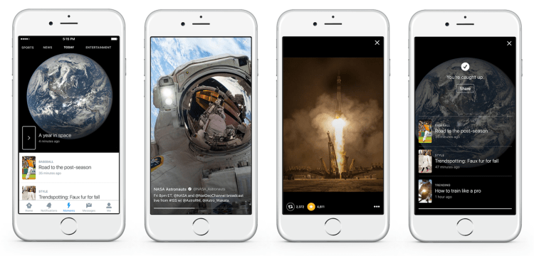
Twitter is currently testing at least one new layout for its Moments product, showcasing related tweets in a timeline-like format instead of its de facto flipbook-style. Because it’s a test, it’s not guaranteed to actually become available to the masses.
A company spokesperson confirmed to VentureBeat that a test was indeed taking place, saying that it was limited to a small group of people.
It seems the test is limited to Twitter’s mobile app for now.
Twitter Moments launched in 2015 and became part of the company’s efforts to market itself. While at first it was limited to curated publishers such as BuzzFeed, Entertainment Weekly, Getty Images, NASA, The New York Times, Vogue, and Major League Baseball, it gradually opened up to more celebrities and influencers until every user had access. When viewed, individual Moments appeared in a gallery-like format where you swiped to read associated tweets.
Now, some users are noticing that instead of swiping through Moments, all of the curated tweets appear in a chronological timeline, not too dissimilar from what you’d find on the main Twitter feed.
Since it’s a test, there’s no telling when it will be more widely available and whether it will supplement the current layouts that exist within Moments or replace them.
Of course, there may be some who question whether this was the best use of the company’s resources, especially as Twitter is continually searching for itself. Updating the way Moments appear wasn’t exactly on the list of things that CEO Jack Dorsey highlighted as things he’d consider fixing this year. In fact, eliminating harassment and enabling tweet editing were the two most requested features from users.
The updated Moments design certainly fits in with the rest of the Twitter app, and also looks cleaner, which could go some way in helping users better understand the service, which has been one of Dorsey’s strategies since taking over as CEO in 2015.


