Trulia sure knows how to appeal to the real estate voyeur in all of us.
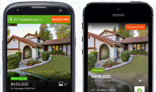
The online real estate company’s new iPhone and Android apps, launched yesterday, put gorgeous photos front and center. The goal: to help you figure out if a listing is good for you even faster.
“Our new design is really just user-driven; we did a lot of research,” said Steven Yarger, director of mobile at Trulia, in an interview with VentureBeat. “You can break anything else, but if you break the photos, they’ll [the users] raise a fit.”
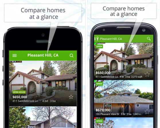
The changes are most noticeable in Trulia’s list view: Instead of just a boring, text-heavy list of available properties, the new Trulia apps put photos right behind every listing. Now, using Trulia’s apps feels more like browsing a real estate magazine, rather than an online search engine.
Best of all, you can actually swipe through photos for every listing without actually jumping into them for more details. That makes it easier to glance at multiple listings quickly, which could hopefully alleviate some of the headache from house hunting.
I’ve been looking for a new apartment in Brooklyn for some time now, and I’ve become a bit of a Trulia addict in the process. The new apps are a refreshing change from their predecessors, which favored lots of white space in a vain attempt at iOS 7-esque design. Finding relevant listings feels a bit faster, but the real benefit of the new apps is the increased efficiency in browsing through listings.
Trulia recently announced that more than half of its traffic comes from mobile devices, including all of its apps and mobile website. The company says more than 60 percent of its agent contacts occur on mobile devices.
VentureBeat's mission is to be a digital town square for technical decision-makers to gain knowledge about transformative enterprise technology and transact. Learn More


