Ever since the debut of iOS 7 on Monday, critics have been split on whether Jony Ive’s new design is really a step forward or simply a colorful retouch that actually hinders the future of design.
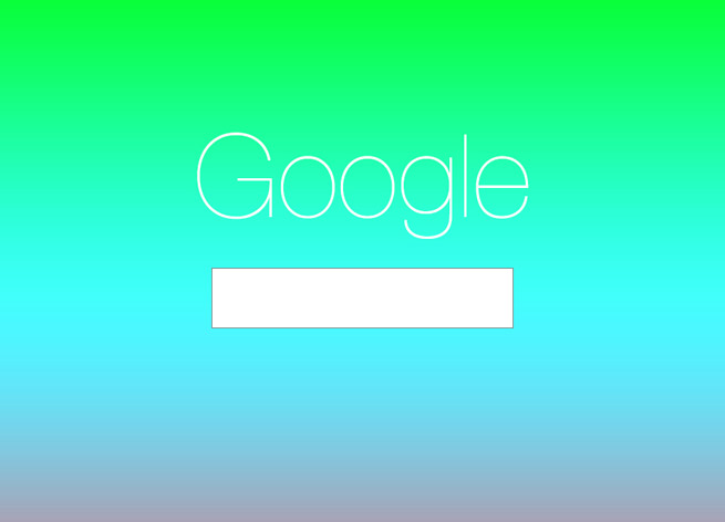
[aditude-amp id="flyingcarpet" targeting='{"env":"staging","page_type":"article","post_id":756786,"post_type":"story","post_chan":"none","tags":null,"ai":false,"category":"none","all_categories":"offbeat,","session":"C"}']So it was only a matter of time before a decent Tumblr blog full of images making fun of iOS 7 and Ive’s design popped up. The blog Jony Ive Redesigns Things takes logos and other properties and gives them a makeover using Ive’s iOS 7 style.
Logos for Google, Instragram, Facebook, Evernote, Adobe Create Cloud, and more all get shiny makeovers with a lot of color. Some are quite funny (like the Evernote unicorn below) but a few are actually nice to look at.
AI Weekly
The must-read newsletter for AI and Big Data industry written by Khari Johnson, Kyle Wiggers, and Seth Colaner.
Included with VentureBeat Insider and VentureBeat VIP memberships.
Take a look at some other colorful “redesigns” in the spirit of iOS 7 below.
Photos via Jony Ive Redesigns Things
VentureBeat's mission is to be a digital town square for technical decision-makers to gain knowledge about transformative enterprise technology and transact. Learn More

