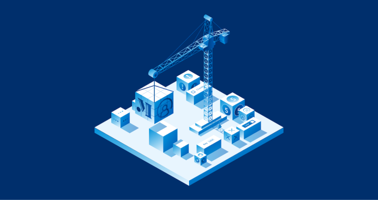
Presented by Chase
At Chase, we have nearly 1,000 designers and 3,000 engineers working across our digital portfolio, and our design system plays a key role in connecting experiences across this large organization to create modern digital products for multiple teams with their own goals and roadmaps.
Our design system, known as Manhattan Design System (MDS), began with a much smaller and less mature design organization, when there were only about 90 designers. Though our goal of helping teams deliver a unified experience to our customers remains the same today, our original approach was a function of what the organization and employees needed at that time.
The beginnings of MDS
Originally, our approach to align the experience was through very intentionally designed and opinionated components that tightly controlled how the user experience looked and functioned. This worked extremely well to add constraints across teams that had little connection to one another. It also allowed us to bring the web and native mobile experiences into alignment, with the added benefit of allowing the design system team to create a rich, accessible experience directly into the components. This greatly reduced the time and effort for developers to get their experiences into production.
There were trade-offs, however. As our organization grew and we added new digital products for our customers such as credit monitoring, rewards shopping and travel, it became very difficult to deliver tightly controlled components that worked for teams building such a diverse set of experiences. Teams in this situation often had to resort to custom building components, even if they were very similar to what the design system offered. Fortunately, the design organization and processes matured by this point, enabling the design system to evolve to meet the needs of our product teams.
Evolving with the organization
We set out to add more flexibility to the system that many of our most innovative teams required. However, our research showed there was a silent majority that really benefited from our current approach of configuration-based component design, with its ease of implementation and baked-in accessibility. This was a critical finding for us, as we were really focused on solving for the capabilities the design system lacked but not necessarily on preserving what worked. Therefore, we sought a path that brought the benefits of a more flexible approach, striking a balance of openness and flexibility with curated solutions.
Our vision was that no one should have to build from scratch. If the system didn’t provide exactly what a team wanted to do out of the box, it would provide the pieces to accelerate their delivery while keeping them connected to the design system.
We landed on a composition-based approach to component design that allowed design system components to be deconstructed into smaller elements called subcomponents, enabling teams to rearrange structure, modify styles and add in custom elements to best meet customers’ needs.
Our new approach to design systems is open and adaptable. It has a set of core principles that ensure consistency with room for flexibility and experimentation. This balance allows us to maintain a cohesive brand identity while also pushing the boundaries of what is possible in our product designs. The new system is not just about rules — it’s about possibilities.
At an organization of our scale and resources, we aren’t restricting ourselves to just a single methodology to design systems. We take an all-the-above philosophy to offer teams a choice for how they consume the design system that best fits the situation they are facing.
Configurable components
Configurable components are highly curated by the design system team and offer a fixed set of intentional features. We use these for highly repeatable and commoditized experiences because they offer product teams speed with their simple instantiation and accessibility.
Composable components with subcomponents
Composable components are designed to be broken apart, modified and reassembled by product teams. To do this we use a concept called subcomponents. Subcomponents break components down into smaller functional regions where some reusability can be achieved. They are great for components that have a wide set of unpredictable use cases like lists and data tables where teams need a lot of flexibility. The tradeoff is they take more effort to put together and to define the accessible experience.
Composed examples
To offset some of the complexity and inconsistency that can be caused by composable components, we provide a set of curated examples that illustrate popular use cases for composable components that we find in production experiences, as well as examples that can be referenced to show how to achieve some difficult compositions. These examples are a great reference for designers and engineers to show how to assemble subcomponents in maintainable and accessible ways, but don’t burden the design system team with additional versioned configurable components to maintain.


Custom theming
A recent addition to the design system is an underling theming engine that enables teams to modify design tokens. This is a great feature to allow teams to modify the aesthetic of components for experimentation. It also allows teams creating new products with specialized branding to use the system until the branding can be made available from the core design system team or to support white-labeled experiences.
Custom components
Teams could always build custom components, but our hope is that with the changes to the design system they will need to do so less often. However, when teams need to make custom components, the design system offers design tokens that can help with brand alignment. Custom components can also be combined with system-provided subcomponents or included in composed components, which could reduce the scope of what needs to be custom built.

Transitioning from a rigid to a flexible design system has been a challenging but rewarding journey. It has allowed us to support innovation and experimentation in ways we couldn’t before and has made our relationship with designers and engineers more collaborative and dynamic. As Chase continues to grow and evolve, we are confident that MDS will be able to support the organization every step of the way.
A design system should not be set in stone. It’s not a build once-and-done project. A well-staffed design system should evolve to serve the ever-changing creative and business needs of the organization it supports. That is the benefit of having a design system team, to craft and evolve the inputs of digital experiences in a way that best serves the needs of the organization and its leadership, even if that means changing the fundamental approach to the system.
Like what you’re reading? Check out Next at Chase for more insights from one of banking’s most innovative organizations.
Jeff Crossman is Head of Design for Design Systems at Chase.
JPMorgan Chase is an Equal Opportunity Employer, including Disability/Veterans.
For Informational/Educational Purposes Only: The opinions expressed in this article may differ from other employees and departments of JPMorgan Chase & Co. Opinions and strategies described may not be appropriate for everyone, and are not intended as specific advice/recommendation for any individual. You should carefully consider your needs and objectives before making any decisions, and consult the appropriate professional(s). Outlooks and past performance are not guarantees of future results.
Any mentions of third-party trademarks, brand names, products and services are for referential purposes only and any mention thereof is not meant to imply any sponsorship, endorsement, or affiliation.
Sponsored articles are content produced by a company that is either paying for the post or has a business relationship with VentureBeat, and they’re always clearly marked. For more information, contact