Want smarter insights in your inbox? Sign up for our weekly newsletters to get only what matters to enterprise AI, data, and security leaders. Subscribe Now
 Today, Facebook CEO Mark Zuckerberg unveiled some huge changes to the social network and its platform at f8, Facebook’s developer conference.
The tagline for today’s event is “Read. Watch. Listen,” which foreshadows the media features and content consumption and sharing functionality Zuckerberg announced from the stage.
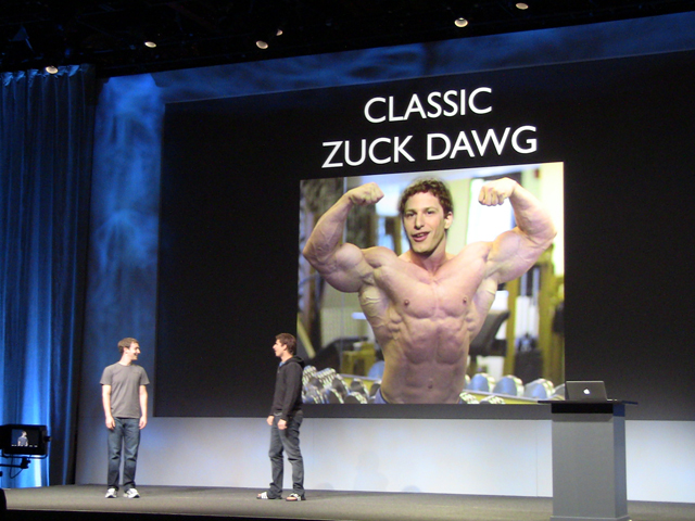
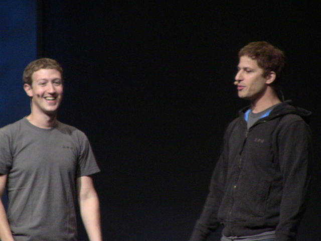
But before Zuckerberg stepped onto the stage, Andy Samberg appeared to give his signature send-up of the young CEO, which both the crowd and “Zuck” himself clearly got a kick out of.
Timeline: The new Facebook Profile
Pointing out that the past five years have been about connecting people to one another, Zuckerberg told the crowd that half a billion people logged into Facebook in a single day just last week, a new record for the company.
“The next year is going to be defined by the apps and the depth of engagement that is possible now that everyone has their networks in place and connections established,” Zuckerberg said.
First, Zuckerberg unveiled Facebook’s new Profile UI, called Timeline: a curation of stories, apps and new ways to self-express in visual ways.
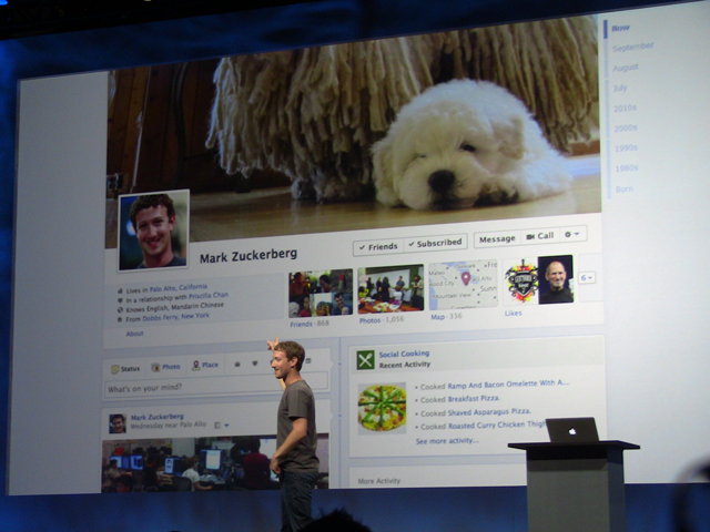
We’ve known for some time that Facebook Profiles were getting ready for a major interface and experience overhaul. In fact, Facebook’s been acquiring and hiring non-coding designers specifically to work on how Profiles present information about the user.
Over the summer, a Facebooker told us in an off-the-record interview that Facebook Profiles were soon going to become a much better way to get an at-a-glance picture of who you are, what you do, and what you like.
“Millions of people have spent years curating the stories of their lives,” said the CEO, noting that Facebook Profiles are too difficult a way to really get to know someone else or share information about yourself. He called the new Timeline “the next few hours of an in-depth conversation” between two people, whereas current Profiles are the first few minutes.
Timelines reflect the current state of web and app design. They’re in keeping with the multimedia-rich, touch-friendly look and feel of modern application design.
In addition to design, Zuckerberg talks about how Timeline sorts content algorithmically. As the user scrolls down a Timeline, information becomes more and more summarized. In other words, you’ll see more stories from this month, fewer stories from last year, and a highly condensed version of what happened to you in 2009. On the right column of the Timeline, you can click to narrow down to a given year or month.
Here’s an overview of how Timelines work:
[youtube http://www.youtube.com/watch?v=hzPEPfJHfKU?rel=0&w=640&h=360]
Even though users tend to instantly hate any changes to their favorite web apps’ interfaces, Zuckerberg said while reviewing some of Timeline’s features, “We think that people are really going to like these… We wanted to design a place that you’re proud to call your home. It’s a completely new aesthetic for Facebook.”
Zuckerberg said the new Timeline is launching with a developer beta right now. In a later press conference, the company’s product chief, Chris Cox, noted that for most users, the rollout would be gradual and would occur over the next several weeks.
Ticker: A lightweight stream of what you’re up to
Next, Zuckerberg told the audience that Facebook will now allow users to express more specifically what they’re up to.
“We’re helping to define a new language for how people connect. When we started, the vocabulary was limited.” In other words, you’ve had to “like” brands, books, movies, locations — every kind of page on Facebook just got a simple “like.”
Now, instead of “liking” a book, you can tell friends you read it through Facebook’s new activities vocabulary. And you can do so without annoying all your friends.
When you share a post, it goes into your Timeline. But when you have an activity from the Open Graph, it goes into Ticker. Ticker activity appears in real time; you can see the Ticker on the right side of the Facebook homepage.
Ticker posts have some cool real-time interactions, too. From the stage, Zuckerberg demonstrated a Spotify integration that allows you to listen to a song in a Spotify note in Ticker just by hovering over the post.
For Ticker-type activity coming into Facebook from outside apps, users won’t get prompts for each lightweight action. Accordingly, the Permissions dialog has been redesigned. It’s simpler, and it gives automatic sharing functions to the app. Settings can be modified later from Facebook’s app and security pages.
Of course, a constant stream of real-time, lightweight activity from all your Facebook friends is a lot of noise and very little signal. Facebook is also allowing users to find patterns in this activity by digging a bit deeper on friends’ profiles. For example, you can see a friend’s favorite bands or albums based on Ticker activity from Spotify.
And speaking of Spotify, Facebook is getting ready to make some big music, movies and media announcements. Check out that news in a separate post.
