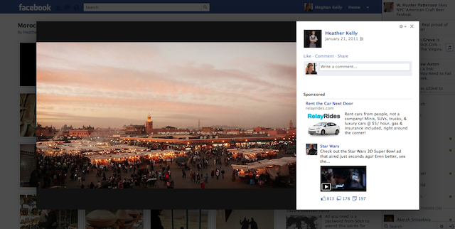
It seems Facebook has rolled out its new lightbox photo viewer to more people today, and some are saying it’s a ripoff of Google+.
The new feature is similar to the old “theater view” in that it takes the user into a pop-up carousel of photos. What’s new is that Facebook has moved the comments to the right side of the photo and added advertising below the comments field. In order to like or tag a person in the photo, you must hover over the photo and wait for an action bar to appear.
This is the first new feature to come out of the company since it filed to go public on February 1. While Facebook’s interface tweaks and privacy policy changes often provoke outrage among its hundreds of millions of users, we think most people will like this one. Facebook has long been known as a great place to view, upload, and share photos. It has been held back, however, by its smaller format. The theater view helped expand Facebook’s photo real estate by lifting the pictures off of the actual web page. The lightbox continues on this path, though one photographer, Thomas Hawk, believes the lightbox could be bigger.
“If I were Facebook I’d still make the lightbox view much larger (like Google+),” Hawk wrote on his website. “When it comes to a photo in lightbox view, bigger is definitely better.”
As Hawk notes, some believe this viewer is very similar to Google+’s lightbox. The comments on Google+ also exist on the right side, and the background greys out similar to the Facebook lightbox.
We have reached out to Facebook to see if this rollout has been completed. We will update upon hearing back.


