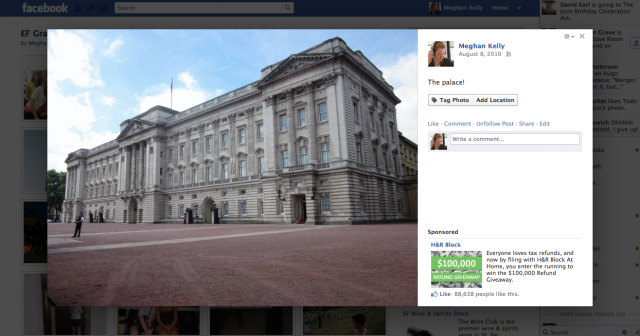
Facebook is rolling out its new lightbox photo viewer feature to all 840 million users by the end of this week, a spokesperson for the company has confirmed to VentureBeat. The new display helps make photos more attractive by showing them larger, moving comments off to the side, and graying out the background to minimize distraction.
“The new photo viewer is rolling out to everyone on Facebook and should be available to people worldwide by the end of the week,” the Facebook spokesperson said in an email.
The lightbox feature has slowly been released to pockets of Facebook users over the last week. The new display helps Facebook compete with other photo services and social networks that already offer bigger, crisper viewers that make photography shine. Facebook is the largest photo-sharing site online, with more than 250 million photos being uploaded each day, according to the company’s recent SEC filing. A recent study by Buddy Media and ComScore found that 17 percent of our time on Facebook is spent looking at photos.
“The biggest thing with photographers is they want their photos to look elegant and beautiful wherever they post them. Also, bigger is better,” photographer Thomas Hawk told VentureBeat.
Facebook’s new photo layout is a big step in that direction. The social network’s image viewer hasn’t been the most aesthetically pleasing. In the beginning, photos were small and lived on the actual web page. Then Facebook introduced its Theater feature, which turned the photos into pop-ups. Now, the lightbox feature dims the whole Facebook page and subdues the comments box by moving it to the right side of the screen. If you hover over the image you see options to Tag or Like the photo.
The new interface has also taken advantage of some under-used advertising real estate and now shows sponsored posts below the comments. As Hawk notes on his website, the advertisements are pushed down as more comments are added.
Hawk believes Facebook is becoming a great place for photographers to market their work. “It’s interesting,” Hawk said. “Ever since Google+ has come out and had success with the photography crowd, I think Facebook is trying to go a long way to improve photos.”
Hawk was recently contacted by Facebook after he published a blog post titled, “1,500 Kickass Photographers on Google+.” The Facebook employee asked Hawk what the photography community wanted out of the social network, how the community operates, and other questions on how to best improve Facebook’s photo products. According to Hawk, Facebook also reached out to other prominent photographers, such as Trey Ratcliff who Hawk refers to as “the most popular photographer on Google+.”
Photographers are enthusiastic about two other recent photo features on Facebook: the cover photo at the top of the new timeline feature and the new thumbnails. However, Hawk would still like Facebook to give photographers a way to crop their photos in the timeline so their art can best be displayed.
Google+ allows you to upload photos up to 2048-by-2048 pixels; any larger will be resized down. In 2010, Facebook increased its maximum photo size from 604 pixels, to 720 pixels on one side. Then, in February 2011, it bumped its photo size to 2048 pixels as well. Whether or not the lightbox feature compresses them down for viewing, however, remains to be seen.
Google, which many people pointed out had the lightbox function first on Google+, told VentureBeat that it does not comment on competing products.
Check out a gallery below of photos using Facebook’s new lightbox function.


