Can you recall the days of “user revolts” over Facebook design changes?
Every time the site changed even a little bit, Facebook members would kvetch to the rafters that the site was ruined forever and would threaten to abandon it and return to MySpace (hah) or Friendfeed (haaahaha).
But if we’re being honest, Facebook took the less popular road and made tough design choices along the way — choices that have made all the difference in getting Facebook safely to its 10-year anniversary.
Some of the biggest, boldest changes have happened fairly recently. There was the launch of Timeline in 2011; this brought a modern, competitive, picture-perfect UI that eventually led to a new News Feed in early 2013.
Facebook Home, while less popular with users, was still a gorgeous step in the right direction.
And with the launch of Paper, a beautiful news app, Facebook proves once again that its design credentials are hard-won and still up to snuff.
But perhaps the most important — and most consistent — aspect of Facebook design is its uncompromising commitment to uniformity and simplicity. When users complained about profile customization, for example, Facebook staunchly refused — and saved itself from the MySpace Ghetto Effect of sparkling animated GIFs and auto-playing music.
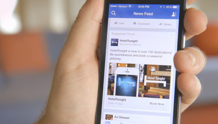
Here’s a then-and-now look at Facebook design: