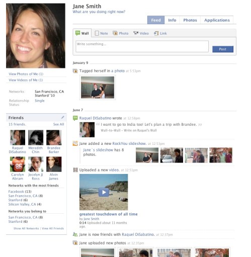
 I’m here at Facebook in Palo Alto, CA. Today the company invited some of us to check out the new profile redesign it will be rolling out in the next few weeks. Facebook doesn’t have a set target date, but these changes will roll out sometime in June.
The changes look very nice, but as we’ve seen in the past with Facebook, users don’t always like change. And the company does not want another Beacon situation, which is is no doubt one reason it has us here today.
The new redesign is predicated on three main ideas:
- A cleaner look and feel
- More control and transparency
- Emphasizing relevant content

AI Weekly
The must-read newsletter for AI and Big Data industry written by Khari Johnson, Kyle Wiggers, and Seth Colaner.
Included with VentureBeat Insider and VentureBeat VIP memberships.
A key part of the new design is tabs. Anyone who uses Google’s iGoogle start page will be familiar with how this is going to work. Rather than having all the user data on one profile page, the content will be broken up into individual tabs.
The tabs by default will be broken down in the following way:
The first tab will be the “Feed” tab, which will store the popular News Feed information. The second tab will be the “Info” tab, which will contain all pertinent user information. Whereas the Feed tab will be dynamic, this Info tab will be more static.
The third main tab will be a “Photos” tab. Facebook has found that photos create the richest and deepest engagement among users. Finally, there’ll be a tab for “Applications”, which Facebook is also calling the “Boxes” tab. This should alleviate the problem some users have with an increasing amount of clutter due to the ever-expanding number of Facebook applications that pop up on user profiles.
Facebook made it very clear that applications already built for Facebook will all be compatible with these new tabs.
In addition to the four mentioned tabs, users will have the option to add custom tabs for applications they use the most.

Some other things of note:
- Facebook has been working on these changes since the beginning of 2008, and the plan for the roll out is to walk users through the transition to the new profile. The company wants to avoid frightening users with a sudden flip-of-a-switch change.
- Facebook will be bringing more emphasis to importing information from third-party sites.
- The developer sandbox will be launching this week. Facebook will be looking for feedback from this.
- There was a lot of talk today that all these changes are still in a state of flux. As I mentioned, Facebook seems concerned about annoying users with changes they don’t want.
- The main area of the page will be a little wider.
- The emphasis is still very much on speed.
- The status of the Facebook Wall (where people leave each other messages) is still being discussed. It could eventually be put into the Feed tab.
Facebook has posted a video of its presentation from the event here. Some other pictures can be found in the preview overview album.
More pictures after the jump.


VentureBeat's mission is to be a digital town square for technical decision-makers to gain knowledge about transformative enterprise technology and transact. Learn More