I don’t use Google + and chances are you don’t, either. Google, however, really, really wants to change that.
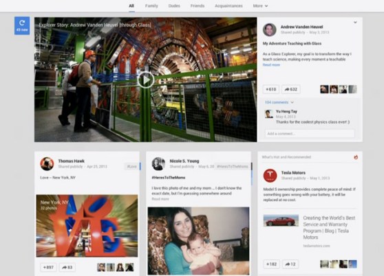
Google is rolling out a major overhaul to the design of Google+, which now looks like a freakish three-column lovechild between Pinterest and Facebook.
The updates, which are among the 42 new features that are headed to Google+, adds a lot of polish to a social network that has so very been awfully bereft of it. I can only applaud Google’s decision to change things up.
In addition, Google+ will now automatically tag your photos, which is either horrifying or awesome, depending on how you look at it. During the presentation, Google senior VP Vic Gundotra used the example of a photo of the Effiel Tower, which, after being analyzed, was tagged with, um, #effieltower.
“We are incredibly grateful to the millions of you who’ve joined Google+, and we can think of no better thank you than to keep innovating,” Gundotra said.


